Why "Woman of the Hour" Nails That Vintage Vibe
A 1970s dating show, a serial killer, and killer retro vibes

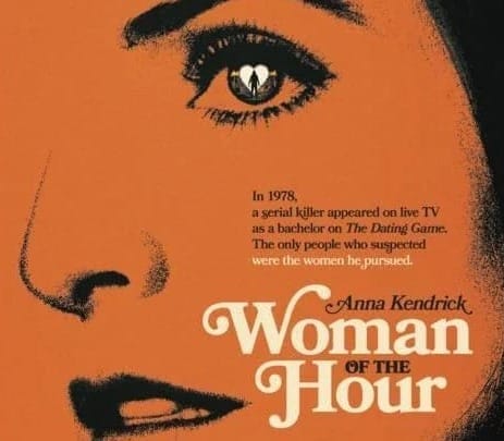
Let’s talk about how the Woman of the Hour poster absolutely nails that retro vibe while giving us chills.
This isn’t just some throwback for the sake of nostalgia—it’s a smart, visually stunning piece that pulls you right into the twisted world of 1970s America.
The Duotone Effect: Vintage and Vivid
First off, the duotone effect. The designers went with a bold burnt orange paired with deep black, and it’s doing some serious heavy lifting here.
It’s like they pulled this straight out of a 1970s magazine, back when everyone was rocking bell bottoms and the color palette was as bold as the fashion.
But it's more than just looking cool.
The orange gives off this warm, faded photo vibe, which instantly screams "vintage." But then you've got the black, which adds a shadowy, almost ominous feel—perfect for a movie about a serial killer on a dating show.
It’s like the color scheme is saying, "Yeah, this is going to get dark, but you’re going to love every second."
Typography: Retro Meets Drama
Now, let’s talk typography. They used Bookman Bold with Swashes, which is a typeface straight out of the ‘70s playbook.
It’s bold, it’s got those elegant curves, and it’s not afraid to take up space. Those swashes—those fancy flourishes—add just the right amount of drama. This font isn’t just there to look pretty; it’s demanding your attention.
The title, Woman of the Hour, is massive and impossible to ignore—just like the woman at the center of this story. It’s like the font itself is telling you, "This is important. Pay attention."
A 1970s Throwback Done Right
Everything about this poster screams 1970s, but not in a cheesy way.
The duotone, the typography, the close-up on Anna Kendrick’s intense expression—it all works together to plant this movie firmly in its time period.
It’s got that retro flair without being stuck in the past.
This isn’t just some half-baked attempt to cash in on ‘70s nostalgia. The poster takes everything that was cool about design back then and remixes it for today.
The result?
A poster that’s both a tribute to the past and a fresh, eye-catching piece that’ll stand out in any crowd.In short, the Woman of the Hour poster is a killer example of how to do retro right.
It’s got the looks, the vibes, and it tells you exactly what kind of story you’re about to dive into.
It’s a design that gets under your skin—in the best way possible.