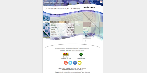
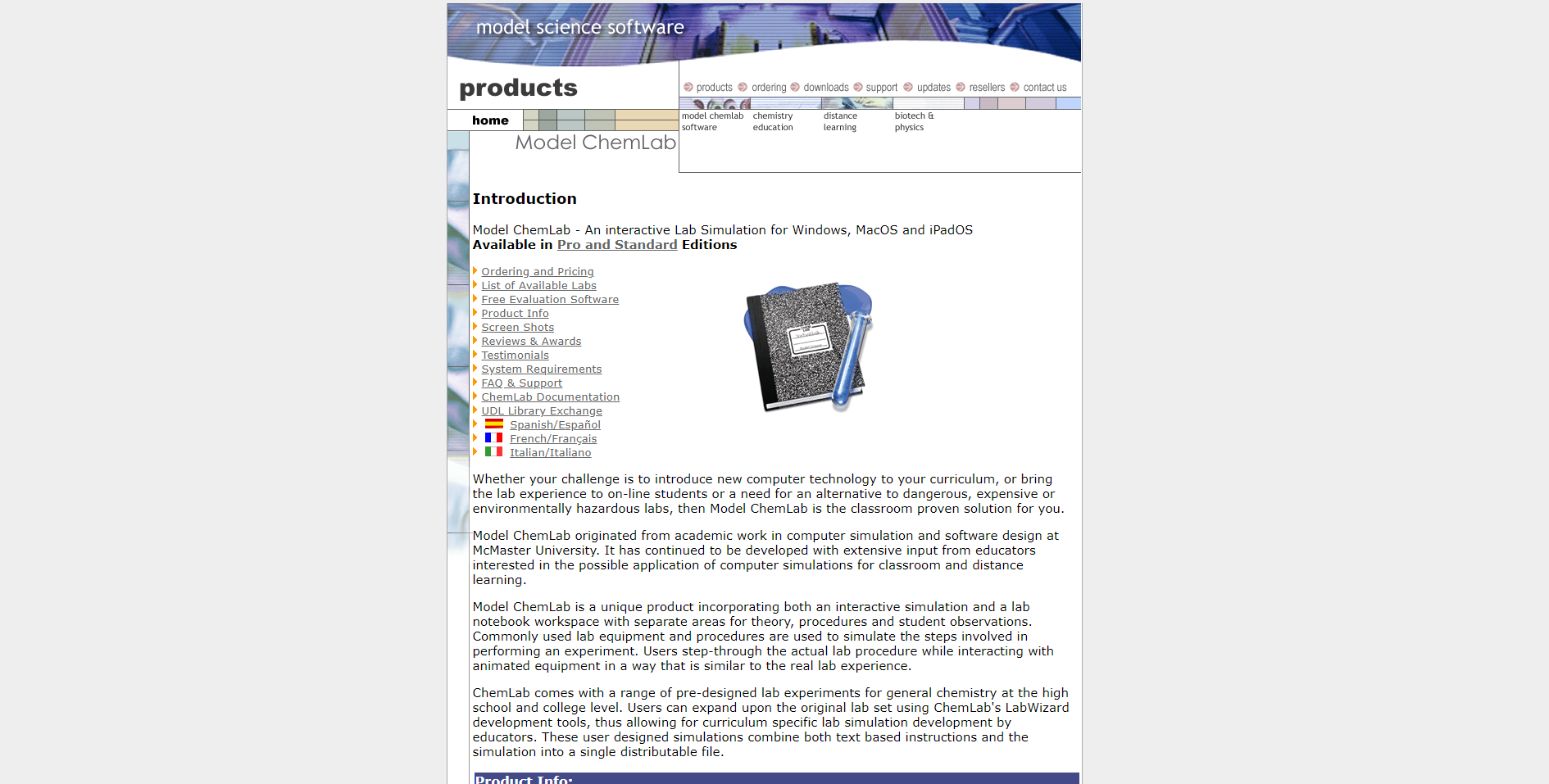
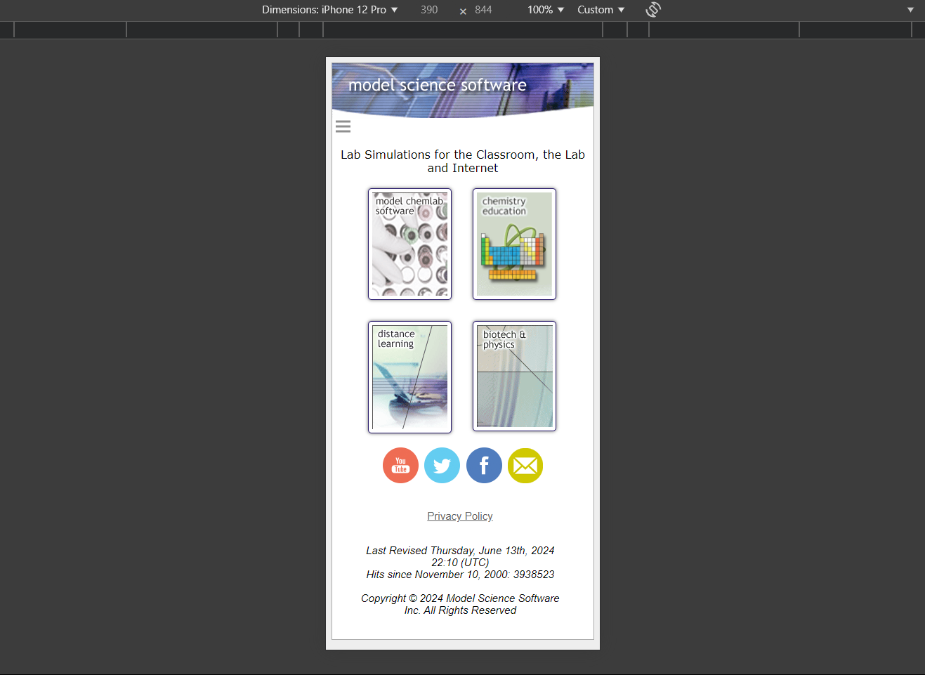
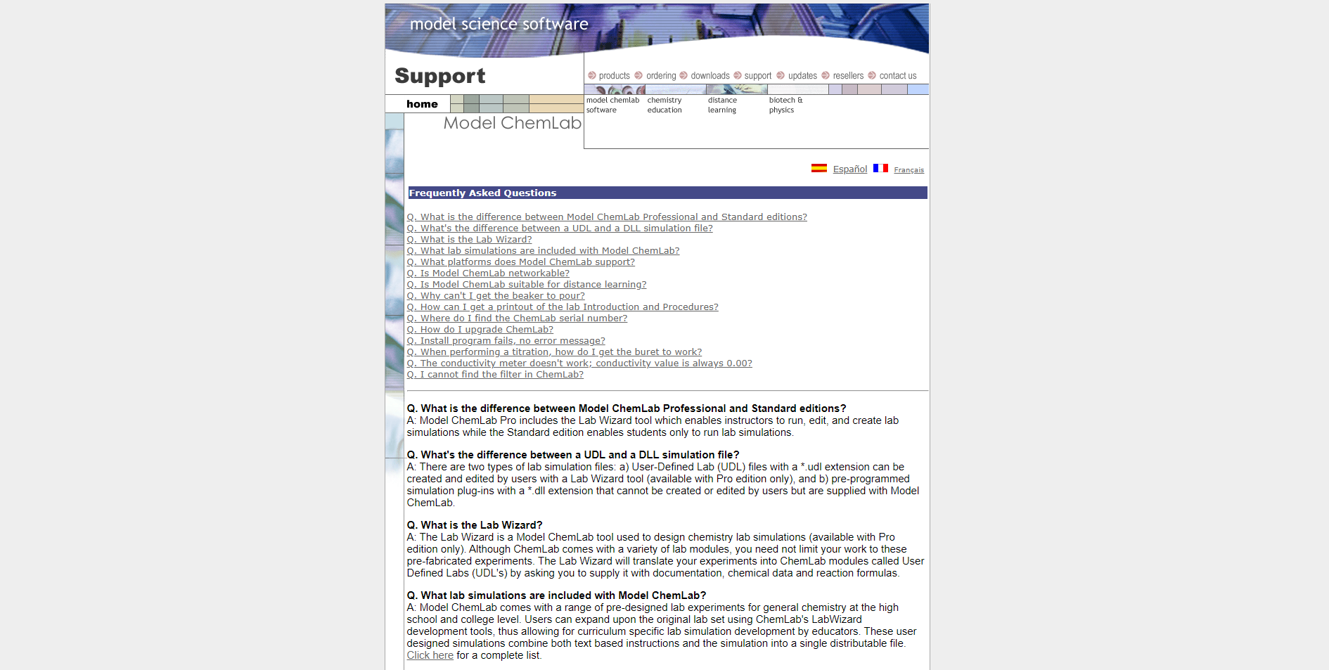
Over at Reddit, user Nerdysmart shared a remarkable glimpse into web history: his father’s website, Model Science, built in 2000, which is still live and functional today.
“He keeps saying it was innovative when it first came out, and yeah... in the year 2000,” Nerdysmart writes, challenging others to prove it’s bad.
Despite its ancient origins, this website is fast, responsive (sort of), and functional, serving as an unexpected counterpoint to the bloated web designs of today.
This site, which genuinely feels like a relic from a different era, exposes a key truth about the modern internet: it has become slow, over-engineered, and more about flashy aesthetics than functional speed.
The nostalgia many feel for simpler times isn't just sentimental—there’s a very real lesson to be learned from the fact that a website from the turn of the millennium can outperform its modern counterparts in several ways.
Speed and Simplicity vs. Modern Bloat
It’s easy to forget how painfully sluggish many modern pages have become.
Thanks to minimal code and straightforward design, Model Science still loads faster than many built-in 2024.
It’s a stark contrast to today’s sites, which are often bogged down by complex frameworks like React or Angular, advertising trackers, and heavy multimedia elements.
We confess we're guilty of that here at feedme.design, and it's really made us question what we could get rid of to speed loading times up.
While modern tools offer incredible capabilities, they frequently lead to excessive load times and performance issues for users.
The worst of these tend to be news websites - which are loaded with sign-up forms, advertisements and overlayed videos.

For sites that don’t need dynamic content or complex features, the extra layers of JavaScript and CSS can feel like overkill. As one Reddit commenter put it, “Wow, pages load fast when you cut out the extra garbage.”
The Surprising Strength of a 24-Year-Old Website
Despite being two decades old, this website even demonstrates some level of mobile optimisation, which is impressive for its time.
The layout adjusts well to smaller screens, even if certain interactive elements aren’t as intuitive as what we expect today.
The site doesn’t try to wow you with fancy design tricks or endless scrolling.
Instead, it delivers exactly what you need: simple, direct information. There’s a refreshing purity in its approach. It’s not designed to keep you hooked with pop-ups or auto-playing videos—it’s just there to serve its purpose.
The Pitfalls of Modern Web Development
One of the more interesting points raised by this website's defenders is the impact of disabling JavaScript.
Without all the scripts that clutter modern sites, the page loads at lightning speed. Many modern sites, by comparison, are loaded with heavy tracking codes, ad networks, and complex backends that slow everything down.
As one user put it, disabling JavaScript feels like taking a breath of fresh air—websites suddenly become faster and leaner without all the baggage.
However, the site isn’t perfect.
It lacks accessibility features that are now standard, like alt text for images, which can impact both user experience and search engine optimisation.
And while it’s stable and functional, some critics raised questions about security—an important concern when dealing with old software and outdated code.
Accessibility and Security Trade-Offs
One legitimate criticism is the lack of accessibility.
Some elements are images without descriptive text, and there are no features like high-contrast options or keyboard navigation.
In 2024, these omissions are dealbreakers for users with disabilities, and modern regulations mandate a more inclusive design.
Security is another grey area.
While Nerdysmart’s dad’s site performs well, there’s always a risk that an older site might not be updated for modern security standards. Hackers have evolved alongside web technology, so keeping a site updated is crucial.
Function Over Fashion
Ultimately, the Reddit thread brings up a critical question: does a website need to look flashy to be effective? Not necessarily.
Many commenters echoed the sentiment that the site “does the job it was meant for.”
It’s fast, functional, and serves its purpose, which is more than can be said for many of today’s feature-heavy but clunky sites.
In the rush to adopt modern design trends, we’ve often traded away simplicity and speed. But does every website need to be a complex, interactive experience?
Chemlab proves that a well-built, no-nonsense design from 2000 can still hold its own in 2024—especially when compared to over-engineered sites that prioritise aesthetics over performance.
As the internet continues to evolve, it’s worth remembering that not every site needs a redesign.
Purpose-driven websites that are fast and intuitive still have a place, and maybe, just maybe, there’s a lesson in restraint to be learned from this 24-year-old relic.