You’ve seen it.
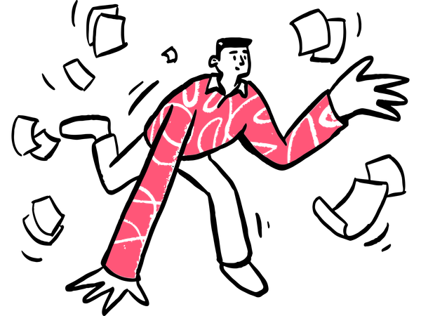
Those blobby humanoids with disproportionately long legs and eerily happy expressions. They’re riding bicycles, holding hands, or inexplicably floating around with money bags.
This is Corporate Memphis (or Alegria, if you're fancy), and for some, it’s less “corporate charm” and more “graphic design is my passion” on steroids.
But why does this art style ignite such rage? Let's dive into the colourful (and controversial) world of Corporate Memphis.
What Is Corporate Memphis?
Corporate Memphis is the art style that big tech brands like Facebook, Google, and YouTube can’t seem to quit.

Its trademark features include:
- Oversized limbs: Legs and arms that stretch like Gumby on a sugar rush.
- Flat colours: Bright, blocky, and a bit soulless.
- Abstract proportions: Heads the size of watermelons or torsos that belong in Salvador Dalí paintings.
- Overly happy characters: Everyone looks like they just won the lottery.
Originally meant to convey inclusivity, joy, and modernity, it’s now shorthand for tech-bro capitalism dressed up in pastel colours.
Why Do People Hate It?
It’s Everywhere
Once upon a time, someone at Facebook saw a big leggy blob-person and thought, “Yes, this will inspire trust.” Fast forward, and now it’s plastered on every app, platform, and startup pitch deck. What was initially quirky and fresh became the new Comic Sans in record time.
It’s Dehumanising
Ironically, Corporate Memphis tries to show “the human experience” but ends up feeling... robotic. The overly simplified characters lack individuality, which can make it hard to relate. When everyone’s just a smiling bean with noodle arms, who’s the audience?

It’s Soulless
For critics, the style feels like it was generated in a lab, not created by an artist. It’s the visual equivalent of canned laughter—pumped out to manufacture feelings, but devoid of authenticity.
The Bigger Context
Let’s not ignore the elephant in the pastel room: Corporate Memphis is often associated with big tech and its “We’re definitely not evil” PR campaigns. Many see the style as a mask for companies dodging accountability or oversimplifying complex issues.
The Subreddit Speaks
The subreddit r/fuckalegriaart is a haven for those who’ve had enough.
Users dissect its ugliest iterations, share memes, and vent about the art style that just won’t die. One recurring joke is how Alegria characters can smile through literally anything: layoffs, data breaches, or even the apocalypse.

A popular post features a blob-person joyfully walking into a burning building, with the caption: "Don’t worry, we’re building a better future—together!"
It’s this juxtaposition of saccharine visuals and grim realities that makes the style feel especially grating to its critics. What I will say though is some of the material over there is an absolute treat, such as this Corporate Memphis take on Saturn Devouring His Son.

Can We Escape Corporate Memphis?
Once Facebook popularised the style, other tech companies quickly followed suit. Google, YouTube, LinkedIn, and countless startups adopted similar aesthetics. Why? Because it was:
- Customisable: Easy to adapt for any brand or message.
- Scalable: Simple enough for icons, illustrations, and animations.
- Non-threatening: Bland enough to appeal to a broad audience without causing controversy.
So while Corporate Memphis dominates today, design trends are cyclical. Skeuomorphism, brutalism, and vaporwave have all had their moments.
The pendulum may soon swing back toward something warmer, more personal, and less… blobular.
Some brands are already ditching it for more textured, hand-drawn, or nostalgic aesthetics. Will we look back on Corporate Memphis with fondness? Probably not. But hey, at least it’s got us talking about art, right?
Corporate Memphis might have started with good intentions, but its oversaturation and association with Big Tech have made it a meme—and not the good kind.
Whether you love it or hate it, one thing’s for sure: it’s impossible to ignore.
So the next time you see a lanky blob-person joyfully holding a magnifying glass or frolicking with data streams, remember: it’s not just you. We’re all in this pastel nightmare together.
What do you think?
Does Corporate Memphis deserve the hate, or is it just a misunderstood art style? Pop over to r/fuckalegriaart and join the conversation. Who knows, you might even enjoy roasting some blobby monstrosities.

