The website formally known as Twitter has been a dominant platform for designers to showcase work, engage with peers, and stay updated.
It still is, with loads of professionals hesitant to make the switch. Leaving a community you’ve spent years building isn’t exactly easy.
But the platform’s recent changes, from paywalls to algorithmic frustrations, have left many users feeling disillusioned.
More concerning, though, is the rise in hateful rhetoric and the way it’s seemingly allowed to flourish.
The platform feels less like a space for creative communities and more like a battleground for polarising ideologies.
With Elon Musk at the helm, many have accused Twitter of becoming a tool to shape narratives that serve personal and political agendas.
Whether it’s amplifying certain voices or pushing divisive content to the forefront, it’s hard to ignore the feeling that Twitter influenced the presidential election.
That’s a hard reality for many to accept, and since the presidential election, there’s been a noticeable shift as people leave Twitter and make their way to Bluesky.
The bottom line is that this shift has made the platform feel toxic and compromised, far removed from the open, dynamic space it once was.
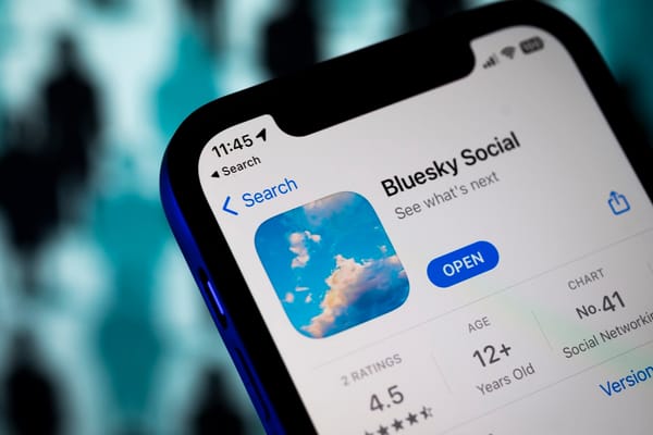
Enter Bluesky: the decentralised social network positioned as Twitter’s thoughtful, community-driven rival.
Here’s why designers might find Bluesky a more promising canvas for their craft.
No Algorithm, No Noise
Twitter’s algorithm is notorious for prioritising trending content over niche communities, but the issue runs deeper than that.
New accounts are often bombarded with an overwhelming flood of right-wing content, regardless of the user’s actual interests or preferences.
By default, Elon Musk’s tweets dominate timelines, making it impossible to avoid his commentary unless you actively take steps to block or mute him.
This setup is further amplified by a sycophantic slurry of blue-ticked accounts, many of whom seem to exist solely to parrot Musk’s every whim.
For those trying to carve out a space for genuine interests or creative pursuits, this noise can be unbearable.
Tailoring an account to your tastes takes an exhausting amount of effort, as the algorithm continues to push unrelated content at you in the meantime.
What was once a place for connection now feels like a battle to create a feed that doesn’t feel alienating or chaotic.
Bluesky, in contrast, focuses on decentralisation and customisation. Want Bluesky to serve you content you like?
Simply start following people and liking posts to get content that's best matched to your interests.
It's wonderfully simple. You see what you want, unfiltered. How refreshing!
Designers can connect directly with their audience without competing with viral memes or divisive debates.
Community-First Approach
Unlike Twitter’s corporate-driven decisions, Bluesky fosters a community-first ethos.
For designers, this creates a space to share work, give feedback, and build networks without worrying about brand interference or relentless ad targeting.
Even better, there’s no need to pander to an algorithm.
On Bluesky, your posts aren’t judged by how many clicks or likes they can generate; they’re simply shared with your community as you intended.
You’re not wading through a sea of engagement bait or forced to “hack” your way to visibility. It’s a breath of fresh air for anyone tired of crafting content to appease metrics rather than creating for genuine connection and expression.
Better for Discoverability
On Bluesky, posts don’t get buried under trending topics or influencer noise.
The network's focus on chronological order and decentralisation ensures your designs are seen by those who value your work.
When I first joined Bluesky, I wasn’t expecting much.
I created my account - mostly hedging my bets incase others came to Bluesky - posted a quick introduction along with a piece of recent work, and figured it’d take time to build any traction.
To my surprise, within minutes, I had a handful of likes and even a couple of new followers.
It wasn’t a viral explosion, but it felt authentic—like real people genuinely interested in what I was sharing.
The lack of trending topics or influencer noise meant my post actually reached the people it was meant for.
That kind of immediate, meaningful engagement is something I hadn’t experienced on Twitter in years. Even with some 30,000 followers on Twitter, when it came down to it, I only cared about likes from people I considered friends.
A Fresh Start
Let’s be honest—Twitter can feel oversaturated. Bluesky offers a fresh canvas to redefine your presence.
It’s an opportunity to be an early adopter and set the tone for a design-forward community.
What makes it even better is that it genuinely feels like the team behind Bluesky is listening to its users—not to maximise profit margins, but to build a platform that truly benefits the community.
Updates and tweaks seem to come from thoughtful feedback, not corporate agendas, creating a space where users feel valued and heard.
It’s a refreshing change that gives you hope for what social media can be.
Creative Control
Bluesky's decentralised protocol allows users to tweak their experience, which is a massive win for anyone tired of the one-size-fits-all approach of traditional social platforms.
Instead of being locked into an algorithm that dictates what you see, Bluesky lets you shape your feed to suit your needs and interests.
Want a timeline that’s purely chronological? You can have it.
Prefer to filter out certain types of content or curate your own niche community? Go ahead.
This level of personalisation empowers users to take control, creating an experience that feels tailor-made rather than dictated by ad revenue strategies.
For designers, this is a game-changer. You’re not at the mercy of an algorithm burying your work beneath unrelated content.
Instead, your posts have a real shot at reaching the right audience—people who genuinely appreciate your craft.
It’s social media, but on your terms, making the platform feel more like a community and less like a chaotic, profit-driven machine.
While it’s still in development, the promise of customisation could make it a dream platform for designers to shape their community interactions.
While Bluesky isn’t perfect—still invite-only and building out features—it’s already proving to be a haven for those tired of Twitter’s chaos.
For designers, it offers a chance to reclaim social media as a place for genuine connection and creativity.
Ready to jump in?
Now’s the time to explore a platform that prioritises users, not algorithms.


