WHSmith's Rebrand: A Closer Look at the Trial, Challenges, and the Path Forward
Word on the street has it that the half-arsed attempt at rebranding is a bit shite

Update: According to The Drum, WH Smith has no intentions of moving forward with this rebrand.
Do you recall the time Twitter and LinkedIn were abuzz with messages from branding agencies and graphic designers due to Nationwide's visual identity change?
I was quite critical at the time, arguing that their new look made it look like every other challenger bank in existence, but now, WH Smith has ventured into the foray with some seriously lacklustre work.
I don't take back what I said about Nationwide's new look, but there's no doubt it was a rebrand with a purpose and clear vision.
WH Smith's efforts? Less so.
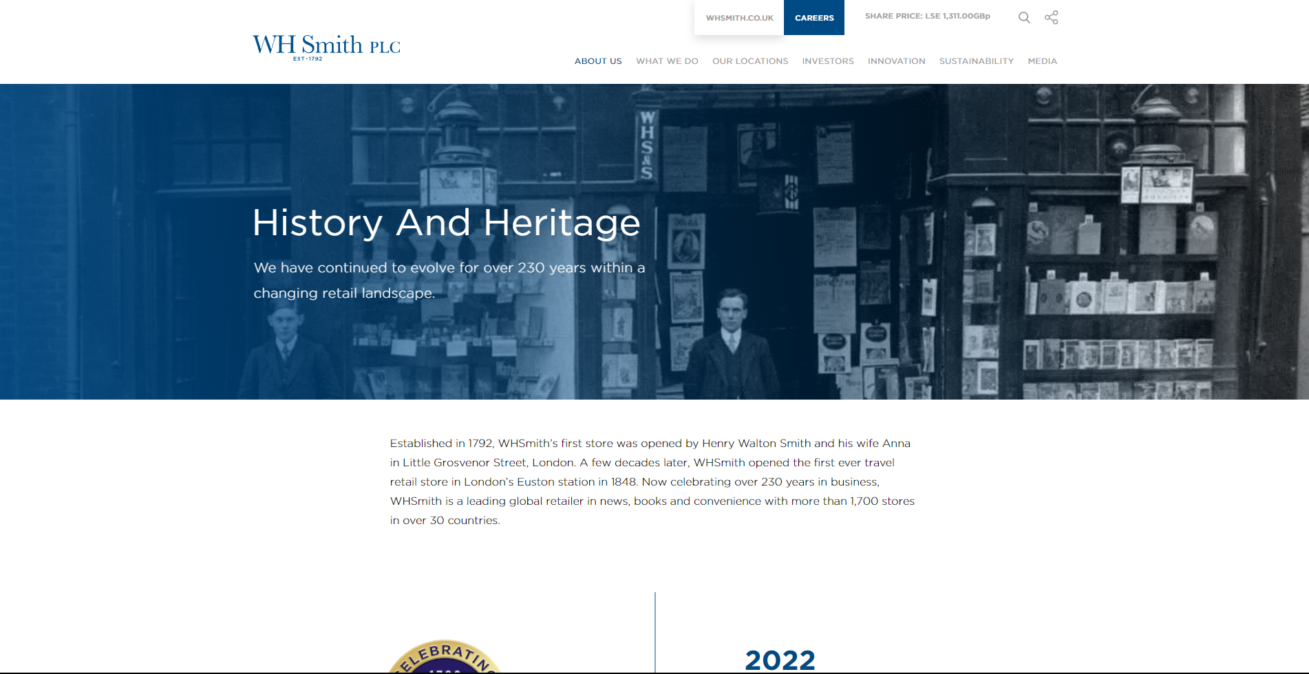
You see, it's more of a trial run. They're experimenting with a localised approach and showcasing some new products.
It might seem like a clever move.
Test-driving a new brand identity allows them to gather customer feedback, measure responses, and keep the initial investment low while minimising risks.
This is good because we need to talk about that logo, one that has unfavourably been compared to our beloved NHS.
No beating around the bush – it's bland, meaningless, and dull.

Devoid of life, cheap and, well, a hint that WH Smith might not be long for the Highstreet in the UK. Whether or not they'll continue to charge £6 for sandwiches in UK airports is another matter.
So you might be sensing that I'm suggesting the logo isn't the real issue here.
This whole experiment perfectly highlights the major problem with WHSmith – it's lacking a clear identity and strategy.
The company seems to be lost, without confidence in its brand decisions. Ask ten people what the store is all about, and you'll likely get ten different answers.
It lacks a defining feature, a unique selling point, and a compelling story. Can you even name five direct competitors?
It's tough.
Is This the End of the Road?
It's a bit disheartening.
The brand is 225 years old and a staple of the British high street, after all. But in times like this, you either evolve or die.
When you have management teams trying everything to survive in a super competitive space, they'll inevitably make decisions that resonate like a fart in a packed elevator.

WHSmith finds itself stuck in the middle ground of mediocrity, just floating. A bit like that fart in a packed elevator.
Right now, WHSmith seems to be struggling with answers to core branding questions.
- What values and principles define your company?
- What sets your brand apart from competitors?
- Who is your ideal customer or target audience?
- How do you want your audience to perceive your brand?
- Are there any specific milestones or achievements that should be highlighted in the branding?
I suspect they simply don't know the answer to these questions, and many more that would be asked of them in an initial discovery meeting.
They lack the confidence to make a significant change, resorting to testing the waters with a bland brand. They're throwing ideas at the wall, hoping something sticks.
The path forward?
Unless they muster up more bravery and boldness, I fear this approach won't work. The problem isn't just the logo – it's the whole strategy.
Until they face that head-on, I can't see a bright future for them on the high street.
I hope they prove me wrong.


