
Web Design for Rebels: Is Neo-Brutalism on the Rise?
For web designers seeking an anti-establishment aesthetic while being part of the establishment
Conventions were made to be broken, and in web design, few styles shatter traditions quite like neo-brutalism.
Born from the bold, unadorned architecture of 1950s Britain, brutalism embraced raw concrete (béton brut) and industrial aesthetics that gleefully defied decorative norms.
With architecture, think Barbican, Boston City Hall and Balfron Tower.

The origins of this uncompromising look can be traced back to pioneering visionaries like Peter and Alison Smithson.
Their revolutionary use of exposed, heavy-duty materials and unusual shapes was the architectural middle finger to the fussiness of previous eras.
Rugged Roots, Digital Uprising
Just as brutalism disrupted the built world, its online cousin neobrutalism is staging an insurrection against the overworked embellishments plaguing contemporary websites.
Embracing rough, unfinished textures and hard-edged shapes, it taps into the anti-establishment attitude and aesthetic sensibilities of the counterculture internet that existed in the 90s.
But don't mistake this as some Johnny-come-lately trend.
While the mainstream has caught on over the past year or so, design outliers like The Designers Republic were serving up prime neo-brutalist cuts way ahead of the curve.

The Sheffield-based 90s design powerhouse understood the raw power of stark, industrial-grade sites long before went mainstream. Their most famous work on the game Wipeout could be said to be a combination of futurism with elements of neo-brutalism.
 Chris Kernaghan
A Study in Stunning Simplicity
So what exactly defines this defiant style?
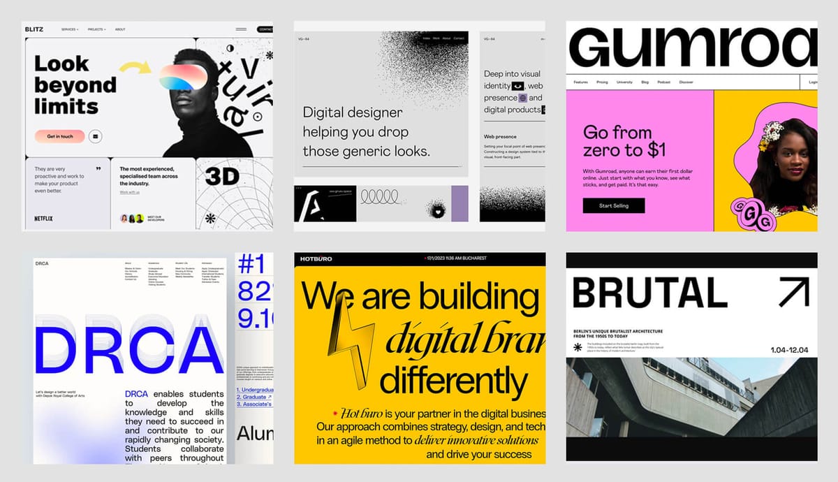
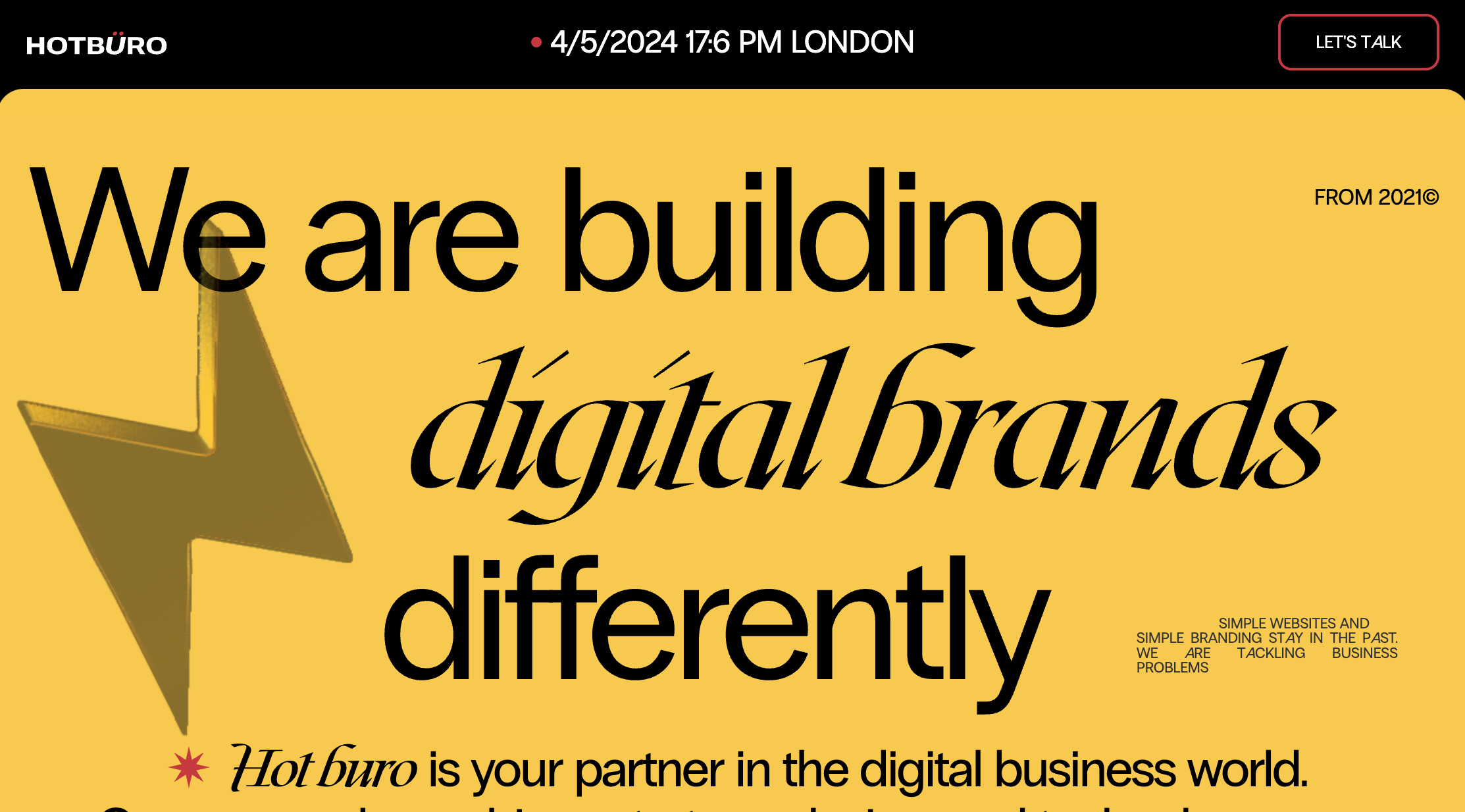
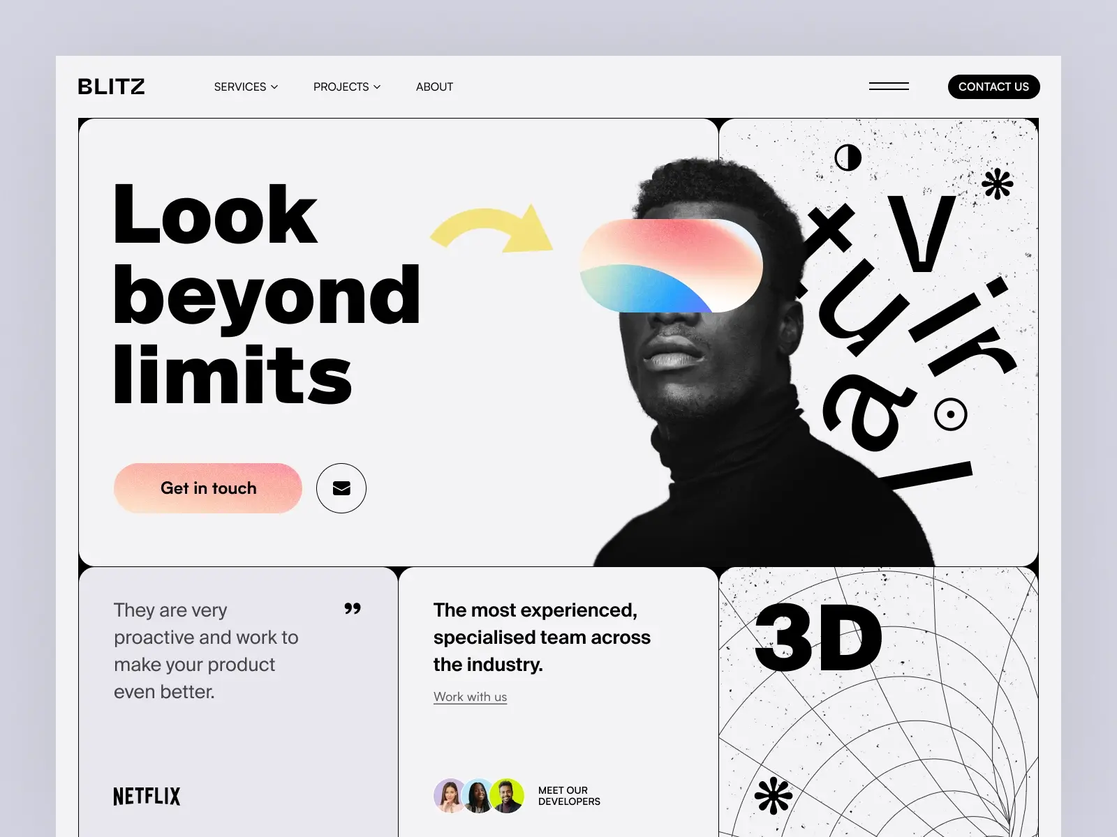
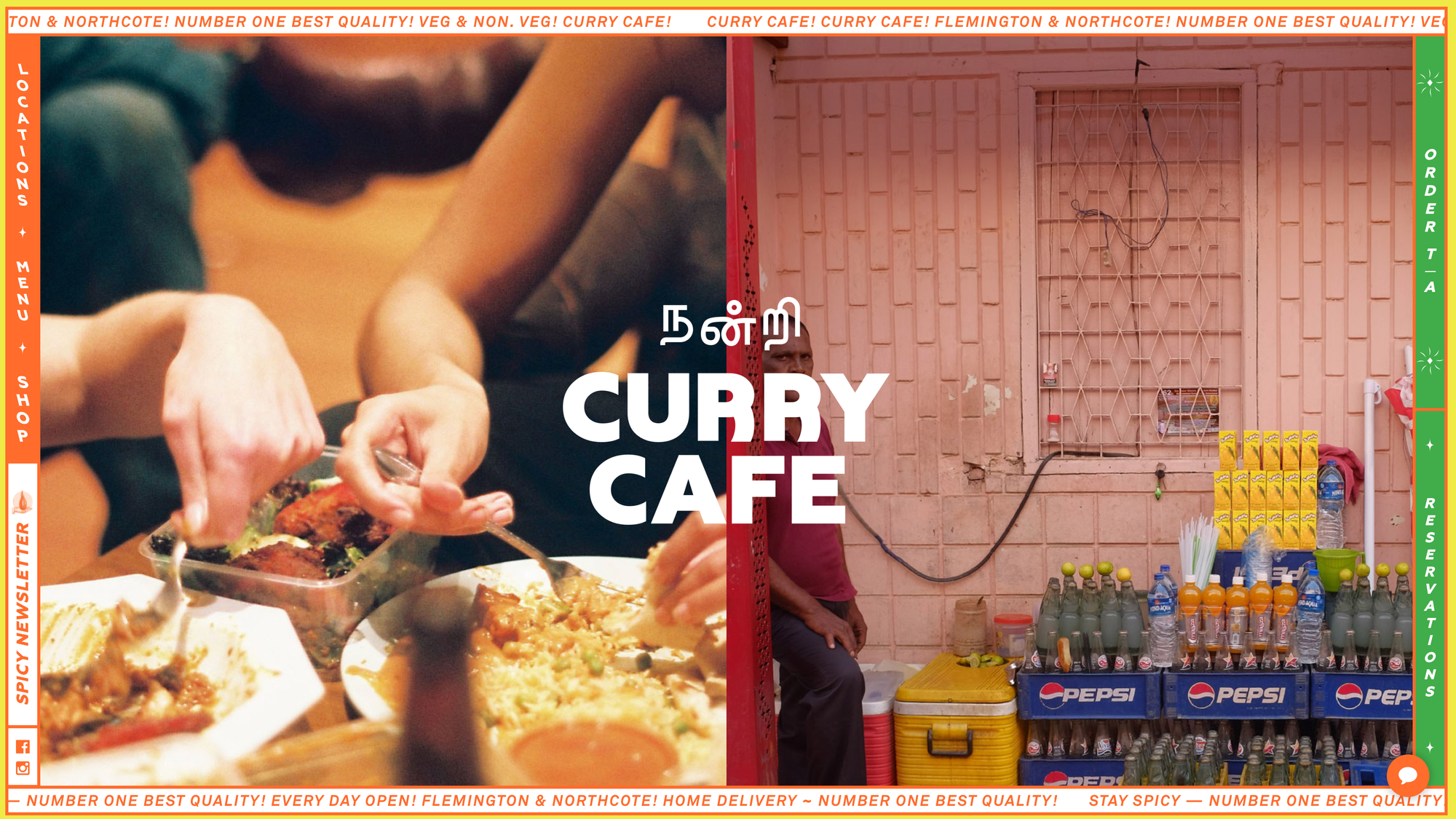
Well, rather than muted earthy tones seen in brutalist architecture, the colour palette within neo-brutalism is unabashedly vibrant and brash - think eye-searing neons, deeply saturated hues, and clashing bright colours that command attention.
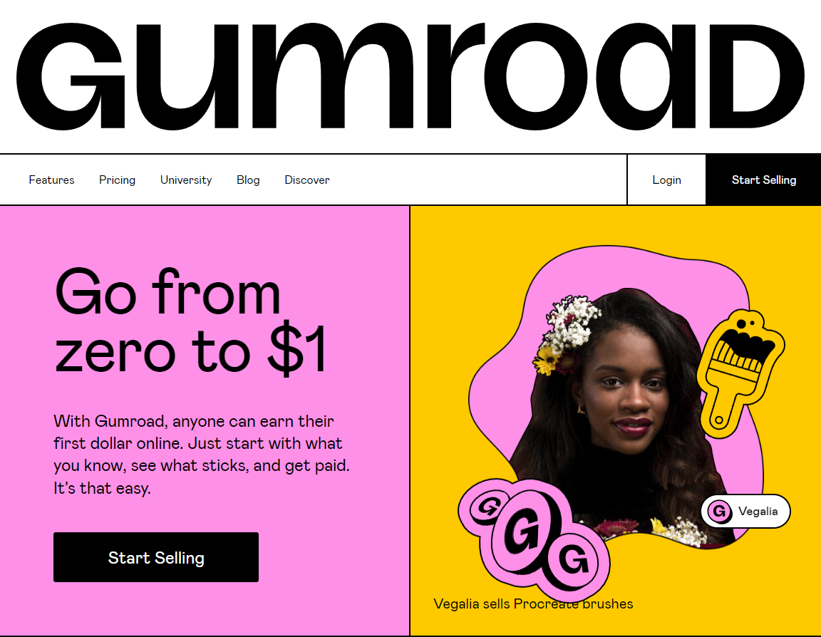
Typography is an exercise in restrained power, utilising thick, monolithic sans-serifs or slabbed letterforms with serious impact. These in-your-face fonts cut through digital noise like a lyrical sledgehammer.
And layout? Balance and symmetry need not apply. Neo-brutalism revels in bold asymmetry, with oversized elements, ample negative space, and an overall sense of imposing heft rarely found online.
But make no mistake—this isn't some contrarian style merely for poseurs and Edge Lords. Beneath its defiantly rugged exterior, neo-brutalism serves a higher calling: stripping back interfaces to their raw, highly functional essence.
On the surface, neo-brutalism adheres to the core web design tenets - obvious hierarchy, a clear call to action, and big, bold, legible typography. And yet, this seemingly straightforward approach exudes an unmistakably Gen Z outlook and attitude.
Design-Z
With its vibrant colour clashes, assertive asymmetry, and uncompromising lack of embellishment, neo-brutalism has become the defiant design voice for a generation raised in the digital age.
It's the perfect edgy aesthetic for brands catering to young, anti-establishment audiences.
Imagine the pulsating energy of a music streaming app, the in-your-face visuals for the latest must-play video game, or the bold, no-nonsense presence of a popular artist's website - all channelling the raw, unfiltered spirit of neo-brutalist design.
However, this youthful style may not be an ideal match for more traditional, high-stakes online experiences like banking portals or healthcare sites, where a softer, more reassuring approach is often preferred.
But for those brands daring enough to embrace neo-brutalism's visceral, authentically Gen Z energy, the rewards are a deeper connection with a demographic that demands their digital experiences be as uncompromising as their attitudes toward life.
By rejecting the bloat plaguing so many contemporary sites, this design uprising prioritises the clear communication of information above all else.

While its unvarnished aesthetics may seem uncompromising, that brutal simplicity ensures unfettered usability for every user. So for those seeking a little more grit and authenticity in their online experiences, neo-brutalism offers a tantalising path forward.
Whether you're a rebel brand craving an anti-establishment edge or a forward-thinking designer hungry to upend conventions, this architectural-inspired uprising is a brutally beautiful reminder that the best designs often emerge from shattering the rules.
So, is neo-brutalism on the rise? No more so than any other trend right now. It's fun, it's vibrant and it can be a welcomed surprise. But like any other design trend, it shouldn't overstay its welcome.
Remember, design trends come and go, but good design is forever.

Comments ()