UX Priming: Subtle Cues with Big Impact
UX priming subtly guides users’ perceptions and actions through subconscious cues, enhancing intuitive interactions and decisions

Priming, a psychological phenomenon, has quietly become one of the most effective tools in UX design.
Essentially, it involves the subconscious activation of ideas and mental representations that influence our actions, often without us even realising it.
By subtly guiding users through these mental nudges, UX designers can create experiences that feel seamless, intuitive, and deeply engaging.

Let’s break it down: priming works by exposing someone to a stimulus that influences how they perceive and react to future, potentially unrelated tasks.
In the context of UX design, this means that visual elements, colours, phrases, or even sounds can gently steer users towards desired actions.
But here’s the catch: users won’t even realise it’s happening.
What is UX Priming, Really?
At its core, priming is about shortcuts—psychological shortcuts, to be specific.
It happens when one thing you encounter (a prime) subtly changes how you respond to something else (the target).
It’s that moment when a seemingly innocuous word or image triggers an association in your mind that leads you to make decisions faster or more intuitively.
Take, for example, a travel booking site that uses lush images of tropical beaches.

The intention behind these images goes beyond aesthetics. Those sunny, relaxing beaches serve as a prime, subtly planting the idea of a carefree vacation in your mind.
As you scroll through the site, subconsciously guided by these cues, you might find yourself more inclined to book that spontaneous trip. The beach imagery has primed you to associate the site with relaxation and escape.
In essence, your decision-making has been nudged in a particular direction.
How Priming Enhances UX
Priming can be a powerful tool in UX design because it aligns with how humans naturally process information.
Designers can use priming to create more fluid experiences by reducing cognitive load, and the amount of mental effort required to use a product.
When the brain doesn’t have to work as hard to figure out what’s going on, the user feels more at ease and engaged.
Take a simple example of filling out a form.
If a site presents you with a clean, streamlined form paired with phrases like “quick” and “effortless,” your mind is primed to believe that the process will be easy, and your attitude towards completing the form shifts accordingly.

You’re more likely to finish the task with less frustration, not because the form is inherently better but because the suggestion that it’s easy has already prepared your mind to accept that narrative.
The beauty of priming lies in its subtlety. It’s not about loud, flashing banners or aggressive pop-ups.
It’s the gentle hint of a familiar word, a soft colour scheme that evokes calm, or the way certain icons resemble actions you’ve done before.
These small design choices activate associations in our minds, making us more comfortable, confident, or even excited to move forward.
The Science Behind Priming: Why It Works
Let’s experiment: imagine you read the sentence, “The coffee shop was filled with the rich aroma of freshly brewed coffee.”
Now, fill in the blanks to form a word: C _ P.
Chances are, the word you thought of was “cup.” Why?
Because your brain made an automatic connection between coffee and cup—two closely linked concepts that often appear together in everyday life.
This is the crux of priming.
It’s not random; it’s built on deeply ingrained associations we’ve formed over time. Cognitive science shows that once we’re exposed to a stimulus—be it a word, image, or sound—it triggers a chain reaction in our brain, bringing related concepts to the surface.
When it’s time to make decisions, those connections heavily influence our choices.
The same effect happens after watching a horror movie late at night. Every creak or shadow feels more ominous because your brain has been primed to expect danger.
In UX, this principle applies directly: primes establish the tone for how users perceive and interact with content.
Priming: A Double-Edged Sword?
Let’s be real—priming is powerful, and like any tool, it can be used both effectively and irresponsibly.
When employed correctly, it can lead to smoother, more intuitive user journeys.
However, when priming is used manipulatively, it risks leading users to decisions they might not have made if they weren’t being subtly pushed.
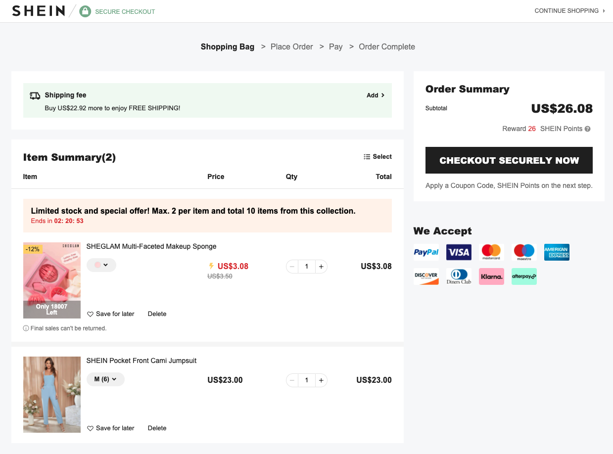
Imagine a shopping site that primes users with phrases like “limited time only” or “hurry, before it’s gone.”

While this creates urgency and can drive conversions, it’s important to ask: are we enhancing the user experience or simply manipulating their anxiety?
As UX designers, we have to walk a fine line. It’s essential to use priming to reduce friction, create positive associations, and foster trust—not to exploit users’ emotional responses.
Priming shouldn’t trick users into decisions; it should make decision-making feel effortless and aligned with their genuine desires.
The Future of UX Priming
Priming is here to stay.
As we continue to explore the psychology behind design, priming will undoubtedly play a more significant role in creating seamless, delightful experiences. However, its success lies in its subtlety.
The best priming is invisible—an unspoken guide that gently steers users in the right direction without them feeling directed.
In the end, UX design is about understanding the human mind. By embracing priming, designers have the opportunity to craft experiences that feel natural, intuitive, and ultimately more satisfying for users.
Done right, it’s not just good design—it’s a masterclass in human psychology.


