Here's what's shaping UX design in 2025:
- AI-driven personalisation
- Voice and gesture controls
- Augmented Reality (AR) integration
- Simple designs with large text
- Enhanced dark mode
- Micro-interactions and animations
- Biometric logins
- Eco-friendly design choices
- 3D elements
- Inclusive design for all users
Key takeaways:
- AI and AR are revolutionising user experiences
- Simplicity and accessibility are paramount
- Sustainability is becoming a design priority
- New interaction methods are emerging
Quick Comparison:
| Trend | Key Benefit | Challenge |
|---|---|---|
| AI Personalisation | Tailored user experiences | Data privacy concerns |
| Voice Controls | Hands-free interaction | Public use awkwardness |
| AR Integration | Enhanced real-world interaction | Battery life issues |
| Simple Designs | Improved readability | Balancing simplicity with functionality |
| Dark Mode | Reduced eye strain | Consistent implementation across apps |
| Micro-interactions | Improved user feedback | Avoiding overuse |
| Biometric Logins | Enhanced security | Data theft risks |
| Eco-friendly Design | Reduced digital carbon footprint | Performance trade-offs |
| 3D Elements | Engaging visual experiences | Potential for slower load times |
| Inclusive Design | Accessibility for all users | Balancing diverse needs |
These trends are shaping a more intuitive, personalised, and accessible digital landscape. Designers must balance innovation with usability to create effective UX in 2025 and beyond.
UX Design in 2025
UX design is set for a major shakeup by 2025. New tech and shifting user needs are driving big changes.
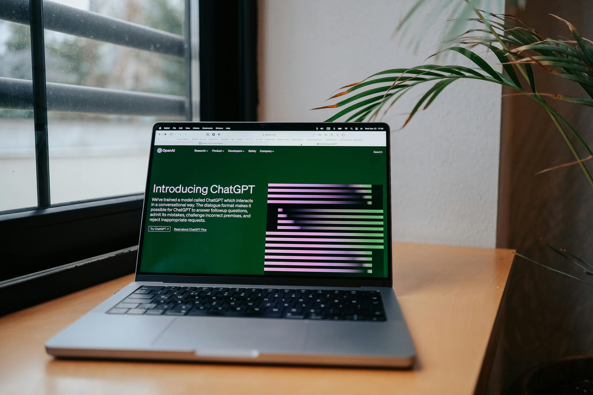
AI is the biggest disruptor. It's already boosting designer productivity.
By 2025, AI will:
- Craft personalised user experiences
- Automate design tasks
- Enhance user research and testing
This shift is happening NOW. 92.1% of businesses already see AI benefits, with 35% actively using it.
But AI isn't the only player.
Other key trends:
Voice and gesture controls: Touchless interaction is growing. The voice UI market could hit $29.02 billion by 2027.
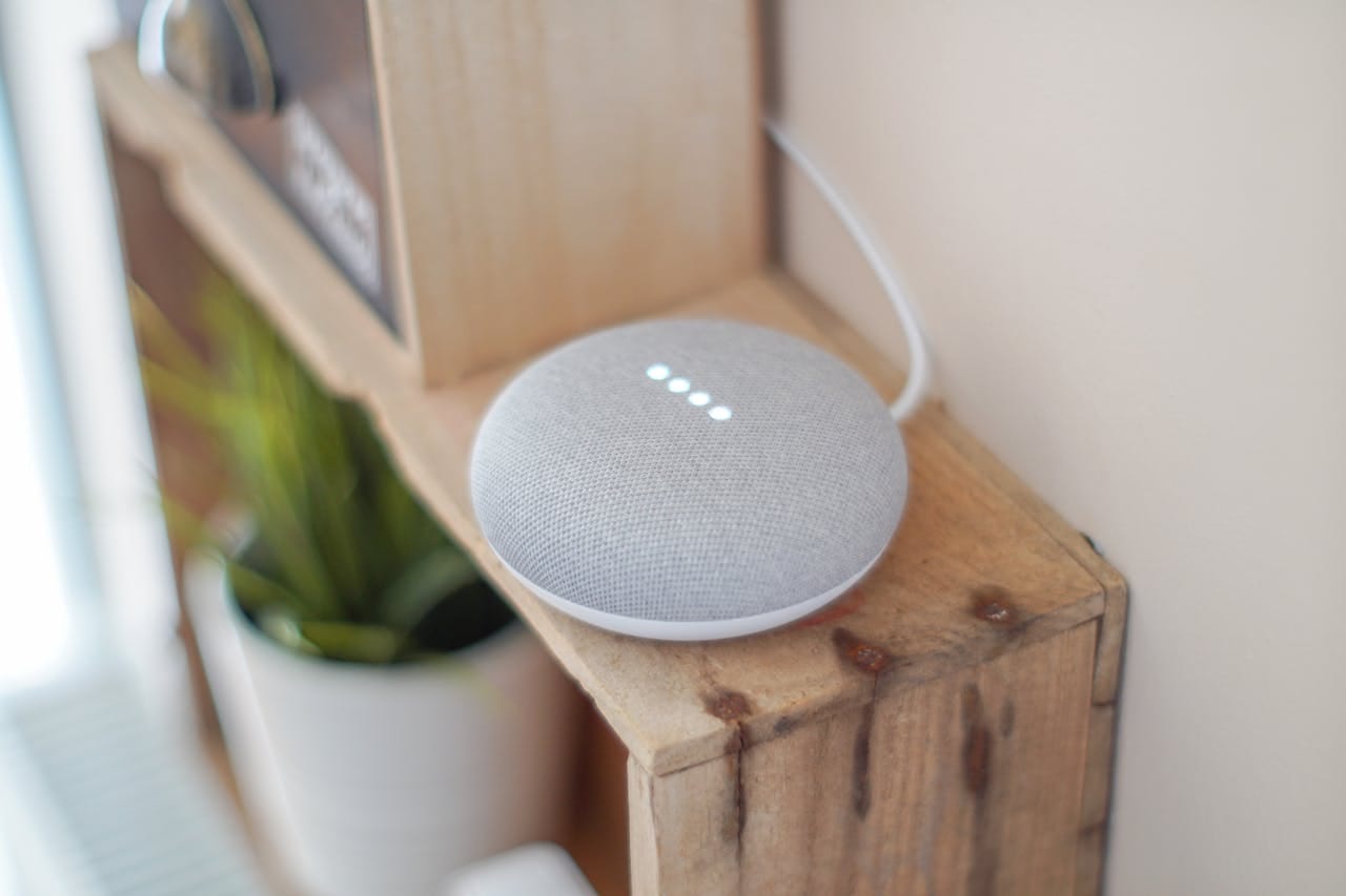
AR and VR: Blending digital and physical worlds. VR market alone? Potentially $20.9 billion by 2025.
Ecosystem design: Social, economic, and tech trends all shape what people want and expect from products and services. Essentially, balancing user needs with environmental impact.
For UX designers, this means:
- Constant upskilling
- Data-driven design decisions
- Focus on accessibility and inclusion
- Considering AI ethics
Companies are jumping on board.
Meta's Horizon Workrooms shows VR's potential for remote work. Spotify's AI-powered Discover Weekly playlist? That's adaptive design in action.
The winning strategy? Stay flexible. Adapt fast. Embrace change.
1. AI for Personal User Experiences
AI is shaking up how we interact with websites and apps in 2025.
It's not a one-size-fits-all world anymore. AI watches what you do and like, then tweaks the design just for you. Creepy? Maybe for a few, but for most, the tipping point is long past.

Here's the scoop on AI-powered personalisation:
- Smart content: AI picks stuff you might like based on your history.
- Custom layouts: Pages change based on how you use them. Love images? You'll see more.
- Tailored recommendations: AI suggests things that match your interests.
- Personal touch: Sites greet you by name and remember what you like.
- Adaptive interfaces: Buttons and menus adjust to your habits.
This personal touch?
It's a big deal. A McKinsey study found that 71% of people EXPECT personalised experiences. When they don't get them, 76% get frustrated.
Some companies are already crushing it with AI:
| Company | AI Use | What Happened |
|---|---|---|
| BSH Group | Personal customer journeys | Conversions up 106% |
| Spotify | AI playlists | Users more engaged |
| Netflix | Personal movie picks | People stuck around |
"AI could flip UX design on its head, giving users personalisation beyond our wildest dreams." - McKinsey report
2. Voice Controls
In 2025, voice controls are reshaping our device interactions. Forget tapping and swiping - now we just talk.
Voice User Interfaces (VUIs) have evolved. They're smarter and more user-friendly, thanks to AI and improved language processing. We're seeing them everywhere:
- Smart speakers (Amazon Echo, Google Home)
- Smartphones (Siri, Google Assistant)
- Cars with voice commands
- Smart TVs
Why the shift? It's natural and often faster than typing. Plus, it's hands-free.
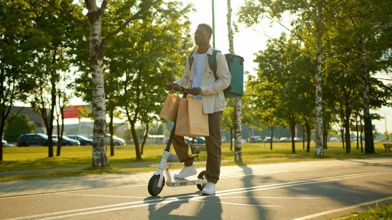
But it's not just convenience. Voice controls are a game-changer for accessibility, helping those with mobility issues or visual impairments.
Here's the 2025 voice landscape:
| Trend | Impact |
|---|---|
| Device expansion | Voice in appliances, cars, etc. |
| Improved accuracy | Fewer command errors |
| Personalisation | VUIs learning your voice and habits |
| Language support | More languages and accents |
Companies are on board:
"Order my usual from Domino's", and your pizza's on its way.
Starbucks: Start your usual order by asking your voice assistant.
But it's not all smooth sailing:
- 62% feel awkward using voice commands in public
- Privacy concerns with always-listening devices
- Challenges in noisy environments
Designers are tackling these issues, aiming for more natural and secure voice interactions.
For UX designers, voice is a new frontier. It's about what users hear and say, not just see. This means:
- Creating clear, conversational dialogues
- Handling errors gracefully
- Considering context and environment
As we approach 2025, voice is becoming crucial in UX design. It's not replacing screens, but it's changing how we interact with our digital world.
3. Augmented Reality in Design
AR is shaking up digital product interactions in 2025. It's mixing virtual stuff with our real world, giving us new ways to experience info and services.
AR in UX design works in four main areas:
| Space | What It Is | Example |
|---|---|---|
| Intimate | Just you | Face filters |
| Personal | Stuff nearby | AR board games |
| Social | You and others | Multiplayer games |
| Public | Location-based | Giant AR building art |
Designing for AR? It's a whole new ball game:
- Think about where people are using it
- Help users move around with on-screen hints
- Make it easy to start using
- Mix old-school layouts with AR features
AR's not just for fun. It's changing how we work:
IKEA's app lets you see how that couch looks in your living room before you buy it.
DHL uses AR to show workers where to put stuff in warehouses. It's making things run smoother.
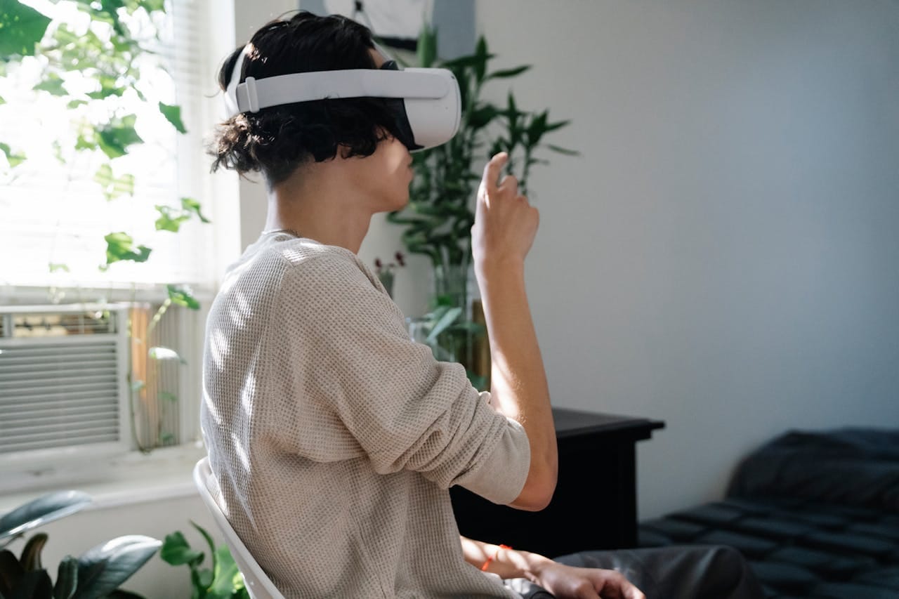
By 2025, we'll have over 1 billion AR devices out there, mostly phones. That means new headaches for UX designers:
- Battery life (these things eat power)
- Dealing with bright sun or dark rooms
- People using AR standing up, sitting down, or lying in bed
Want to nail AR design? Here's the deal:
1. Know what devices can (and can't) do
2. Think about how people use AR in real life
3. Test, test, and test some more
4. Make sure AR actually makes things better, not just flashy
As AR becomes part of everyday life, we need to create experiences that feel real and fit right in with how we live.
4. Simple Designs with Big Text
In 2025, UX designers are going all-in on simplicity. How? By using big text and stripping away the fluff.
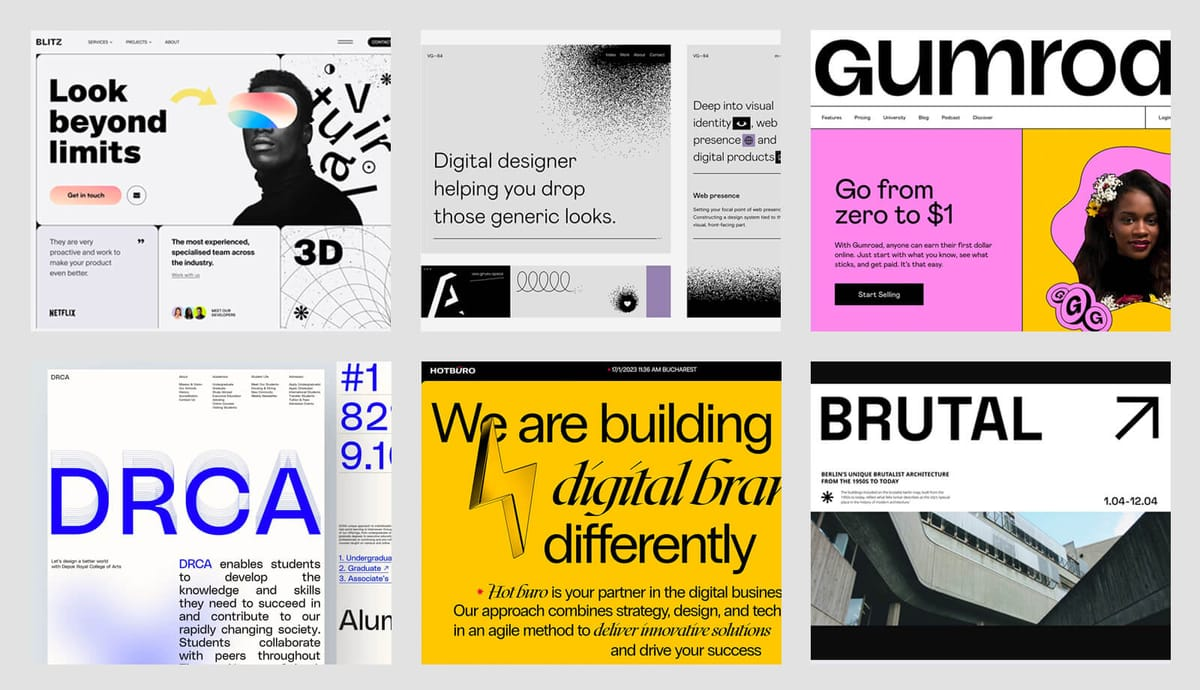
Here's what it looks like:
- Huge, bold letters for titles
- Lots of white space
- Bare-bones UI
Why bother? It's not just about looking cool:
| Benefit | What It Means |
|---|---|
| Easy to read | Big fonts = happy eyes, especially on phones |
| Faster sites | Less stuff = quicker loading |
| Find stuff fast | Clean layouts help users spot what they need |
| Less brain drain | Simple designs are a breeze to use |
Want to nail this trend? Here's how:
1. Pick fonts that look good on any screen
2. Use responsive text (at least two size changes)
3. Tweak letter spacing for those big headlines
4. Keep titles short and punchy
Real designers are already on board:
"Connor Murphy's portfolio has a main title at 176 pixels. It's fluid, so it looks great everywhere." - Matej Latin, UX designer
InVision's doing it too. Their Careers page rocks a 156-pixel title. BAM!
Need font ideas? Try Montserrat, Open Sans, or Helvetica Neue. They're clean, modern, and come in different weights.
5. Better Dark Mode
Dark mode is getting a major upgrade in 2025. It's not just about inverting colors anymore.
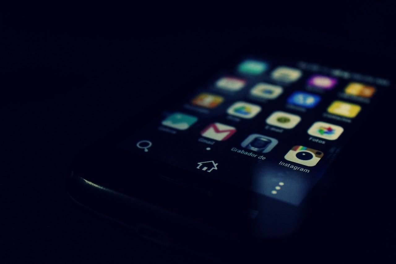
Here's what's changing:
1. Smarter contrast
Designers are ditching pure black backgrounds. Instead, they're using dark greys (like #121212) to reduce eye strain.
2. Custom color palettes
Apps are now adjusting their entire look for dark mode, not just flipping colours.
3. Auto-switching
Your device switches to dark mode based on the time of day or ambient light.
4. Improved readability
Fonts and spacing are tweaked for better reading in low light.
Here's how top apps are nailing dark mode:
| App | Dark Mode Feature |
|---|---|
| Slack | Dark gray background with custom color accents |
| YouTube | Enhanced video thumbnails against dark background |
| Multiple dark themes for user preference |
Why the dark mode hype? Thomas Steiner, a Google engineer, found that 82.7% of their dev team used dark mode at work. It's easier on the eyes.
"Dark mode isn't just a trend. It's about making digital spaces more comfortable for extended use", says Akshay Kothari, CPO at Notion.
Want to nail dark mode in your designs? Here's how:
- Test on different screens (OLED vs LCD)
- Use off-white text instead of pure white
- Adjust your entire colour scheme, not just the background
- Let users switch between modes
6. Small Movements in Design
Tiny animations are making waves in 2025. These micro-interactions are changing how we use digital products.
What's the deal with micro-interactions? They're quick moments when you interact with a digital product. Think:
- Buttons changing colour when you hover
- Menus that bounce
- Progress bars
- Fun animations when you finish a task
Why should you care? They make users happier by:
- Giving instant feedback
- Helping users navigate
- Making things more fun
The Nielsen Norman Group says good micro-interactions can boost user satisfaction by 20%. Not bad, right?
Want to use them well? Here's how:
- Keep 'em quick (300-500 milliseconds)
- Match your brand
- Use natural movement
- Give clear feedback
Real companies are already on it:
| Company | What They Did | Result |
|---|---|---|
| Animated "Like" button with emojis | More engagement | |
| Mailchimp | High-five after sending a campaign | Added personality |
| Etsy | Bouncy add-to-cart button | Clear visual confirmation |
Some tips:
- Focus on function first, then add fun
- Use micro-interactions to highlight important stuff
- Don't go overboard with animations
"Subtle, quick UI animations can improve user experience. They communicate changes, prevent confusion, and reinforce visual cues."
Remember: small movements, big impact.
7. Using Body Features to Log In
In 2025, your body is your password. Face and fingerprints are replacing traditional logins.
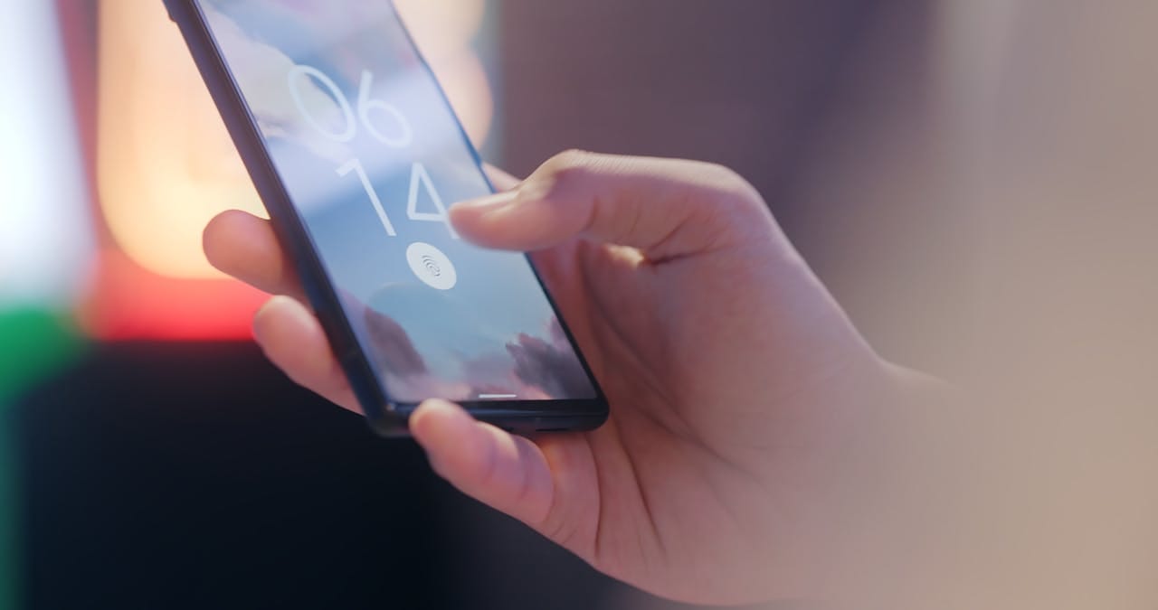
Why? It's simpler and more secure. Here's the breakdown:
Fingerprints: Already on your phone, now used for cars and shopping.
Face scans: Like Face ID, but better. Works with masks. Banks love it.
Iris scans: Uses light to check eye patterns. Super accurate - 1 in 10 million error rate.
Big players in the game:
| Company | Tech | Impact |
|---|---|---|
| J.P. Morgan | Palm scans for payments | Faster checkouts, less fraud |
| Amazon | Palm scans in stores | Cashless, cardless shopping |
| Apple | Face ID on iPhones | 1 in 1,000,000 false unlock rate |
But it's not perfect:
- Data theft risks: Can't change your face or fingerprints
- Tech glitches: Rare, but they happen
- Privacy concerns: Some people don't like sharing body data
For businesses considering this tech:
- Combine methods (e.g., face scan + PIN)
- Encrypt and secure body data
- Offer alternatives for user choice
8. Eco-Friendly Design Choices
UX designers are going green in 2025. Here's the scoop:
Energy-smart designs: Apps and websites are slimming down. Google's AMP project is showing how it's done - faster pages that sip power.
Keep it simple: Clean designs aren't just eye candy. They're eco-warriors too. Less data, faster loading. Microsoft's making new Windows work on old PCs. Less junk in landfills.
Green hosting: Companies are plugging into clean energy servers. WWF's website? 100% renewable. No fossil fuels invited to that party.
User know-how: Apps are now your eco-coach. Acorns doesn't just help you invest - it teaches you to put your money where the planet is.
Dark mode takeover: It's not just for night owls anymore. Dark designs save juice on OLED screens. By 2025, expect apps to embrace their dark side.
Big tech's green moves:
| Company | Green UX Move | What It Does |
|---|---|---|
| AMP Project | Speeds up web, cuts energy | |
| Microsoft | Old PC compatibility | Keeps devices alive longer |
| WWF | Clean energy hosting | Website runs on sunshine |
| Acorns | Green investing lessons | Makes money talk environment |
These changes aren't just good for the planet - they're making our digital world faster, smoother, and easier on the eyes. It's a win-win for users and Mother Earth.
9. 3D Elements in Design
3D elements are shaking up UX design for 2025. They're not just pretty - they're changing how we use apps and websites.
Why 3D? It adds depth and makes designs pop. Users can now interact with digital objects in new ways.
Here's what's happening:
- Product showcases: E-commerce is going 3D. Spin products, zoom in, see every angle.
- Interactive menus: Stripe's website uses 3D menus. It's an experience, not just a list.
- Immersive storytelling: Campo Alle Comete's site takes you through a 3D floating city to tell their wine's story.
- Data visualisation: 3D graphs make complex info easier to grasp.
Real-world examples:
| Company | 3D Feature | Impact |
|---|---|---|
| Samsung | 3D phone model | See Galaxy Z Fold from all angles |
| Dasher & Crank | 3D ice cream sandwiches | Products pop on pink background |
| TAG Heuer | 3D watch displays | Boosts luxury brand feel |
But it's not all smooth sailing. 3D can slow down websites if not done right. Designers need to balance looks with speed.
"3D web design has a ton of practical applications." - Bianca Belman-Adams, Elementor
The key? Use 3D wisely. It should help users, not confuse them. When done right, 3D can turn a flat design into an adventure.
10. Designs for Everyone
In 2025, UX design will be all about making digital products work for everyone. It's not just adding a few features for people with disabilities. It's about creating designs that work well for all users, period.
Here's what's happening:
Big tech is leading the charge. Apple's VoiceOver and AssistiveTouch help users with vision and mobility issues. Google's Android has TalkBack for spoken feedback. Microsoft Windows includes a narrator and Eye Control.
But it's not just tech. Mastercard's new credit cards have notches on the side. Users can tell which card they're using by touch. Olay and Degree have introduced products with easy-open lids and better grips.
Digital accessibility is key. Intercom Messenger follows WCAG 2.0 guidelines. It works with screen readers and keyboard navigation. Salesforce products meet WCAG 2.1 standards with clear page titles and logical layouts.
Why does this matter? About 15% of people worldwide have some form of disability. But good design helps everyone. Larger text and clear navigation make apps easier to use for older folks too.
What should designers do? Test with diverse users. Follow accessibility guidelines. Use clear colours and simple language. Add features like keyboard shortcuts and voice commands.
"Inclusive Design is a methodology, born out of digital environments, that enables and draws on the full range of human diversity." - Microsoft
Designing for everyone isn't just nice to have. It's a must-have. It's about making products that work for all users, no matter their abilities or background. That's the future of UX design.
Using New UX Design Trends
Adding new UX trends can be tricky. You want to be current, but also keep things simple for users. Here's how to do it right:
Nail the basics first
Before adding trends, make sure your design works well:
- Clear navigation
- Fast loading
- Easy-to-read text
- Clean layouts
Pick trends that help users
Don't add features just because they're cool. Choose trends that improve the user experience:
- AI personalisation: Tailor content to each user
- Voice controls: Make hands-free use easier
- Augmented Reality (AR): Help users visualise products
Test with real users
Before launching new features:
1. Try them with actual users
2. Get feedback
3. Make changes based on what you learn
Keep it simple
Don't overwhelm users. Add one or two trends at a time. See how they work before adding more.
Make it work for everyone
New trends should improve the design for all users:
- People with disabilities
- Older users
- Those with slow internet
Real-world examples
Here's how some companies use new trends well:
| Company | Trend | How They Use It |
|---|---|---|
| Ikea | AR | App shows how furniture looks in your home |
| Spotify | AI personalisation | Creates playlists based on listening history |
| Amazon | Voice control | Alexa for shopping and smart home control |
Trends come and go
Don't overhaul your design just to follow a trend. Focus on what works for your users. If a trend doesn't fit, skip it.
What's Next for UX Design
UX design is always evolving. Here's what might be coming after 2025:
Brain-Computer Interfaces (BCIs)
Imagine controlling your devices with just your thoughts. BCIs could make this a reality, forcing us to rethink interface design from the ground up.
Holographic Displays
Flat screens? That's so 2023. 3D holograms might be the next big thing, pushing designers to think in three dimensions.
Haptic Feedback
Ever wanted to "feel" a digital object? Advanced haptic feedback could make this possible, opening up a whole new world of tactile interactions.
Quantum Computing
Quantum computers could take personalisation to the next level. We're talking real-time, hyper-personalised experiences that adapt on the fly.
Biometric Design
Your heart rate might soon influence your user experience. Biometric design could create interfaces that respond to your physical state.
Environmental UX
As the world heats up, so does the focus on digital carbon footprints. Get ready for UX that's not just user-friendly, but planet-friendly too.
AI Co-Designers
AI might not replace designers, but it could become their new best friend. Think of it as a super-powered design assistant.
| Tech | UX Impact |
|---|---|
| BCIs | Thought control |
| Holograms | 3D design |
| Haptics | Touch interaction |
| Quantum | Deep personalisation |
| Biometrics | Emotion-responsive UX |
| Eco-UX | Green interfaces |
| AI Design | Faster creation |
These changes won't happen overnight. But smart UX designers are already keeping an eye on these trends. The future of UX is coming - are you ready for it?
Wrap-Up
UX design in 2025 will be all about cutting-edge tech and what users really want. Here's what to watch for:
- AI that knows you
- Talking and waving to control stuff
- AR everywhere
- Big text, simple designs
- Better dark mode
- Subtle moving parts
- Logging in with your body
- Earth-friendly design
- 3D elements
- Design for everyone
These trends show UX is getting smarter, more personal, and easier to use. Get this: by 2025, over half of homes will have a smart speaker. That's huge for voice control.
Want to stay on top? Here's what to do:
- Learn all you can about AI in design
- Play with AR and 3D in your projects
- Make your designs good for the planet
- Design for EVERYONE, no exceptions
The future of UX is exciting. Are you ready for it?
