Utilising Negative Space in Web Design
Remember to let your design breathe so users can too

There’s a Japanese concept you might be familiar with if you’re a fan of Studio Ghibli. It’s a concept that allows for quiet contemplation between scenes, punctuating the narrative and giving the audience time to comprehend what’s on screen.
The concept, ma (間), essentially refers to the space or gap between objects or elements. It’s a term that can be applied across the board, be it physical, temporal, or even conceptual — but it exists as a means to accentuate content, giving it further meaning and context.
Much like ma, negative space can be applied, and often is, within the context of web design.

What is negative space?
If you’re not familiar with the term negative space, it is simply the area around and between design elements.
It plays a crucial role in creating balance and harmony within a design, guiding the viewer’s eye, and accentuating the importance of the subjects or objects within the screen. Calls to action become more prominent, text more obvious ,and form elements less cluttered as a result.
As you can imagine, design without negative space would cause issues for many users. It would be considered busy, difficult to navigate, and come at a significant cost to a user’s cognitive load. This is the very opposite of what designers should set out to create.
N.B., cognitive load refers to the amount of mental effort and resources needed for users to interact with a product or system. It includes the processing of information, decision-making, and memory retention required to complete a task, and can impact user satisfaction and productivity.
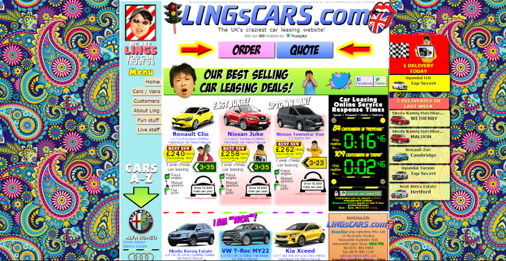
Ling’s Cars is a good example of a website that disregards norms for the sake of novelty. This will have been a calculated decision, done more for the sake of publicity than usability, but ultimately a design such as this will be difficult for many users to navigate.
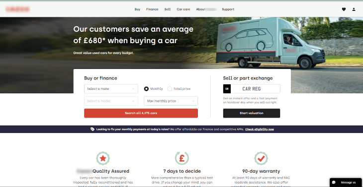
It’s very unlikely that other websites would purposely replicate the style of Ling’s Cars and find success with it. It’s much more likely that a website would rather implement a more modest look and implement user experience improvements through research and analysis.
The design above (and many other similar websites) is much more conventional as a result. Each element is given a clear hierarchical purpose, with enough negative space to allow the elements to breathe.
Consider also how the navigation is free from clutter, with the central part defining key areas of the business. The leading title, “Our customers save an average of £680 when buying a car” delivers a strong value proposition with nothing more than text.
Finally, further down the page, we have an input form to allow a user to search for their ideal car.
The emphasis is very much on this input, with a clear call to action that allows the user to consider their options without expending too much of their precious cognitive capacity.
Effectively, the user is being guided to points of interest on the page by the surrounding negative space — something that might be considered more difficult for the Ling’s Cars example.
Using negative space in your work (for desktop)
We’ve established that negative space is a versatile design element in website design. But let’s make a distinction — it is not limited to minimalist websites, and it can be used in various aspects of web design.
It’s important to remember that negative space can be utilised in navigation menus, to separate content, to create a visual hierarchy, and to draw the viewer’s attention to important elements on the page.
The use of negative space can also enhance a website’s readability, legibility, and overall user experience. While minimalism is one way to utilize negative space, negative space can be used regardless of the overarching design philosophy.
Minimalism is a design philosophy that tries to convey sense and feeling by using as little as possible. Negative space is a way in which designers can enhance the user experience by creating a sense of balance and harmony.
N.B., while the term “white space” suggests that negative space is always white, this is not necessarily the case. Negative space can be any color or texture, as long as it remains empty and unused in the design.
Let’s take a look at how you can implement negative space in your work with our fictitious online retailer, Toutem.
Navigation
Let’s practice adding negative space in navigation:
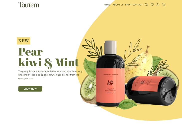
A general rule of thumb when designing for the web: if there’s space available, don’t be afraid to use it. In the above example, the navigation feels constricted because of its position. But what if we expand the navigation slightly and shift the main navigation to the centre of the page?:

This is a good start.
We’re now using the negative space afforded to us on the desktop, and we’ve created a sense of balance and hierarchy because we’ve split the navigation, essentially, up into three distinct areas: logo, middle navigation for top-level items to navigate to other pages, and a utility nav.
The utility nav allows users to search, view their favourites, view account information, and check their basket. Great! But we’re not done.
There’s not enough spacing between the middle navigation elements, and it appears a little cramped as a result. We’ve added some additional space here, with 50px between each navigational item as opposed to the 10px used previously:
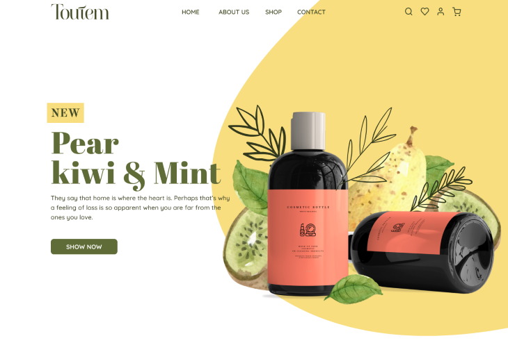
This now makes the navigation more manageable in terms of cognitive load, more scannable, and improves usability. We could of course add even more padding between navigation items, but how much is needed can be rather subjective. As a rule of thumb, at least 50px works best.
Readability
Negative space improves readability in web design by providing a visual break between different elements on the page, such as paragraphs of text, headings, and images.
By separating these elements, negative space creates a clear and uncluttered design that is easier to read and understand.
Let’s take a look at the below example:

At first glance, you might think the above example isn’t too bad. But on closer inspection, you’ll notice just how cramped those two product cards are. The title for each product, the product description, and the line height are causing all sorts of spacing issues.
Again, if there’s space available — use it! Let’s space this out:

Visual hierarchy
We’ve established that negative space can be used to make important elements stand out by providing enough space around them, making them more prominent on the page. But how can we use negative space to improve visual hierarchy?
Eye-tracking studies have identified two common scanning patterns: the Z pattern and the F pattern.
Z pattern
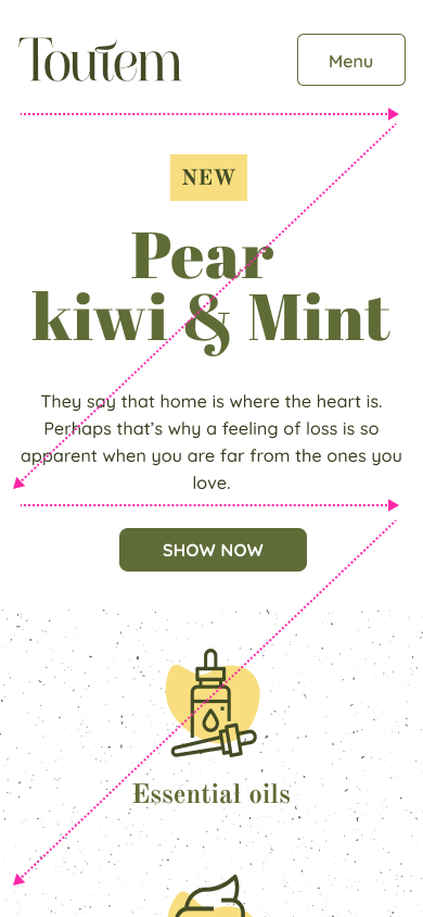
The Z pattern involves the user scanning across the top of the page from left to right, then diagonally down to the bottom left of the page, then across to the bottom right. This pattern is common on pages with a lot of visual elements, such as images or icons.

F Pattern
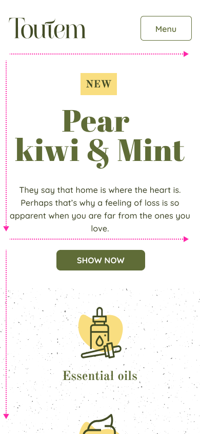
The F pattern involves the user scanning across the top of the page from left to right, then down the left side of the page, scanning for headlines or important information, and then scanning across the page again to the right. This pattern is common on text-heavy pages, such as articles or blog posts.
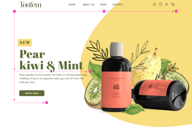
You can imagine with both patterns that a website that doesn’t incorporate negative space will make it difficult for a user to know where to look. The Z and F pattern is really regarded as the path of least resistance for a user, meaning in an ideal world, they’ll follow that pattern because of logical design patterns. Without negative space, this isn’t always the case.
Clarity
Studies have shown that the use of negative space can improve reading comprehension and recall. In a study published in the Journal of Reading in 1979, participants were given reading passages with either single or double spacing.
The participants who read the passages with double spacing, which created more negative space between the lines, had significantly better comprehension and recall of the material.
While white space is important for creating a clean and uncluttered design, negative space is a crucial element for creating an effective and impactful design. Understanding the difference between the two and knowing how to use them effectively can help designers create more successful and engaging designs.
Using negative space in your work (for mobile)
On mobile devices, negative space is especially crucial because it helps to prioritize and emphasise important elements, such as calls-to-action and key messages, within a limited viewport.
Without adequate negative space, these elements may become lost in visual clutter, leading to a frustrating user experience, reduced engagement, and the perception that mobile doesn’t matter.
Moreover, the use of negative space can also enhance the readability and legibility of text on mobile devices, where the screen size is smaller and the text is often condensed. By providing visual breathing room, negative space can prevent text from appearing cramped and overwhelming and allow users to consume information more easily.
N.B., recent trends show that mobile usage has surpassed desktop usage, with more than half of all internet traffic coming from mobile devices. This shift is driven by a number of factors, including the widespread availability of smartphones, the convenience of mobile access, and the increasing popularity of mobile apps.
Navigation
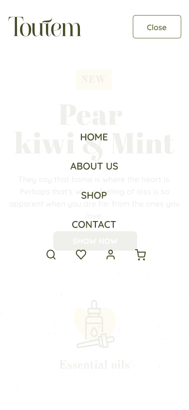
Negative space within the context of a mobile device or tablet for navigation can be quite tricky to get right, but not impossible. While there are various ways in which navigation can be implemented, fundamentally, whichever way you choose should be clear, as concise as possible, and easy to use. Using negative space appropriately ensures that this is the case:

As space on mobile devices comes at a premium, it has to be used in the right way. More often than not you’ll see a hamburger, menu button, or a series of tabs at the bottom of the screen. While there is often a debate around the implementation of the menu on mobile, this is the correct use of negative space:
Readability
Improving readability on mobile devices with limited space can be challenging, especially when considering negative space, but there are several strategies designers can use to make content more accessible and legible.
One way to improve readability is to use larger fonts and bolder typography, with a greater line-height between sentences. Ample space between paragraphs helps, too. Smaller fonts can be difficult to read on mobile devices, particularly on small screens, so using a larger font size can make text more legible.
Choosing a bold typeface will help make text stand out on the page:
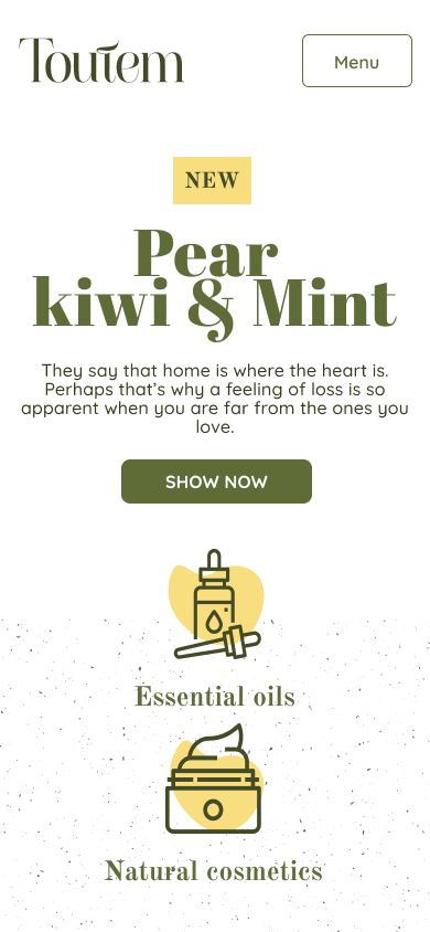
Another strategy is to use shorter paragraphs (which is easier for certain websites over others) and bullet points to break up large blocks of text. This makes it easier for users to scan the content and find the information they need quickly:

Visual hierarchy
Visual hierarchy, from my experience, is something that’s even more important to get right on mobile. Typography is key in establishing a clear hierarchy of information but equally so, too, is negative space.
By using different font sizes and styles, designers can create a visual distinction between different types of content and help users understand what is most important.
Using a clearly defined amount of spacing for each element type is important, too. Headings, different types of headings, paragraphs, pull quotes, and so on will have varying degrees of padding in order to create a consistent level of visual hierarchy:
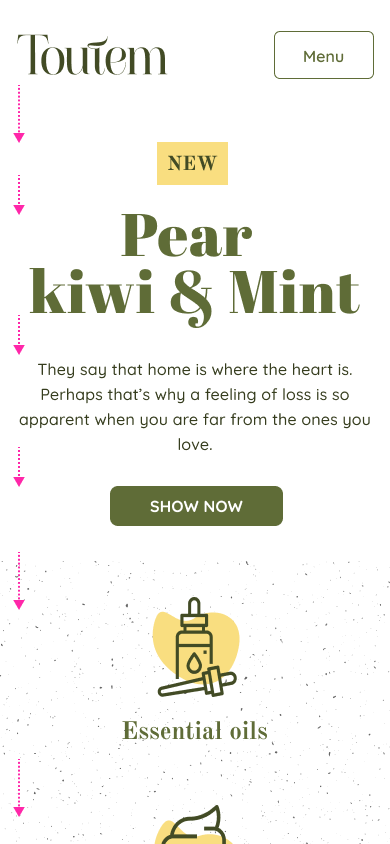
N.B., visual rhythm in the context of mobile web design refers to the repetition of design elements to create a sense of flow and continuity throughout a web page. It’s a way of establishing a pattern of visual elements that the user can follow, creating a more engaging and cohesive user experience.
A combination of negative space and providing visual cues, such as icons or images, can also help establish hierarchy by providing users with a quick and easy way to understand the meaning and purpose of different elements on the page.
Z pattern
F pattern
Clarity
If we refer back to the Journal of Reading study from 1979 regarding improved reading comprehension, it’s important to note implications for mobile web design, too.
While the study was not conducted with mobile devices in mind, it does nonetheless suggest that readability is an important factor in facilitating comprehension and understanding regardless.
When designing for mobile devices, it’s important to prioritise readability by using appropriate font sizes, line spacing, and contrast between text and background. While double line spacing may not be feasible on a mobile screen, designers can still take steps to ensure that the text is easy to read and understand.
Conclusion
Negative space is an essential element in design that helps to create balance, hierarchy, and harmony within a composition. It is the area around and between design elements and is often referred to as white space.
By leaving areas of the design empty, negative space can emphasise the importance of the subjects or objects in the design, create visual interest and flow, and guide the viewer’s eye through the design in a deliberate and intentional way.
Negative space can also be used creatively to convey hidden meanings or messages and make a design more versatile. Just as ma creates a sense of balance and harmony in Studio Ghibli movies, negative space can be used to create balance and harmony in web design.
Ultimately, understanding how to use negative space effectively is a crucial skill for designers who want to create impactful and effective designs that stand out and communicate their message clearly and effectively.
Incorporating negative space in your designs can help create effective and visually appealing compositions. Don’t be afraid to experiment with negative space to emphasise the importance of your design elements, guide the viewer’s eye, and create a sense of balance and harmony in your designs.
And finally, from the book UI is Communication by Everett N. McKay, “Negative space isn’t just empty space; it’s a critical component of effective UI design.”


