Unlocking Potential: Effective Empty-State UX Design
Empty states in UX design guide users, reduce confusion and enhance engagement by providing clear, actionable information

Empty states are everywhere in the physical world. Imagine going to your local grocery store, and searching for your favourite brand of granola. To your horror, there’s an empty space where the granola should be.
There’s no explanation why the granola isn’t there, so you wonder, when are they going to get it back in stock? Will they ever? Will breakfast ever be the same?
You look down at the labelling along the shelves “Out of stock, back on October 25.” It’s not an ideal situation, as you’re going to have to look for an alternative for the time being, but the ambiguity and breakfast-related fear you were once filled with is replaced with mild disappointment.
At least you’re informed, and now have some idea when breakfast normality resumes.
When something’s missing, like in a considerate store where they tell you why, the same courtesy should be applied to digital products. Empty states in UX are an integral part of reducing confusion among users.
What exactly are empty states in UX?
Open up Spotify for the first time, and you might be prompted to create a new playlist. Download Instagram, and on opening it up as a new user, you’ll be guided through some steps to show you how to take a photo.
The alternative is…well, nothing. A screen with some potentially confusing UI elements, but ultimately little indication of what you can do with the app, and that’s dangerous from an engagement perspective.
N.B., users who struggle or are confused by the purpose of an app, commonly referred to as cognitive friction in UX or psychology circles, are users who are most likely to go elsewhere. It hinders smooth user experiences.
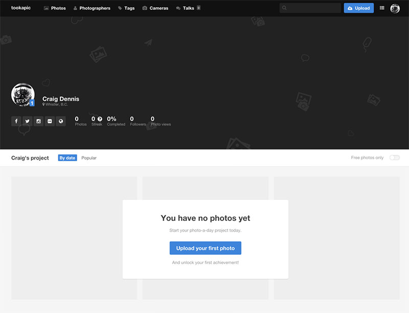
In more specific terms, empty states in user experience refer to the blank or informative screens that appear when users interact with a digital application or website for the first time or under specific conditions, such as when there is no content to display, no data to show, or when the user has just signed up.
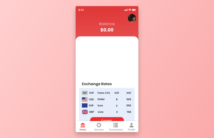
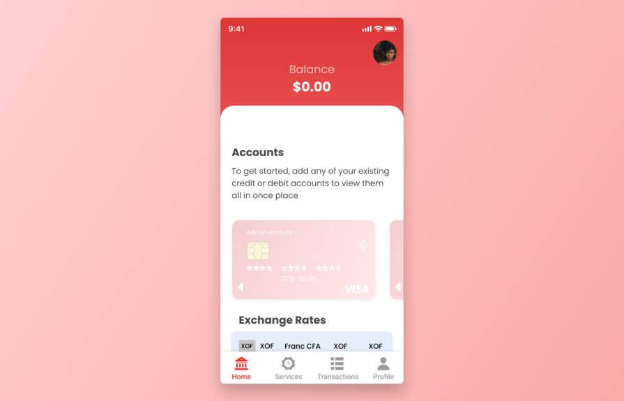
For instance, imagine, as a new user, you’ve downloaded an app to keep all your finances in one place. This is the first screen you see. You might have questions about whether it’s working or not. Where should the user go in this instance to add existing accounts?
These empty states act as a canvas for designers to communicate with users, providing guidance, context, and a welcoming environment.
They are the digital equivalent of a friendly notice of someone’s favourite granola being sold out, helping to guide them in whatever their next action will be. Their primary purpose is to enhance the user experience by preventing confusion and offering clear, actionable information.
The benefits of well-designed empty states are twofold. First, they minimize user frustration by avoiding a sense of abandonment or confusion when users encounter a blank screen or an absence of content.
Instead, they provide context and direction, helping users understand what they should do next.
Second, empty states can actively engage users by inviting them to take specific actions, such as completing their profiles, exploring features, or beginning a journey within the application. In essence, empty states serve as a friendly and informative guide, improving user onboarding and overall satisfaction with the digital platform.
The historical evolution of empty states
The historical evolution of empty states in user interfaces mirrors the progression of technology and the increasing focus on enhancing user experience. In the early days of computing and graphical user interfaces (GUIs), empty states were a relatively overlooked aspect of design.
Developers often prioritised functionality over aesthetics, leading to minimal, often uninformative screens when data was absent.
Users encountered a stark, blank canvas that provided little guidance, effectively the polar opposite of what developers and designers work toward today.
As technology advanced and the Internet became a ubiquitous part of our lives, teams started recognizing the need to address user confusion and disorientation when confronted with empty spaces.
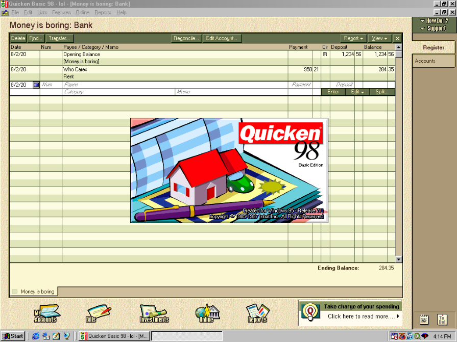
The late 1990s and early 2000s marked a shift, with designers experimenting with more informative and visually appealing empty states.
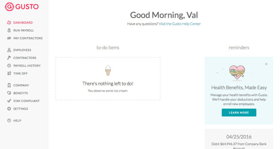
This was a typical finance program running on Windows 98. Empty states were still very much in their infancy, with users expected to jump in and experiment until they got the hang of it:
The turning point came with the rise of smartphones and mobile apps in the mid-2000s, and arguably, the release of the iPhone. The limited screen real estate on mobile devices made every pixel crucial, and designers began focusing on crafting these empty states to serve as both functional and aesthetic assets.
Apple, seen as a champion of good user experiences, helped usher in a new era of user consideration.
Empty states evolved into a critical component of mobile app design, offering guidance, reducing user frustration, and contributing to a more polished user experience.
This reflects the growing recognition of empty states as an essential tool in the UX designer’s toolkit, demonstrating a commitment to enhancing user satisfaction and reducing confusion in the ever-evolving world of technology and interface design.
The importance of empty states
We touched upon the granola scenario at the supermarket, illustrating how important a small design choice can be in alleviating any fears customers may have.
But consider all the touch points in your life, and how often those touch points have some sort of empty state. Imagine those touch points not having empty states, and how frustrating that might be.
Like library shelves that are empty with no explanation, or a receptionist that’s popped out of the doctor’s office for fifteen minutes. As a user, you’re in a bit of a pickle, because you have to decide what’s best for you based on the limited information available.
The importance of empty states in UX design extends beyond merely filling a void in an app or website. These screens play a pivotal role in alleviating confusion among users, and their significance lies in their ability to create a sense of direction and purpose.
From a psychological perspective, they have a profound impact on the user’s mindset.
Empty states address the so-called fear of the unknown
When users encounter an empty screen, it often triggers anxiety and uncertainty. They may question whether they did something wrong or whether the application is malfunctioning.
In this context, empty states step in as a reassuring guide, signalling that everything is okay.
They communicate that the user is in the right place and that there’s a purpose to the emptiness, which, in turn, helps mitigate the unease users might feel.
Empty states provide a cognitive break
The moment a user encounters an empty state, they experience a brief pause, and this is an opportunity to offer valuable information. By presenting a clear message or engaging visuals, empty states capitalize on this cognitive pause to educate users, set expectations, and encourage the next steps.
This subtle interruption in the user journey not only reduces confusion but also serves to reset the user’s expectations and refocus their attention on the application’s core functionalities.
The psychology behind effective empty states is that they create a sense of control and empowerment. Users are more likely to engage with an application when they understand what’s expected of them. These screens present a choice: the user can either proceed with a recommended action or explore further on their own terms.
This element of choice empowers the user, making them feel more in control of their digital experience. In essence, empty states become a virtual welcome mat, signalling to users that they are in a space designed for them and that there is a clear path forward, diminishing confusion and enhancing their overall experience.
Types of empty states
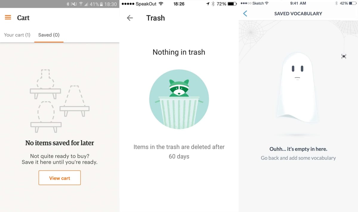
Blank state
A blank state is a screen or interface that users encounter when there is no content, data, or information to display. In other words, it’s essentially an empty canvas within an application or website. But, it’s also an opportunity to guide users towards engagement.
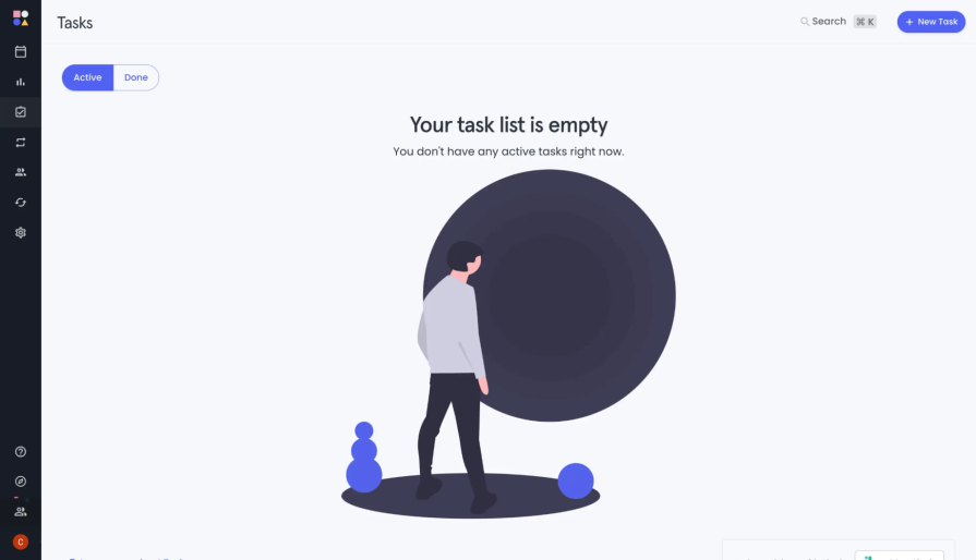
The purpose of a blank state is to communicate to users that there’s currently no information or data available to be shown in a particular area of the app or website.
Instead of leaving users with a confusing or uninformative void, a well-designed blank state typically includes a visually clean and uncluttered layout, along with a brief, user-friendly message that conveys the situation and, ideally, offers guidance on what users can do next:
This type of empty state is essential in preventing user frustration and confusion when content is absent, providing clarity and guiding users to take appropriate actions to populate the empty space. This ensures a more user-friendly and intuitive experience.
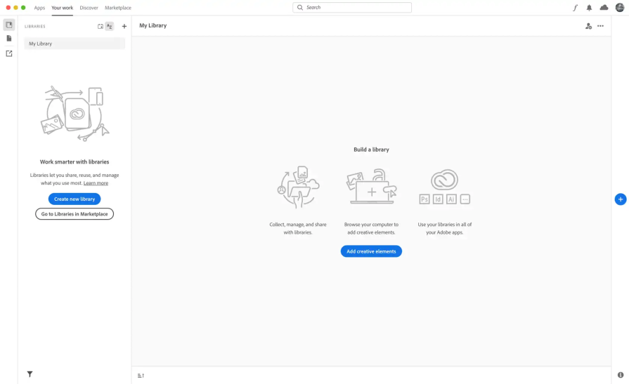
Welcome message
A welcome message is a specific type of informative content that is presented to users when they first interact with an application or website, or when they enter a particular section that is devoid of content or data.
This message is designed to greet users, set a welcoming tone, and provide essential information or guidance:
A welcome message typically includes friendly and inviting language, acknowledging the user’s presence and expressing gratitude for their engagement with the platform.
It may offer a brief explanation of the purpose of the page or section and provide instructions or suggestions on how to get started or which actions the user can take.
For example, a welcome message on a social media platform might say, “Welcome to your profile page! Start by uploading a profile picture and sharing a status update to connect with friends.”
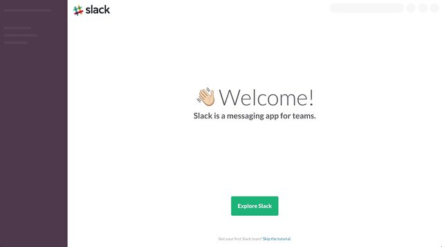
Initially, welcoming messages used in Slack are a little less specific, such as “Explore Slack,” then become more specific as the user works their way through the interface:
These messages aim to make users feel comfortable and informed as they begin their journey within the app or website, contributing to a more user-friendly and engaging experience.
Persuasive copy
Persuasive copy refers to specific information strategically placed within an empty state to encourage users to engage with a particular product, feature, or action.
It is a way for companies to draw attention to something they want users to engage with, even when there is no other content to display.
For example, if a social media platform is experiencing a low number of user posts in a particular area of the app, it may use the empty state to promote a feature or action.
In this case, they might display a message like “Discover Trending Topics” with an accompanying button to explore current popular topics. By utilising the empty state in this way, the platform aims to guide users toward a specific action that enhances their experience and encourages interaction.
Users have the option to select “trending topics,” which transforms a previously vacant space into a purposeful feature, increasing user engagement:
Persuasive copy in empty states is a strategic approach to utilize otherwise empty or underutilized spaces to drive user engagement, highlight important features, or promote products or services.
When done effectively, it can capture users’ attention and lead to increased participation and interaction.
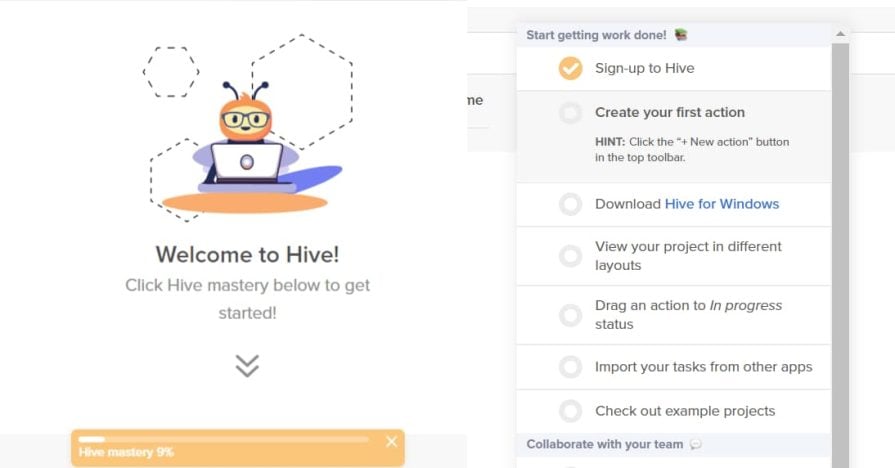
Data-driven empty states
Data-driven empty states are a type of empty state that goes beyond the standard “blank slate” or generic messages. These empty states are specifically tailored to the user’s context or the state of the application.
The data-driven states are informed by real-time or dynamic data and are designed to provide users with personalized information or guidance based on their specific circumstances.
For example, in a task management app, if a user has completed all their tasks for the day, a data-driven empty state might display a message like, “Great job! You’ve completed all your tasks for today,” along with suggestions for what to do next or options for planning future tasks.
In this scenario, the empty state is responding to the user’s actions and status within the app:
Data-driven empty states are powerful tools for enhancing user experiences because they can provide contextually relevant information, guide users based on their behaviour, and keep users engaged by offering tailored content or actions.
These empty states are particularly effective in modern, data-rich applications where personalization and real-time feedback are essential for a seamless and user-friendly experience.
Crafting a user-friendly empty state
Step 1: Define the purpose
When creating an empty state, first, question the purpose of it. Understand why it might occur, such as data absence or user actions. This step ensures you have a clear objective for the empty state, whether it’s to guide, inform, or engage users effectively.
Let’s go back to our finance app example we touched upon at the beginning of this article. We know that users want to have all their financial information in one place, so we need to make clear how to do that before they’ve done it.
Step 2: Choose the right type
Select the appropriate type of empty state for the context. There are various categories, including placeholder states, informative states, and persuasive copy states. The choice should align with the user’s needs and the overall UX goals.
In our context, we want to actually create an empty state that borrows a little information from each type of state discussed.
That is, the empty state we create for our finance app will be a combination of a placeholder, informative, and promotional state.
Why? Well, we need a placeholder that informs the user on what actions to take, while also using persuasive copy to do so:
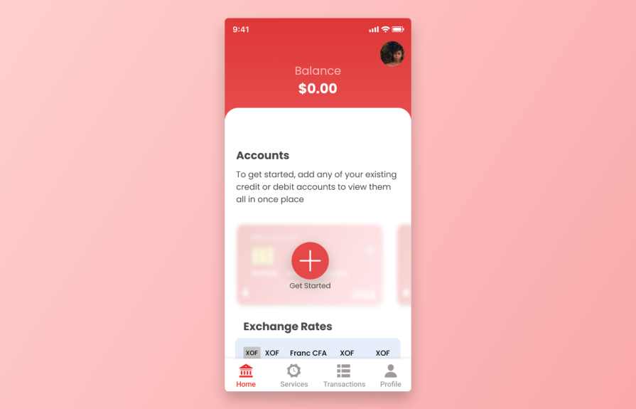
Our finance app is starting to take shape. The above is better than a blank page, or an empty space, and at least informs the user on what to do. It could be clearer though.
Step 3: Design with clarity
Focus on designing the empty state with simplicity and clarity. Use clean visuals, concise text, and an intuitive layout to ensure users immediately understand the situation and what actions they can take.
Clarity is key to preventing confusion and frustration.
Persuasive copy and clearly designed elements can go a long way in getting users to engage with an app. In this instance, we have text and a graphical CTA with good contrast to point users in the right direction:
Step 4: Add micro-interactions
Enhance the user experience by incorporating subtle micro-interactions.
These can include animated elements, transitions, or tooltips that provide guidance or delight, making the empty state more engaging and user-friendly.
Not only do microinteractions look the part, but they also give further hints to users that “something has happened” after they carry out an action.
Step 5: Test and iterate
After creating the empty state, don’t forget to test it with real users. Collect feedback and data to understand how users interact with it. Use this information to make iterative improvements, refining the design and functionality to enhance the overall user experience.
Testing and iteration are essential for achieving optimal results.
Conclusion
Empty states in UX represent opportunities for user engagement and guidance. Thoughtful design and content in these moments can transform user frustration into exploration and satisfaction, fostering a more positive and productive user experience.
Good teams will seek out user pain points, doing what they can to ensure a smooth experience — empty states are a surefire way to make sure users are guided on a path to success.