Typography for Tomorrow: A Typeface Good Enough for Wipeout
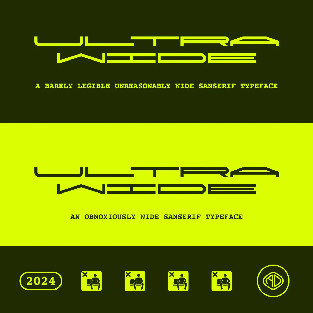
Ultra-wide typography for future generations

It's said that typography is more than just letters on a page—it’s an art form, a method of visual communication that has the power to transcend language and evoke emotion.
This is especially true when it comes to experimental fonts that push the boundaries of traditional legibility, as is the case with the typeface by AbrahamicDesign.
The designer took to Reddit to gather opinions on this experimental creation, and the responses have been both thoughtful and diverse, reflecting how this font has resonated with the community.
A Font That Defies Conventions
The first thing that strikes you about the font is its willingness to break free from convention.
Each letterform, numeral, and symbol is crafted with a clear sense of artistic experimentation. The geometric, techno-modern look seems at home in the world of neon signs, cyberpunk aesthetics, and futuristic branding.
It's not just a tool for communication, but an exploration of form itself—an experiment in how far you can push type while still retaining a sense of functionality.
You'd be forgiven for mistaking it for the work of The Designers Republic, circa 2048.
However, this experimental spirit has sparked a range of opinions on Reddit, where AbrahamicDesign invited the community to weigh in.
The feedback is as layered as the font itself, with users expressing a mixture of admiration, curiosity, and critical analysis.
Community Feedback: The Good, the Bold, and the "Cursed" Numbers
One recurring piece of feedback from Redditors relates to the font’s numerals, which have been described as “cursed.”
This comment, likely born from the unconventional structure of the numbers, suggests that while the numerals are visually striking, they may disrupt the legibility that many users are accustomed to.
Convention be damned.
This doesn’t seem to be a complaint so much as a reaction to how wildly the numbers deviate from standard forms, perhaps a nod to the font's avant-garde approach.
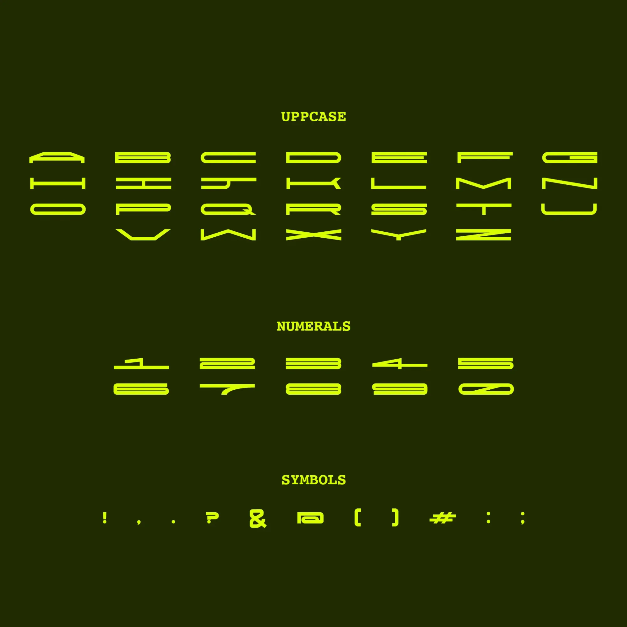
One user commented, “This is true art. The numbers alone are so mentally ill. I wish there were a way to ensure that the whole typeface can only be printed in neon on black (or the reverse).”
This particular take speaks to the font's polarising yet powerful nature.
It's not just for designers to play with - this thing's a real piece of art. It's got a vibe all its own, and the way those bright colours pop against each other really makes it something special. Legibility is another focal point for feedback.
Many users found the uppercase letters to be generally readable, though some suggested increasing the space between letters.
The suggestion to expand the spacing speaks to the delicate balance between form and function—while aesthetics are key, usability in certain contexts could benefit from adjustments.
One user noted, “Most letters are legible though. I'd also prefer more space between separate letters.”
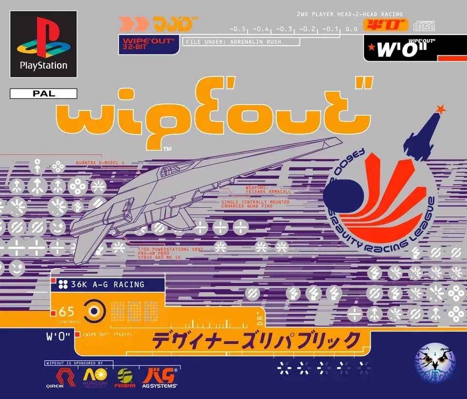
A Typeface with Wipeout Vibes
Several users drew comparisons between this font and the futuristic aesthetic of The Designers Republic, specifically their work on the video game Wipeout.
These vibes are evident in the sharp lines, angular geometry, and neon colour scheme, all of which echo the visual identity that TDR helped pioneer.
As one user pointed out, “As a fan of everything TDR, I like it for what I’d use it for.”
This reinforces the idea that the font belongs in a space where legibility is secondary to style, such as in electronic music promotions, sci-fi posters, or a neon-lit product logo. This aesthetic carries through even in the community’s suggestions for improvement.
Users provided thoughtful critiques on how to refine some of the more complex characters, such as the “A” and the “V,” while maintaining consistency within the typeface.
One designer's feedback was particularly specific: "The counters for the 'A' and 'V' are problematic, for different reasons. I think the 'A' should have a hairline counter like the 'R' and 'S.'"
Continuing, "The A counter looks oddly chopped at the ends, the angle isn't helping it. The bowl of the 'J' should be truncated like the '1' and '7'." These critiques highlight the balance that AbrahamicDesign is seeking to strike between creative freedom and the rules of typographic form.
It’s a delicate dance between pushing boundaries and ensuring coherence across the set.
An Evolving Experiment
While the font may have initially started as an experiment, it’s clear that AbrahamicDesign is deeply invested in refining it.
One of the best pieces of feedback came from a user who praised the conceptual logic of the typeface.
They suggested that with a bit of tweaking on details, it could move beyond experimental to become a more polished tool in a designer’s arsenal: "A really well thought out typeface, now getting the tiny details is the next step." Others appreciated the artistic integrity behind the design, with one user even joking, “Someone should offer you a grant just for the letter K.”
These comments reflect the enthusiasm for the artistry behind the project and the acknowledgement that every typeface is a labour of love, requiring attention to the smallest details. One of the most intriguing suggestions came from a user who envisioned the font only ever being printed in neon on black, further establishing its place in a world that blends art, technology, and design.
Whether it’s the “cursed” numbers or the unusual spacing, the details that some may see as flaws are exactly what make this typeface memorable.
As it continues to evolve, this font could very well become a defining feature of futuristic design projects that aim to leave a lasting impression. In the words of one Redditor: “This is true art.”