How far would you go to stand out in a crowded job market?
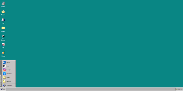
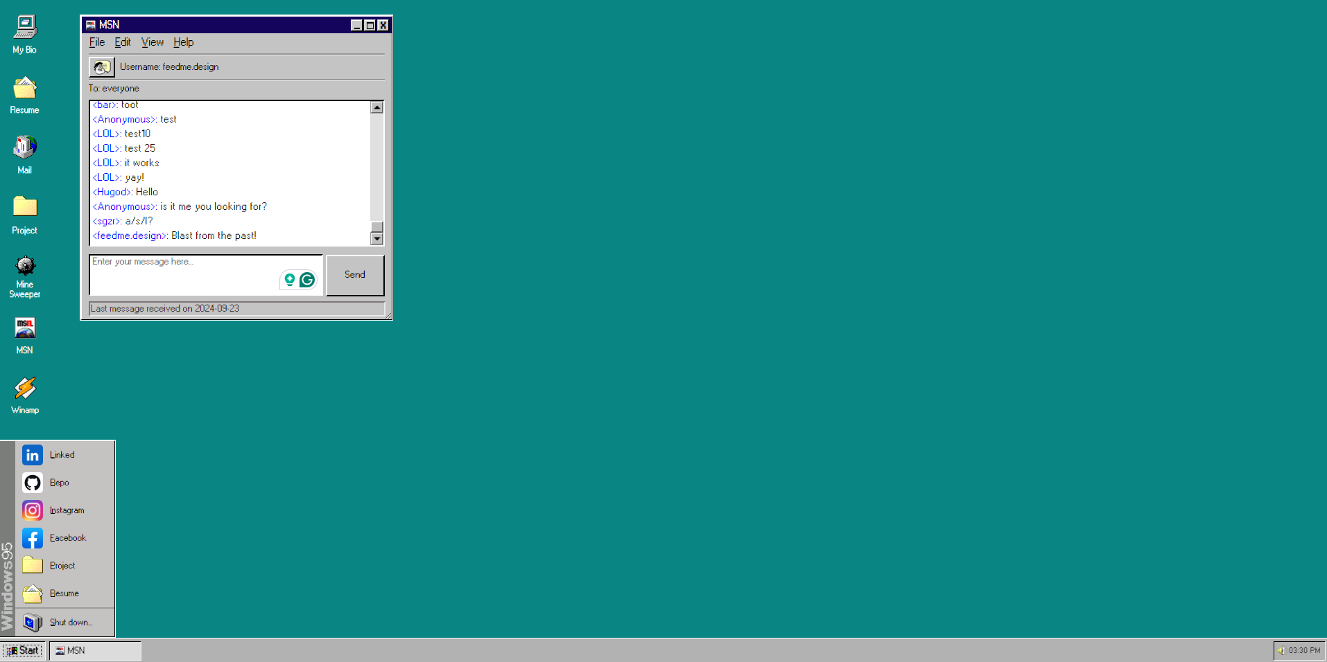
Would you recreate the Windows 95 aesthetic, right down to the classic game, Minesweeper?
That's what software engineer and Redditor Yute Litliprapun did.
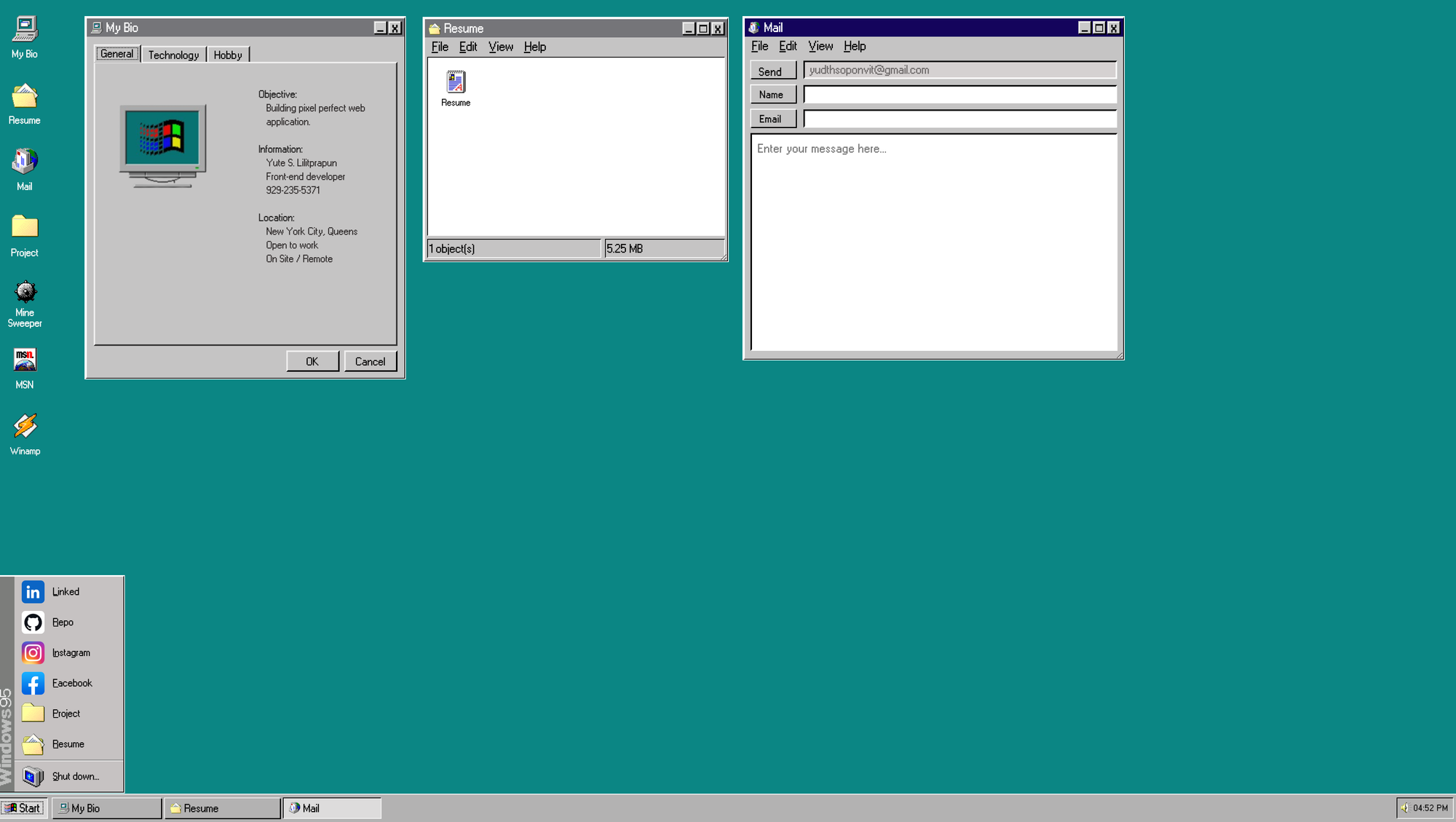
At first glance, this portfolio is a feast for the eyes, bursting with pixelated icons and vibrant colours that defined an era when R.E.M, Wheezer and Sound Garden were in constant rotation.
Crafted entirely from scratch using React and CSS—aside from the nostalgic touch of WINAMP—this project showcases not just coding skills, but a passion for retro aesthetics that many of us hold dear.
The Fun of Discovery
Navigating through the site is like unearthing a treasure chest of memories.
With features like a messaging app filled with tongue-in-cheek comments and a media player looping Rick Astley’s “Never Gonna Give You Up,” it’s a playful homage that captures early computing.
Apart from intermittent clicking whenever the hard drive is in action.
However, amid the nostalgia, finding key information can sometimes feel like a mini-adventure, requiring a bit of patience and exploration when compared to more traditional portfolios.
What makes this project even more compelling is the Yute's openness to feedback.
Inviting the community to share thoughts and suggestions reflects a collaborative spirit that’s crucial in the tech world. It’s a reminder that, behind the playful design, there’s a genuine desire to learn and improve. As the portfolio evolves, there’s certainly potential for enhancements.
A more intuitive navigation system or clearer project showcases could enhance usability while retaining that nostalgic vibe. The balance between fun and function is delicate, but with a few tweaks, this project could truly shine.
This Windows 95-inspired portfolio celebrates creativity and individuality in web development.
It may not fit the conventional mould for professional portfolios, but it embodies the joy of exploration and the charm of a bygone era.
For those looking for a unique experience that marries nostalgia with impressive coding, this portfolio is a must-see.
Now, how long do we have to wait until we start seeing Xbox 360 "Blades" inspired portfolios?

