Across Europe, cities are declaring war on “visual smog” — the barrage of signage, advertisements, and clutter that dominates urban landscapes.
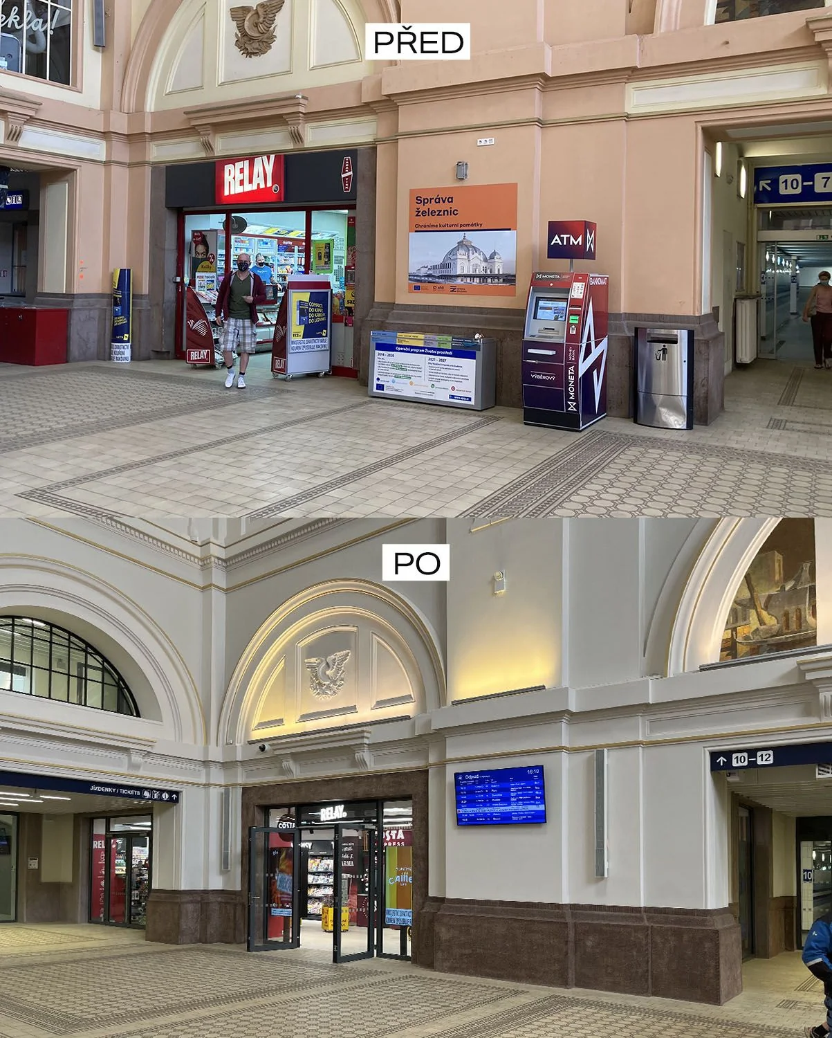
Train stations, bus stops, and public spaces are being stripped back in an effort to declutter and reveal their true architectural beauty.
But the movement is stirring up a debate: Is this a necessary cleanup, or are we stripping away the very signs and information that make cities accessible for all?
The Battle Against Visual Clutter
From Prague to Budapest, the "war on visual smog" is gaining momentum.
In Prague, for example, the government recently ended a decades-long contract with the French advertising giant JCDecaux.
Their billboards and bus stops, once plastered across the city, are being replaced with a unified, minimalist design.
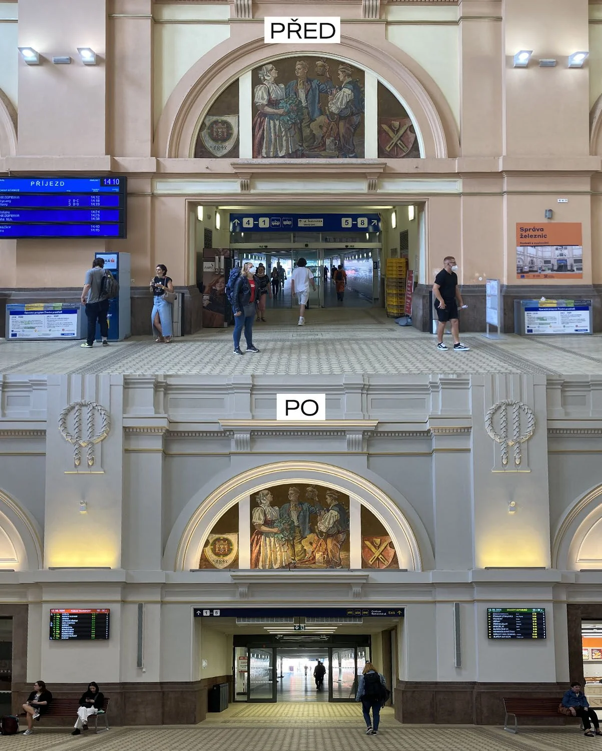
Similarly, cities like Warsaw are passing laws to reduce the presence of advertisements in public spaces, reclaiming the city from commercial overreach.
The appeal of this movement is clear: fewer ads, less clutter, and more opportunities to appreciate the architecture and urban design that lies beneath.
For many, walking through a city has become an exercise in dodging ads and focusing on brand messages rather than the beauty of the buildings around them.
In this sense, removing unnecessary signs and banners is liberating public spaces from corporate dominance.
Minimalism’s Impact on Accessibility
However, not everyone is cheering on the changes.
For those who are visually impaired, signs in public spaces are already difficult enough to spot.
When cities opt for minimalist signage, using muted tones that blend into their surroundings, these changes can have unintended consequences.
In many parts of central Europe, train signs traditionally follow a standard design, often in high-contrast blue.
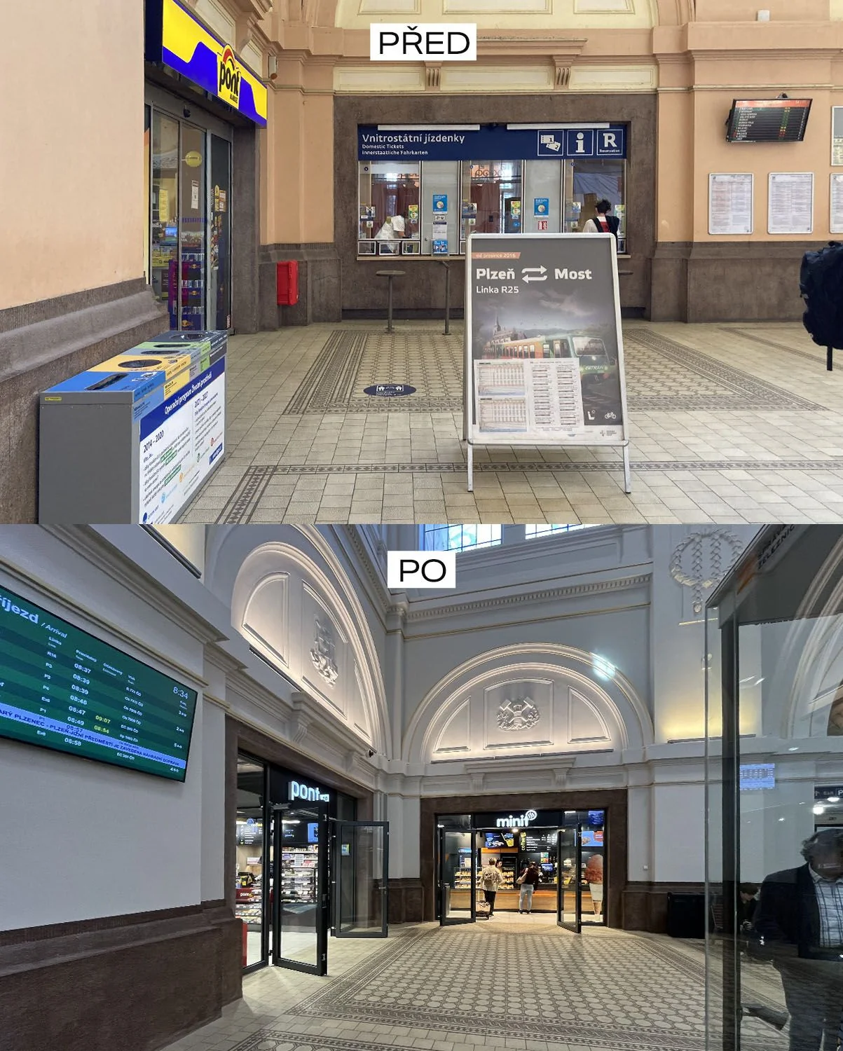
But in some cities, this trend of decluttering has led to signs being replaced with neutral colours like black or grey, which some architects and designers deem more "aesthetic."
The problem?
These new designs may look sleek, but they’re harder to read for those with visual impairments, particularly when the signs fade into the background or are placed above doorways where they’re hard to spot.
"Signs are not meant to be design statements," says one accessibility advocate. "They are functional pieces of information that must stand out and be seen clearly."
A Balancing Act
The challenge for city planners, designers, and policymakers is finding a balance between reducing visual clutter and maintaining accessibility for all citizens.
While fewer advertisements may lead to more aesthetically pleasing spaces, there’s a risk that this minimalism may go too far, making essential information like wayfinding signs harder to find.
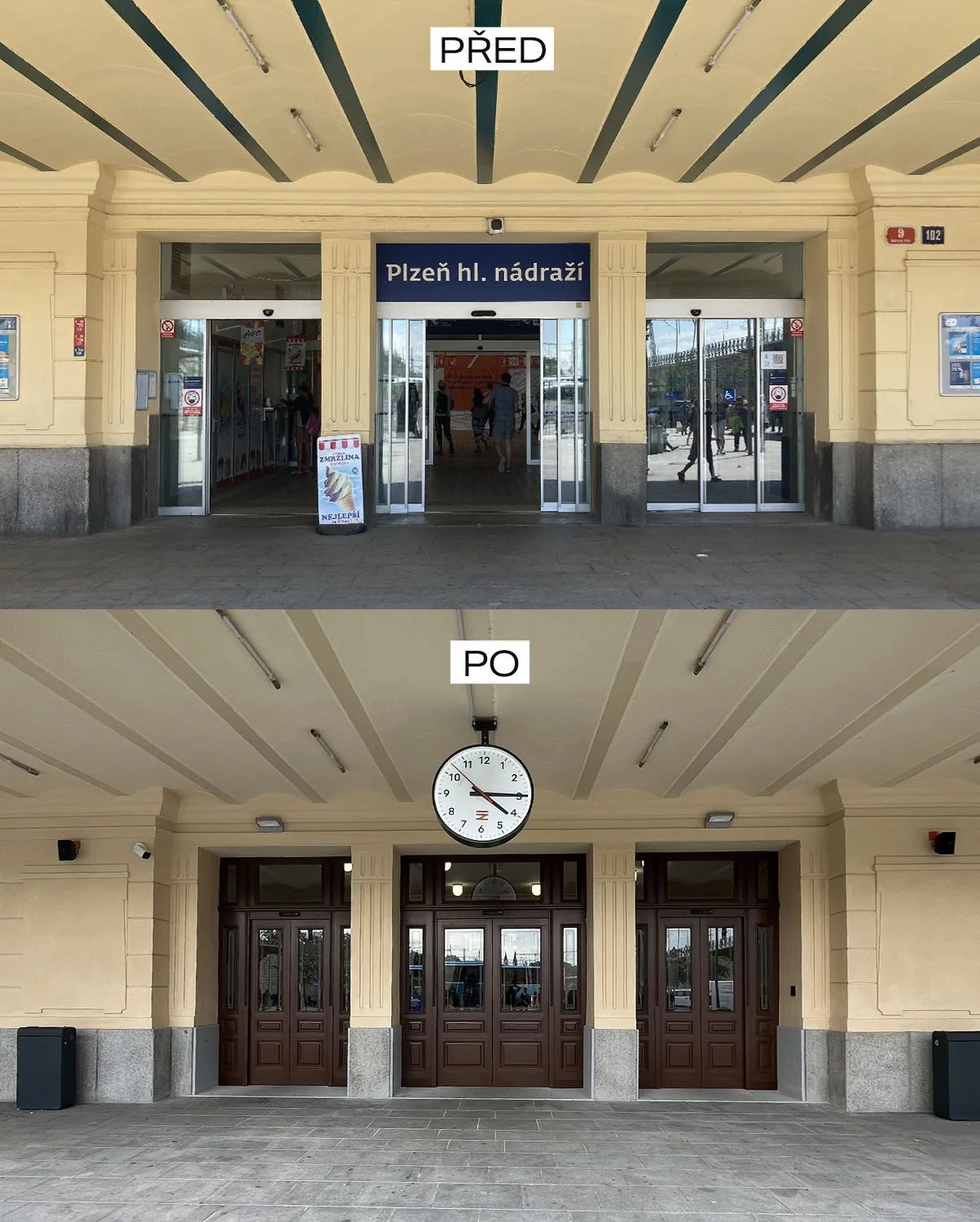
There are, however, ways to balance aesthetics and function. Contrasting colours, larger fonts, and clear placement of signs are all strategies that can keep spaces accessible while still reducing the overload of visual noise.
It's not an either-or scenario; good design should always consider inclusivity.
A Global Trend?
Prague, Warsaw, and Budapest are not alone. This shift towards cleaner urban spaces is part of a global trend.
In 2021, Amsterdam implemented new rules restricting outdoor advertising, and Paris has also been quietly regulating its own visual landscape for years, with restrictions on the size and placement of billboards.
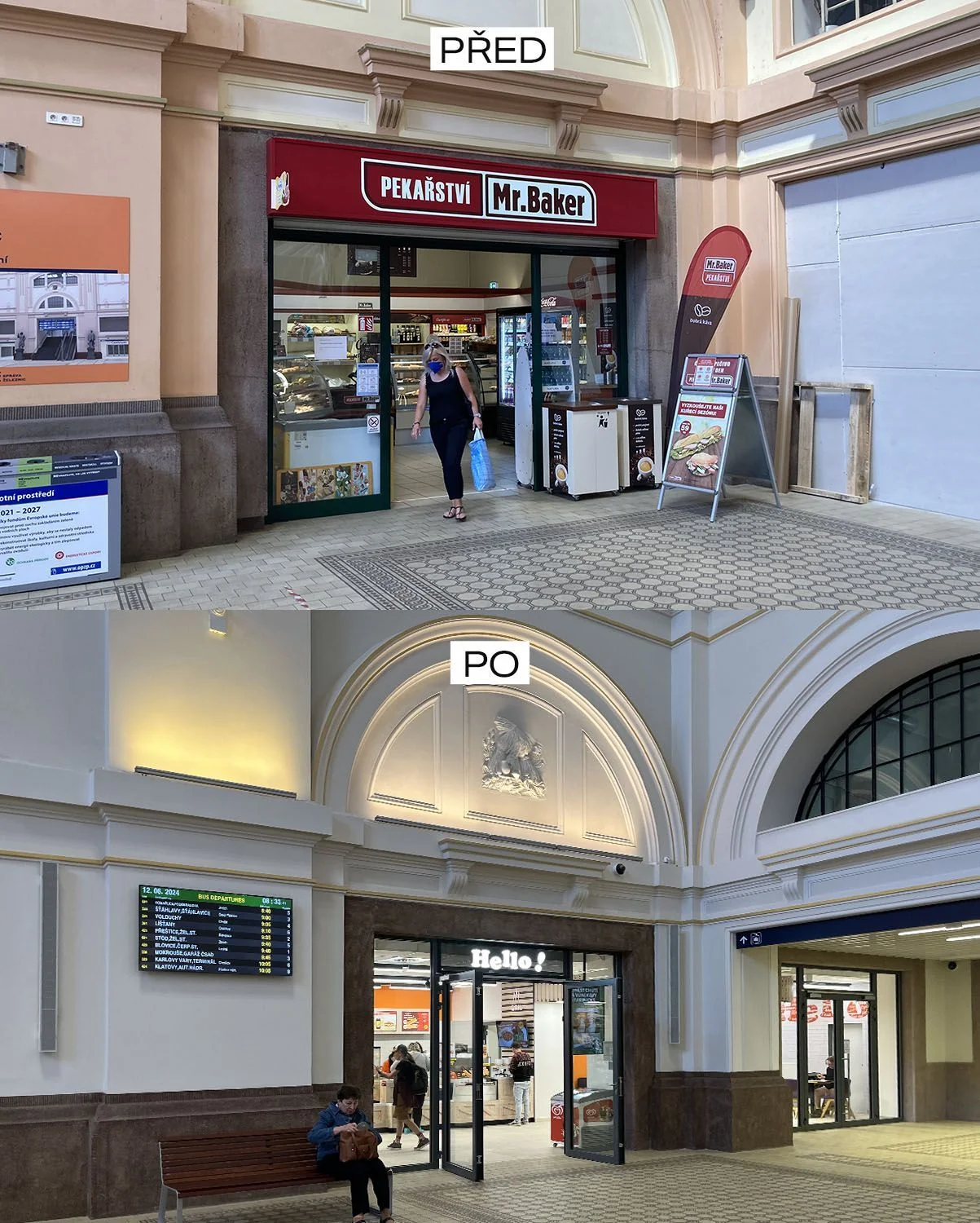
For many citizens, these changes are a relief. Ads are seen as a form of visual pollution, constantly interrupting the flow of everyday life. Removing them has been likened to reducing engine noise in a city – it’s something that once you experience it, you wonder why you ever tolerated it in the first place.
Some remember experiencing cities on days when cars were banned from the city centre, shocked at how different the environment felt when there were no noisy engines or distracting ads, but simply architecture, space, and quiet.
The Way Forward
The war on visual smog is about more than just aesthetics; it's a movement toward reclaiming public spaces from corporate control and restoring a sense of calm in increasingly busy cities.
But in our rush to declutter, we mustn’t forget that public spaces need to be accessible to everyone. Striking a balance between clean design and clear communication will be key to the success of this movement in the long run.
As cities across Europe continue to tackle this issue, it will be important to watch how they navigate the fine line between beauty and function.
The fight against visual smog is far from over, and the debate over its impacts on accessibility and public space will likely continue for years to come.
For now, however, the movement is a bold step towards making our cities not just less cluttered, but more livable.


