The Story Behind Atari’s Logo: How “Fuji” Became Iconic
How a mountain, Pong, and graphic genius birthed the Atari logo

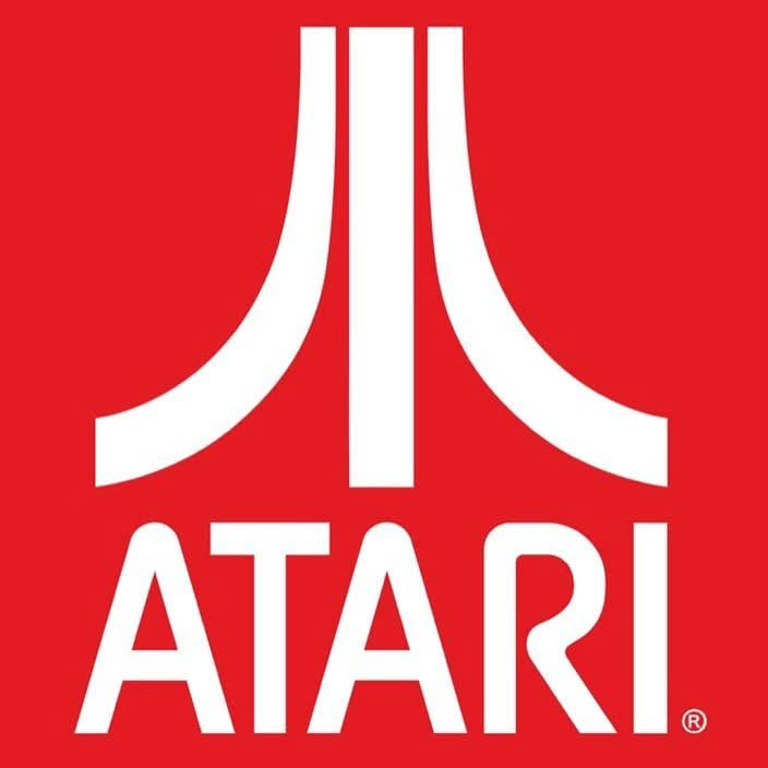
If you've ever played an old-school Atari game or stumbled on retro gaming merch, you've probably seen that bold, symmetrical logo: three rising lines that sort of look like an abstract "A" or a sci-fi symbol.
That logo—nicknamed “Fuji”—wasn’t just a cool graphic. It had meaning, intent, and one hell of a designer behind it: George Opperman. Let’s take a quick trip back to the early 1970s. Atari was still finding its feet, and Pong was the new arcade obsession.
Nolan Bushnell, Atari’s co-founder, wanted a logo that would stand out. Not just something that looked good, but something that meant something.
He turned to George Opperman, a designer running his own agency called Opperman-Harrington Inc.
Innovation and Fun
Opperman didn’t just doodle a few shapes and call it a day.
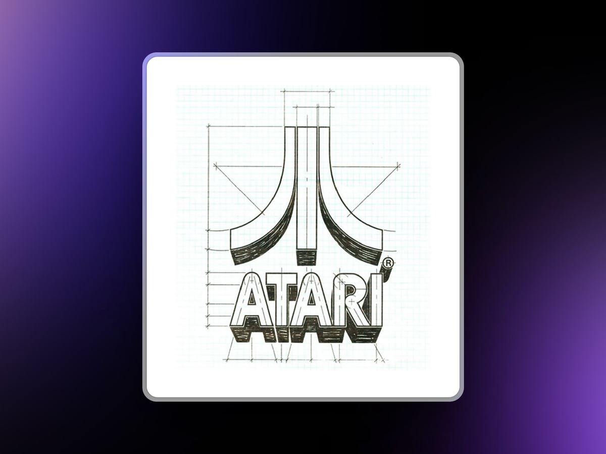
He looked at what Atari stood for. This was a company all about innovation, fun, and a new era of entertainment. So, he designed something with layers. The Atari logo is often called “Fuji” because it resembles Japan’s Mount Fuji.
That might sound like a stretch until you remember that “Atari” itself is a term from the Japanese game Go. It roughly means “you’re about to get taken,” or a warning. The Japanese influence runs deep. But there’s more to the design than just a mountain. Opperman said the symbol was built around the idea of Pong—the game that put Atari on the map.
The two outside lines? Those are the players. The center line? That’s the court’s centerline, the space between them. The logo looks balanced and symmetrical because Pong was too.
Two paddles, one ball, simple rules. And that simplicity drove the design. What makes the Atari logo stand out even today is that it doesn’t try too hard. There are no gradients, no unnecessary flourishes. It’s bold. It’s minimal. It feels confident.
And that’s a tough thing to pull off, especially in an industry where flash and noise often win. George Opperman didn’t just design the logo and disappear. He went on to create a lot of the artwork used on Atari’s arcade cabinets. That included pinball games and titles like Airborne Avenger and Superman.
If you’ve seen those wild, bright side panels on old arcade machines, there’s a good chance you’ve seen his work—even if you didn’t know it was his. A lot of folks don’t realize just how much design shaped early video games. The technology was limited.
The screens were pixelated. So it fell on artists like Opperman to make games look exciting through the box art, posters, and arcade cabinets.
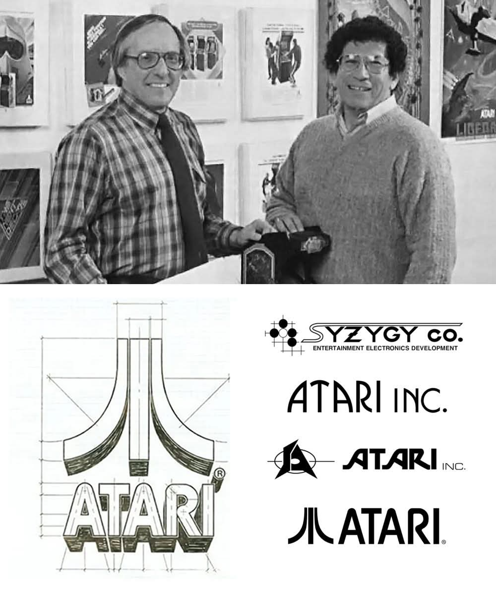
He understood that a strong visual identity helped players connect with a brand—even before they dropped a coin into the machine. And Opperman wasn’t working in a vacuum. The original name of Atari was actually “Syzygy.” That’s a real word—it’s a rare astronomical alignment—but it didn’t quite roll off the tongue.
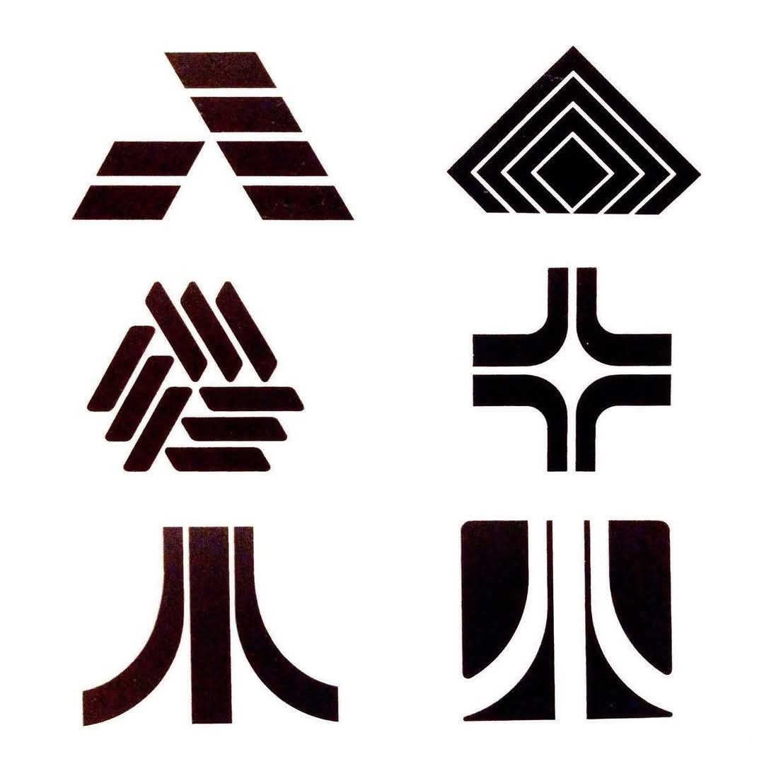
They eventually settled on Atari, and with it came the need for a new visual identity. Looking at the early logo concepts shared in the image, you can see how many different directions they considered.
There are a few wild ideas there—more angular, some using stars, others leaning into that futuristic sci-fi vibe. But it’s the clean, central “Fuji” mark that stuck. Design-wise, it ticks a lot of boxes. It’s scalable, meaning it looks just as good on a cabinet as it does on a sticker. It’s symmetrical, which gives it a sense of stability and trust. And it feels both retro and timeless. That’s a hard combo. George Opperman passed away in 1985, but his legacy lives on. The Atari logo has become one of the most recognizable icons in gaming history.
The Legacy Lives On
It shows up on shirts, hats, posters, even tattoos. It’s more than just nostalgia—it’s a symbol of when video games were just beginning to shape pop culture. Even now, when you see that logo, it gives off a feeling. Not just of old games, but of possibility.
That logo came from a time when everything was new, and no one knew just how big this thing would get. And that’s the thing about great logos—they’re not just pictures. They’re stories. They’re signals. They stick. So next time you see the Atari logo, take a second to appreciate the thought behind it.
Two Pong players. A centerline. A nod to Japanese culture. And the mark of a designer who really understood the power of simplicity. Thanks, George. You nailed it.