The Star Wars Logo That Never Made It
Before the icon, Star Wars had a weirder, geometric 1976 logo

Before the thunderous fanfare and the iconic yellow text crawled up cinema screens in 1977, securing its place in pop culture history, the visual identity of Star Wars was still finding its footing.
The logo we instantly recognize today—bold, heroic, slightly tilted, with those distinctive ligatures binding the S-T and R-S pairs—feels inseparable from the space opera itself. It speaks of adventure, scale, and a certain classic pulp sensibility.
But this emblem of a cinematic empire wasn't the first attempt.
In 1976, as George Lucas and his team were deep in the trenches of production on their ambitious, risky space fantasy, Lucasfilm Ltd. commissioned and briefly utilized a very different logo.
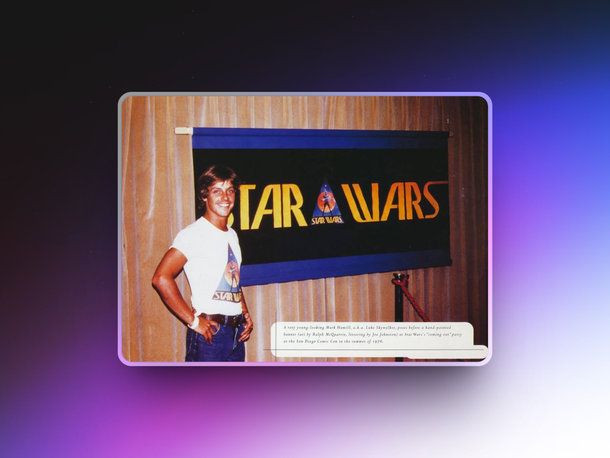
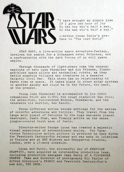
Designed by Ralph McQuarrie (legendary concept artist for the film) and executed by Joe Johnston (who would go on to direct films like The Rocketeer and Captain America: The First Avenger), this initial design feels like an artifact from an alternate timeline.
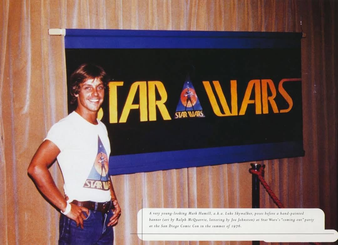
Dissecting the 1976 "Lost" Logo:
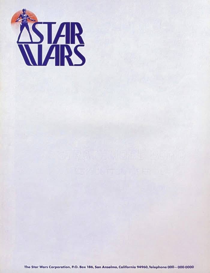
- The Font: It employed Precis, a font family known for its sharp, geometric forms and somewhat condensed feel. It lacked the weight and heroic stature of the final logo font (a modified version of Helvetica Black).
- Sharp Angles & Odd Connections: The letters featured pronounced angles and unconventional connections (ligatures) between letters like 'A' and 'R', and 'R' and 'S'. These weren't the smooth, integrated ligatures of the final logo; they felt more jarring and attention-seeking.
- The Pyramid Icon: Perhaps the most striking element was a distinct, almost abstract pyramid-like symbol nestled between "STAR" and "WARS". Its meaning isn't explicitly clear – perhaps hinting at ancient power, alien structures, or simply adding a touch of sci-fi mystique common in the era's design.
- Overall Vibe: It felt less like a movie title card and more like something you'd find embossed on the cover of a dense, speculative science fiction novel from the mid-70s. Think abstract, intellectual, maybe even a bit dystopian.
This 1976 logo carried the distinct energy of its time.
The 1970s were a period of bold graphic experimentation, particularly within the science fiction genre. Covers for books by authors like Arthur C. Clarke, Isaac Asimov, or Philip K. Dick often featured abstract geometric shapes, stark typography, and psychedelic color palettes.
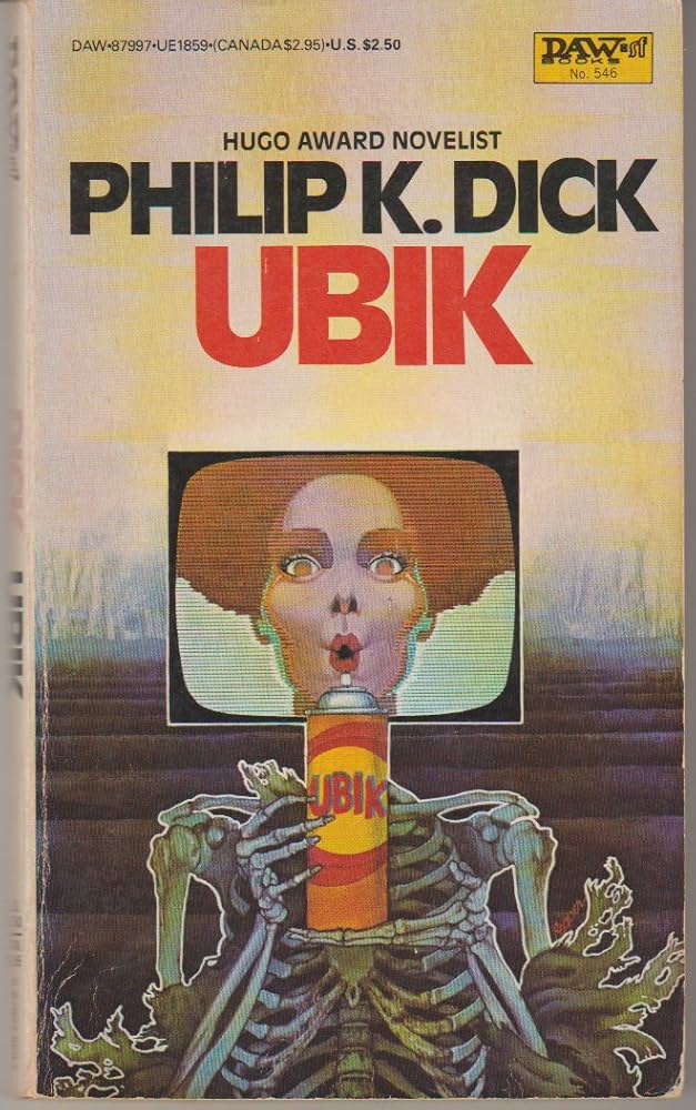
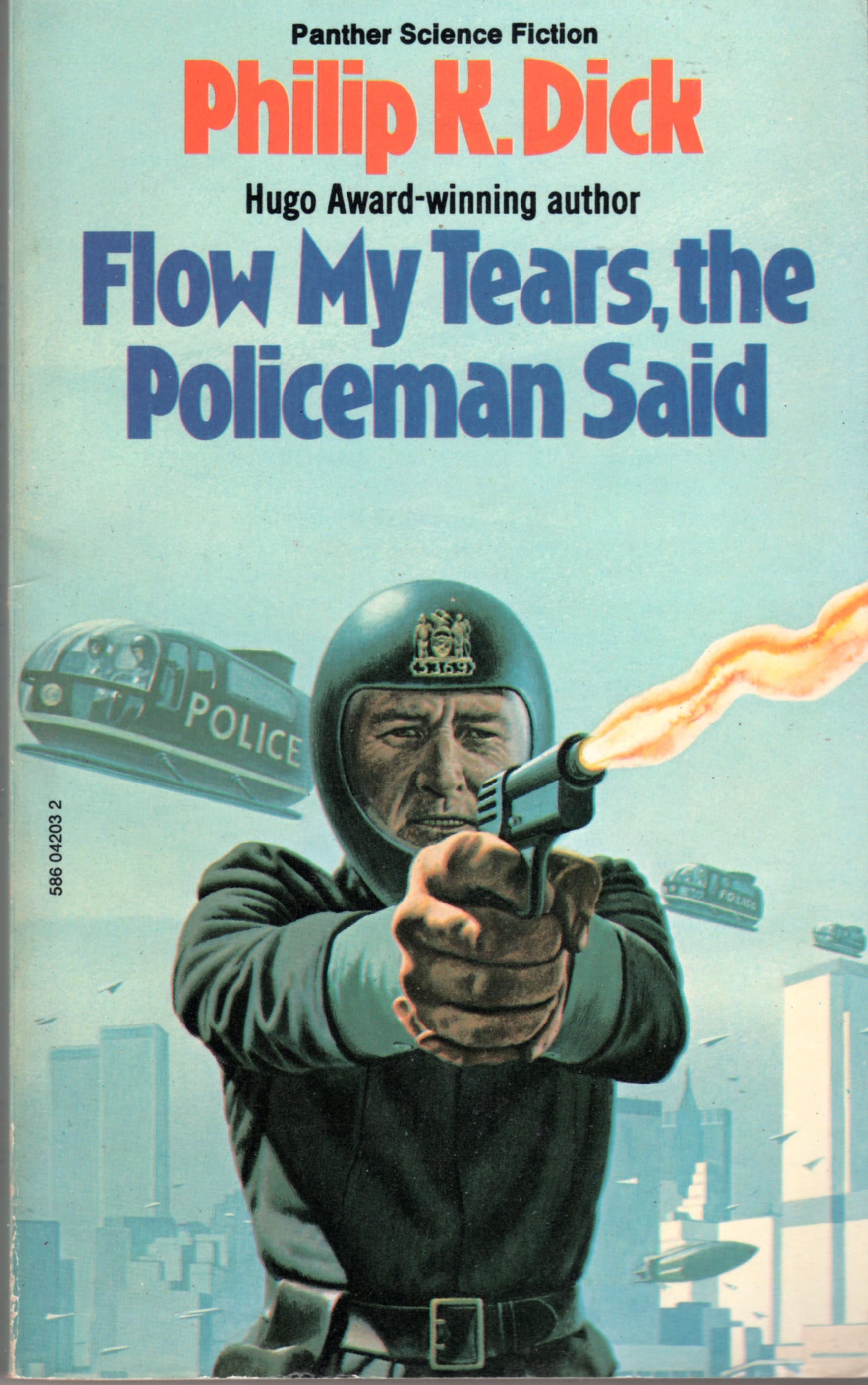
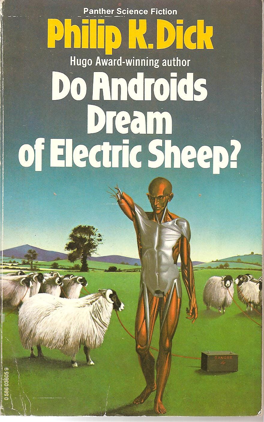
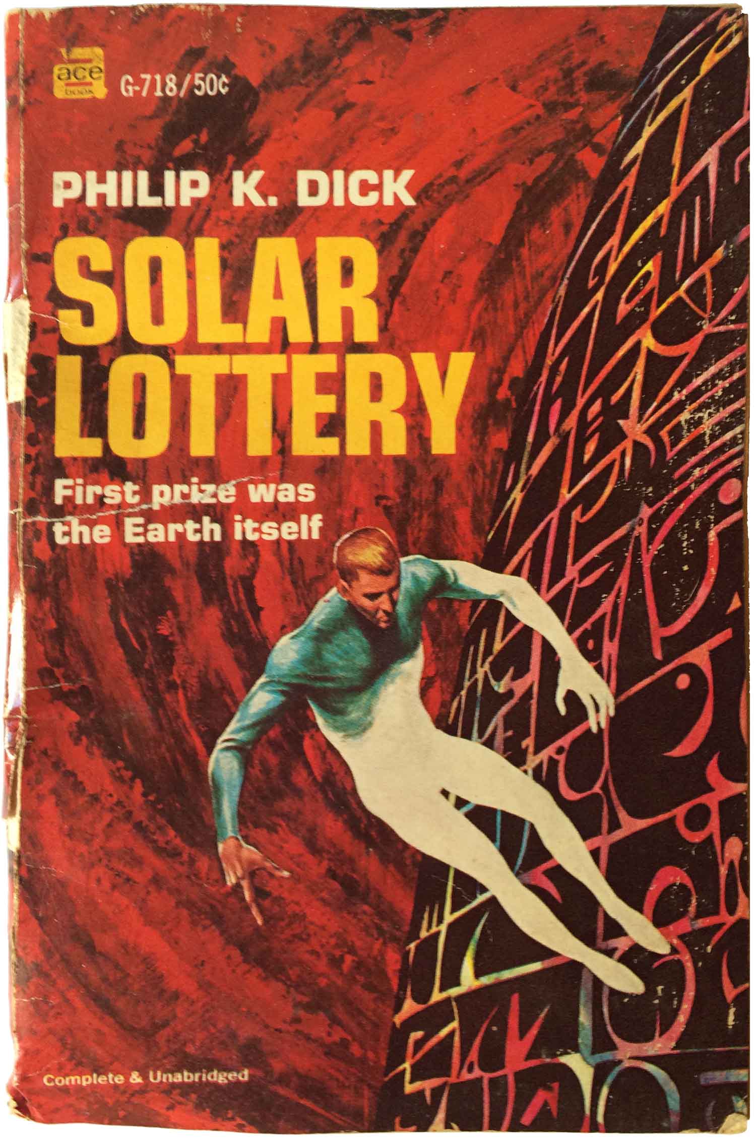
Typical sci-fi art from the late 60s and 70s. Source: Philip K. Dick
The Precis logo fit neatly into this aesthetic.
It was ambitious, trying to convey a sense of the futuristic and the complex. However, it arguably failed to capture the more swashbuckling, adventurous, and fundamentally human spirit that Lucas was aiming for with the film itself.
It felt colder, more technical than the "used universe" aesthetic seen on screen.
So Why Was It Abandoned?
The decision to abandon this design came relatively late in the game, just before the film's promotional push began in earnest. The reasons were likely multifaceted:
- Legibility Issues: The sharp angles and tight spacing, especially with the unusual ligatures, could pose readability challenges, particularly at smaller sizes or from a distance (like on a movie poster).
- Tonal Mismatch: As the film neared completion, it probably became clear that this cool, somewhat abstract logo didn't quite match the warmer, action-oriented tone of the movie. Star Wars was aiming for broad appeal, inspired by Flash Gordon serials as much as high-concept sci-fi.
- Scalability and Application: The team likely realised the logo needed to work effortlessly across various media – posters, trailers, merchandise, and crucially, the opening crawl. The bolder, simpler replacement, designed by Suzy Rice (inspired by historical fascist typography, aiming for an authoritarian feel for the Empire which Lucas then adopted for the main logo), proved far more versatile and impactful.
The revised logo, which itself went through minor tweaks before settling on the final version we know, was instantly more powerful.
Its thick strokes conveyed strength, its slight tilt suggested dynamism, and its clean lines ensured maximum readability. It perfectly complemented the iconic opening crawl sequence, becoming an integral part of the Star Wars experience.
Yet, the forgotten 1976 logo remains more than just a footnote. It's a tangible piece of design evolution, showcasing the iterative process behind even the most successful branding.
It reminds us that creativity involves exploration, dead ends, and refinement.
Even globally recognized brands often start with ideas that seem promising but ultimately don't capture the essence or meet the practical needs of the final product.
This early Star Wars logo is a testament to the fact that effective design isn't just about looking clever or "of the moment"; it's about clarity, context, enduring appeal, and ensuring the final design truly fits the story it represents.
Sometimes, the path to timeless involves leaving the trendy and experimental behind.