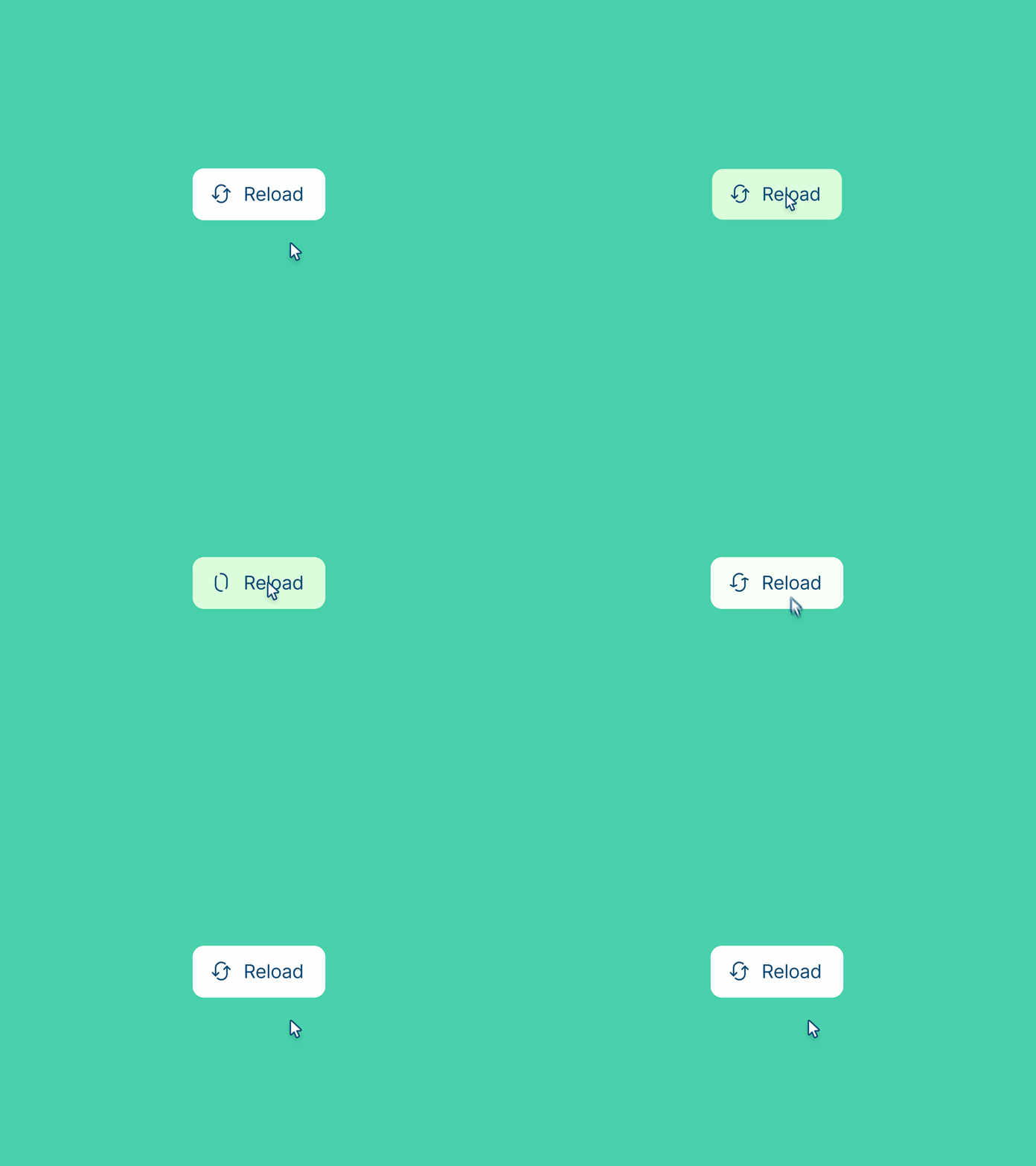
Let's be honest, when designing a website or app, it's easy to get swept away by the big picture.
We obsess over layout, color palettes, and the perfect typography. But often, the real magic – the stuff that makes a user experience truly sing – lies in the tiny details, the subtle nuances that often go unnoticed: microinteractions.
"Chris, microinteractions? Seriously?"
Yes, I'm totally serious. Microinteractions not only enhance the visual appeal of a design but also play a crucial role in improving accessibility.
These subtle, functional animations or responses can provide users with valuable feedback, guide their actions, and make interfaces more intuitive for individuals with varying needs.
I'm not talking about flashy, over-the-top animations here.
I'm talking about the subtle feedback, the gentle nudges, the quiet affirmations that guide users through their digital journey.
Think about it: the satisfying click of a button, the gentle whoosh of a dropdown menu, the progress bar that subtly communicates how long you’ll be waiting.

These aren’t just pretty graphics; they’re signals, whispers of acknowledgment that reassure users that they’re on the right path.
A well-designed microinteraction isn’t just about aesthetics; it's about functionality and feedback. It's about instantly communicating to a user that their action has been acknowledged and is producing the desired result.
It's the equivalent of a friendly nod from a shopkeeper, a reassuring smile from a waiter, or the satisfying thunk of a perfectly closed door. These small moments build trust, create delight, and ultimately, shape the entire user experience.
But here’s the thing: microinteractions, like spices, can be overdone.
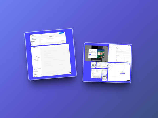
Obviously as a functional piece of UI, the animation here is over the top. It at the least shows the designers chops in creating animations. Source: Mauricio Bucardo
Too much flash, too many unnecessary animations, and suddenly your interface feels like a chaotic circus. A clunky loading animation can make even the simplest task feel agonizingly slow. An overly complex hover effect can be distracting and even disorienting.
So how do you nail the perfect microinteraction?
Well, first, you need to remember that it’s not about showing off your animation skills – it’s about serving the user. Every interaction should have a clear purpose.
Ask yourself: What action is the user performing? What feedback do they need? And how can you deliver that feedback in a way that is both clear and delightful?
The Anatomy of a Killer Microinteraction
Let's break it down. A great microinteraction usually consists of a few key elements:
- The Trigger: This is the user action that initiates the microinteraction. It could be a click, a hover, a swipe, or even a timed event.
- The Rules: This dictates what the microinteraction will do and how it will behave. For example, a loading animation might change speed or appearance depending on the progress.
- The Feedback: This is the visual, auditory, or haptic response that informs the user of the action. It could be a subtle animation, a change in color, or even a satisfying sound.
- The Loops & Modes: How long does the interaction last? Does it repeat? Are there different states or variations that change the experience?
Let’s look at some examples:
- The Good: A well-designed "like" button that subtly animates and changes color upon a tap. Or a text field that changes color and displays a checkmark when a password meets the required criteria. These are small, focused interactions that provide clear and satisfying feedback.
- The Bad: A loading animation that’s clunky, slow, or feels like it’s lagging. Or hover effects that are too distracting or unpredictable. These create frustration and confusion.
- The Ugly: That jarring, over-the-top animation that feels completely out of sync with the rest of the design. Or those tiny little interaction targets that are almost impossible to tap with any degree of accuracy. These are just plain offensive.
A Holistic Approach
Here’s where we get a little spicy: I'm tired of seeing microinteractions treated as an afterthought.
They're not sprinkles on a cupcake; they’re a crucial ingredient in the recipe. So, let's stop just throwing in default animations and actually design these micro-moments with intention and purpose.
Let’s move beyond the “make it pretty” approach and start thinking about how these small details can truly enhance the user's journey.
Loading Microinteraction. Source: Maximillian Piras
It’s time we embraced the power of the small. It’s time we obsessed over the nuances and the subtleties, and create microinteractions that are not just functional, but genuinely delightful.
The user experience is a sum of its parts, and those tiny interactions often add up to the biggest impact.
So, next time you’re designing, don’t just think about the big picture. Zoom in, pay attention to those micro-moments, and make sure that every interaction, no matter how small, sings. Because when you get them right, it’s more than just good UX; it’s magic.
And frankly, that’s what good design is all about.
Let’s all strive to be the type of designer that cares about all the details, not just the big ones. Our users (and our portfolios) will thank us for it.


