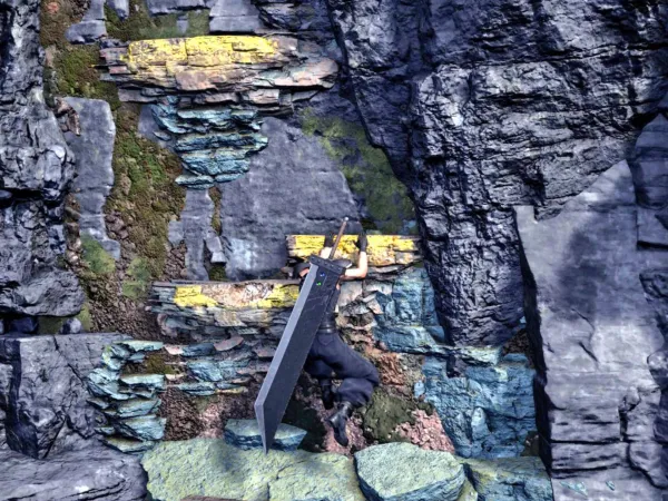
There's no question that guiding players with visual cues has been a part of video games for years.
Want to save your game in Tomb Raider (1996)? Just walk over to the giant, floating blue crystal. Not sure where to go in Final Fantasy VII (1997)? Just follow the arrow that highlights exits.
While the idea of using "yellow paint" to highlight interactive objects feels new, the underlying concept has been around for a long time.
Game designers may choose to provide hints either diegetically or non-diegetically, but at the end of the day, they’re still guiding players. Even so, the use of yellow paint continues to spark online debates about its effect on immersion and the quality of game design.
So, is this a genuine concern, or has it been overblown by a handful of chronically online critics looking for debate?
Understanding the Use of Yellow Paint
Players sometimes criticize the use of yellow paint because it can, apparently, disrupt immersion. In many games, there may be no logical reason for ladders, cliffs, or other interactable objects to be marked with the same bright color.
This uniform highlighting can make players feel patronized, as if they need obvious indicators to progress. However, not all uses of color-coded guidance receive criticism.
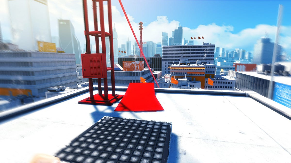
For example, "Mirror's Edge" employs red highlights, known as "runner's vision," to denote climbable pipes, balance beams, and springboards.
This approach was well-received because it fit the game's narrative and wasn't the sole path forward. The game offered multiple routes, allowing players to choose their path, which maintained engagement and challenge.
If you look back to the '90s and '00s, designers avoided using bold, attention-grabbing colors to mark important objectives. Instead, they subtly highlighted environmental features to guide players.
A climbable rock face might have distinct vines or handholds, making it clear to players without additional highlighting. For instance, in "Pokémon," specific trees that could be cut down were visually distinct, leaving little room for confusion.
With increasingly detailed graphics, have environments become so cluttered with superfluous details that important interactive elements are now harder to spot? Possibly.
To tackle this issue, developers often rely on highlighting the way forward to keep players on track and avoid frustration.
Reworking art assets or shifting the overall art style could potentially be a massive undertaking, requiring significant time, effort, and resources. Highlighting key elements becomes a simpler, more practical solution, even if it’s not always the most immersive one.
At the time of writing this article, I'm playing through Uncharted 2: Among Thieves, and I keep getting pulled out of the experience because the game constantly throws on-screen hints at me.
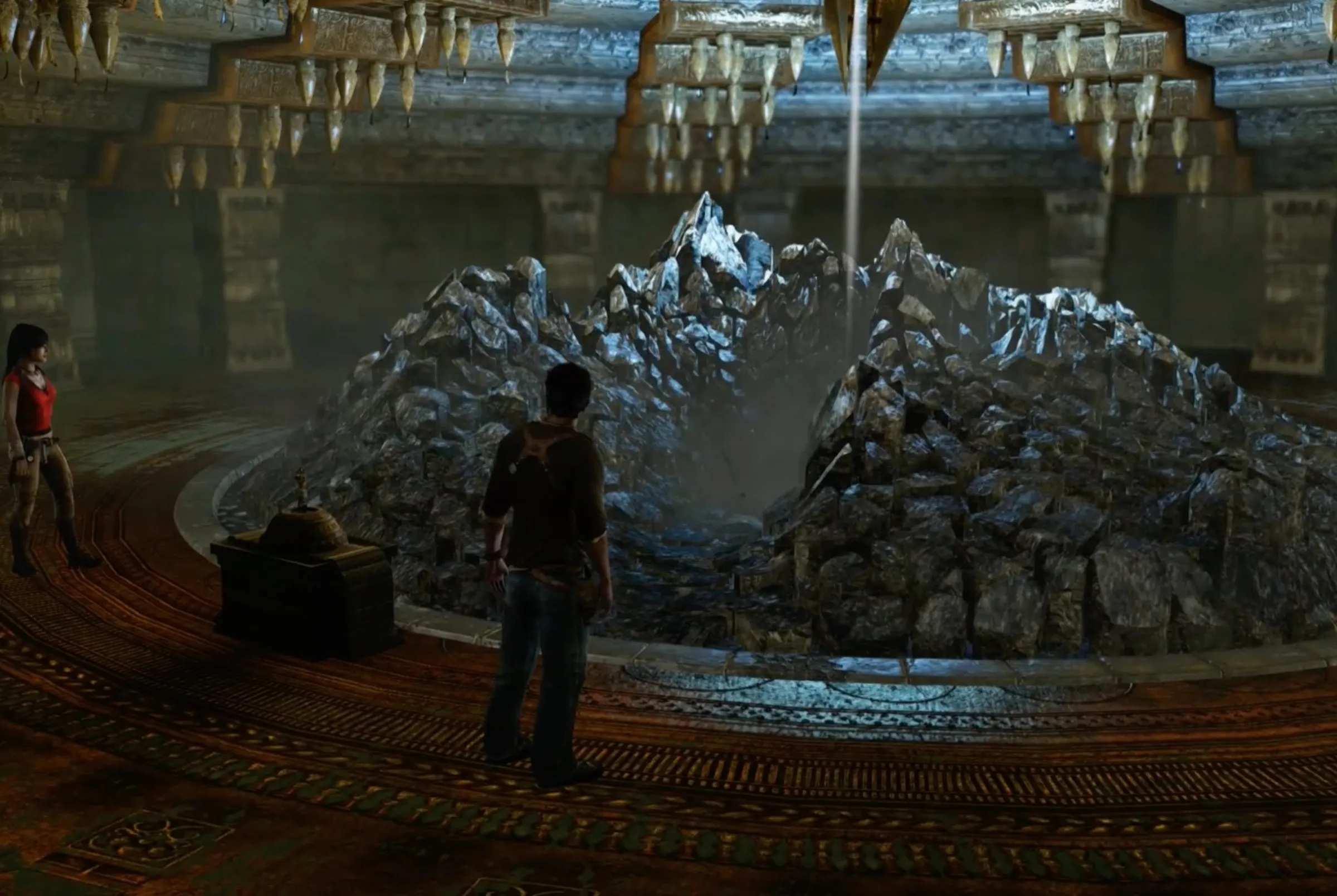
Isn’t yellow paint a more subtle, diegetic, way to address what’s essentially a non-diegetic UI?
The Implications of Overusing Visual Cues
As it happens, leaning too much on visual markers like yellow paint or non-diegetic UI can point to deeper problems in game design.
It suggests a focus on functional utility over engaging mechanics.
What does that mean?
In games where climbing boils down to spotting an interact point and pressing a button, the mechanic can often feel shallow and uninspired. It lacks any real challenge or engagement, reducing what could be an exciting gameplay element to a repetitive task.
While it adds variety to the player's experience, it often fails to provide depth or purpose, making it feel like filler content designed to pad out the game rather than enhance its overall design.
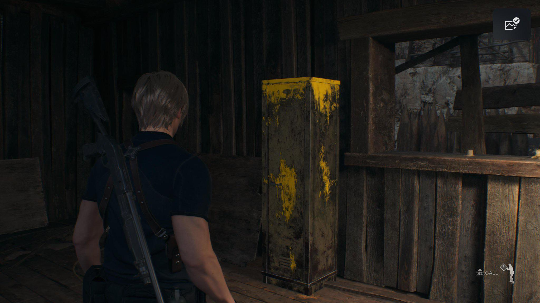
Instead of encouraging creative problem-solving or rewarding exploration, these mechanics risk becoming forgettable distractions.
Conversely, some players might not mind if climbing or other similar mechanics are simplified into straightforward, almost menial tasks. For these gamers, such elements serve as a way to break up the action and provide a moment of pacing rather than being a core challenge.
If the game shifts its creative energy into delivering memorable boss fights, elaborate set pieces, or tightly crafted combat encounters, players may find this trade-off worthwhile.
After all, not every aspect of a game needs to demand intense focus or mastery—sometimes, simplicity in one area lets the standout moments shine even brighter.

Notoriously difficult games like "Bloodborne" or "Elden Ring" avoid such highlighting. They focus on creating interesting challenges by combining environments and enemies in ways that require players to think strategically.
These games don't include unnecessary animations or actions unrelated to core gameplay, emphasizing substance over superficial polish.
To move beyond superficial design elements, developers should aim to create dynamic, challenging, and deep gameplay systems. This involves designing mechanics that test player skills and present interesting choices, rather than adding features that serve only as a means to an end.
For example, "Spider-Man 2" (2004) featured a web-slinging system where Spider-Man's webs attached to actual objects in the environment, allowing for realistic pendulum-like swinging.
This dynamic system added depth and required skill, enhancing player engagement. In contrast, later games simplified this mechanic, allowing web-slinging without environmental attachment, which reduced the challenge and immersion.
Similarly, "Mirror's Edge" treated parkour as a platforming challenge, offering a variety of contextual animations for specific environmental interactions. This design encouraged players to master the mechanics and explore different routes, providing a more rewarding experience.
Yellow paint and other visual cues can help players navigate, but leaning on them too much can show cracks in game design.
To make games more immersive and engaging, developers should focus on creating systems that challenge players and reward exploration, rather than relying on flashy shortcuts.
The thing is, as graphics get more detailed, this kind of trade-off feels unavoidable. You either make key parts of the environment stand out with bold colors, or you use UI elements to point the way.


