The Role of Loading Spinners and UX-Friendly Alternatives
You spin me right round baby, right round...


Loading spinners, ubiquitous on the web, are graphical indicators that signify ongoing processes, usually associated with data loading or system actions initiated by a user.
These elements, while simplistic, play a vital role in enhancing user experience. By providing visual cues during periods of waiting, users are informed that something is happening and that they’ll need to wait to progress.
So in this article, we’ll delve into the significance of loading spinners, shedding light on their role in improving user experience. We’ll explore real-world examples to illustrate how these dynamic indicators contribute to smoother online interaction.
We’ll also cover when spinners aren’t useful — there’s a time and place for them.
Understanding loading spinners
Throughout history, numerous unfortunate incidents have occurred as a result of insufficient system feedback.
The airline industry, space industry, and even the automotive industry have all had incidents in which feedback should have been communicated effectively, but wasn’t, which resulted in tragedy or misfortune.
The Mars Climate Orbiter mission failed due to a navigation error caused by the use of metric units instead of imperial units in the software.
This discrepancy in system feedback and unit communication led to the spacecraft approaching Mars at too low an altitude, causing it to burn up in the Martian atmosphere.
While the work NASA continues to do is far removed from your average loading spinner, the intent is similar. Communication is imperative for users to reach their goals, just as it was imperative for the Mars Climate Orbiter to complete its mission.
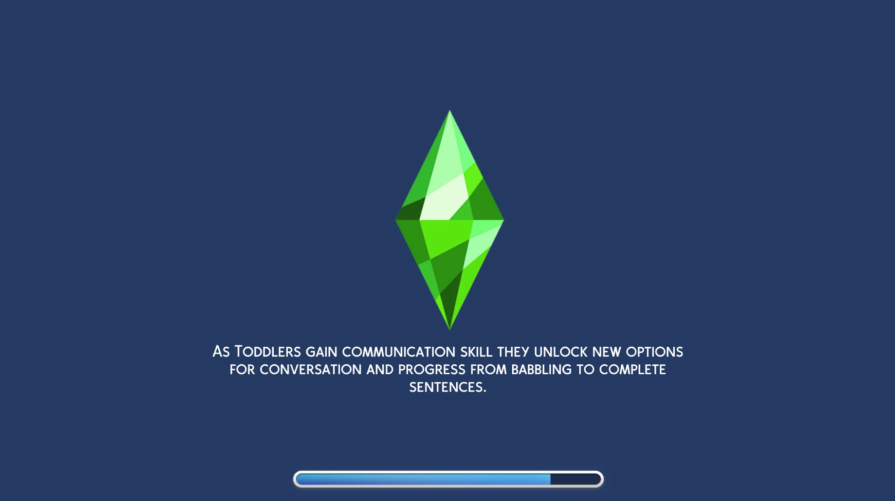
Loading spinners, commonly encountered on websites and apps, are dynamic graphical elements designed to convey an ongoing process or action to users.
These animated indicators typically manifest as rotating circles, pulsating dots, or other visually distinctive patterns.
The spinner’s purpose is to offer immediate visual feedback during instances where a system is processing data, performing an action, or fetching information.
While some instances can be visually inventive, it’s the animation of the design that alludes to something loading in the background.
N.B., in public spaces like airports, train stations, or amusement parks, there are often signs or displays indicating that a process is underway, such as baggage handling, ticket validation, or ride preparation. These signs serve a similar purpose to “loading spinners” by informing people that something is happening and asking for their patience.
The essential function of loading spinners is to bridge the gap between user input and system response, preventing ambiguity or frustration during brief wait times.
By signalling that an operation is in progress, these spinners provide users with a sense of assurance, communicating with them that their request is being addressed.
This simple yet effective visual cue contributes significantly to a more transparent and user friendly online experience.

Imagine waiting for an elevator in a busy office building. As you press the button to call the elevator, a digital display lights up with a spinning animation or a progress bar, indicating that the elevator is on its way.
This visual cue serves as a real-life loading spinner, reassuring you that your request has been acknowledged, and the system (in this case, the elevator) is working to fulfil it.

The spinning animation provides a clear signal that something is happening behind the scenes, making your wait more tolerable and reducing uncertainty about when the elevator will arrive.
In this everyday scenario, the loading spinner concept translates seamlessly into the physical world, offering a practical analogy for its significance in providing user reassurance during waiting periods.
What is the purpose of a loading spinner?
Because users encounter them regularly, spinners are crucial in communicating that something is going on behind the scenes.
Imagine the frustration users would experience with no indication of loading. They click and need to wait while staring at a blank screen. Questions would arise if the website or app is doing anything, if it’s broken, or if the user has done something wrong themselves.
In the realm of digital design, managing user expectations during loading times is a pivotal aspect of creating a positive user experience.
Long loading times can lead to frustration and abandonment, making it essential to keep users informed about ongoing processes.
We know that loading spinners reduce the sense of anxiety on behalf of users, but why is that?
Visual feedback
User experience is, more or less, about effectively managing a user’s cognitive load, informing them of what’s going on at all times, and making sure they can get from point A to B.
Loading indicators do this because they provide visual feedback, indicating ongoing processes and reducing uncertainty, thereby alleviating anxiety.
This immediate response fosters a perception of system efficiency and responsiveness, enhancing the overall user experience. Simultaneously, loading spinners occupy users’ wait time, making brief delays feel more manageable and preventing frustration.
By preventing premature exits and reassuring users of system activity, these spinners contribute significantly to smoother and more user-friendly interaction with the application.
Reducing perceived wait time
Loading spinners not only convey the notion of ongoing processes but also play a psychological role in reducing the perceived waiting time.
The animated nature of spinners captures the user’s attention, making the wait feel more engaging and less tedious.
As users watch the spinner, they are cognitively reassured that their interaction with the website is actively progressing.
Reducing user error
Imagine you’re using a banking app. When initiating a bank transfer without the presence of a loading spinner, users may find themselves uncertain about the transaction’s progress.
Without a visual cue, they might contemplate whether to wait patiently or risk triggering another transaction by attempting the process again.
This lack of feedback can lead to user frustration and potential confusion.
Drawing parallels with the scenario of submitting a form on a website, the absence of a loading spinner in the banking app leaves users without the assurance that their transaction is actively being processed.
Incorporating a loading spinner would not only keep users informed about the progress of their bank transfer but also prevent unnecessary repetition of actions.
Much like in e-commerce, where loading spinners during checkout processes offers transparency and keeps users updated on transaction progress, integrating a spinner in the banking app can enhance the overall user experience by providing clarity and guidance during crucial financial transactions.
Types of effective loading spinners
Loading spinners come in various types, each with its own visual appeal and design characteristics.
Here are some common types:
Circular spinners
Perhaps the most ubiquitous, circular spinners feature a rotating circle or set of circles. They are straightforward, providing a clear indication of ongoing activity, normally after a user has navigated to a new page within a website or app.
In the below example, we’ve added a product to the basket — as it takes the system a few seconds to complete this action, the yellow button turns to gray, with a circular spinner indicating that it is adding to the basket.
This is a good example of a circular spinner that is contextual.
It’s placed directly where the user has clicked, meaning they’re more likely to see and understand the meaning behind the animation:
Dots or ellipses
A series of pulsating dots or ellipses is another prevalent type. The pulsating motion offers a dynamic visual cue and is often used in loading bars.
In the example below, we can see the famous iOS typing indicator in iMessage, which uses a series or dots to communicate to the user that someone is typing:
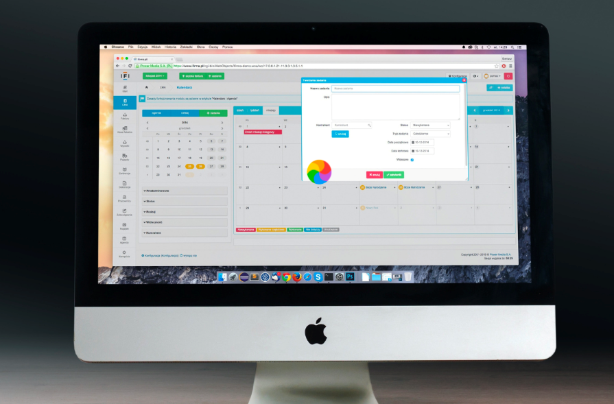
Hourglass spinners
Mimicking the classic hourglass shape, these spinners convey the idea of time passing. Just as with any other animation, they’re associated with actions that take time.
Rather famously, this was the default loading indicator in older platforms, like Windows 98.
When things took particularly long, the hourglass would rotate until loading was completed. Notice in the image below that printer information hasn’t loaded in yet, but the window appears regardless as a placeholder:
Custom shapes and icons
Some spinners take on specific shapes or icons relevant to the platform or brand. For example, a gear icon might rotate during system updates or settings changes.
Another operating system example, MacOS featured a pinwheel (or beachball if you prefer) that would spin whenever something was loading.
Unfortunately, this rather colorful custom shape is associated with the Mac freezing up entirely and requiring either a force quit or an entire restart:
Progress bars
While not traditional spinners, progress bars indicate the completion of a task.
They fill up gradually, offering a visual representation of the progress, and are almost as ubiquitous as loading spinners themselves.
These are often used in SaaS platforms, installations, or in game design to show progress. There are also two types of progress bars to consider.
Determinate
A determinate loading bar is a visual element on a website or app that displays progress with a clear endpoint, giving users a specific indication of how much has loaded.
Indeterminate
An indeterminate loading bar is a visual element on a website or app that shows ongoing activity without specifying the exact progress or endpoint, often represented by a continuous animation:
Text-based spinners
Instead of graphical elements, some loading indicators use text, such as “Loading…” or “Please wait.” This minimalist approach is efficient for conveying information.
Instances where spinners aren’t ideal
Fast processes
While loading spinners are valuable in many situations, there are instances where they may not be the most suitable choice.
One such scenario is when the expected loading time is exceptionally brief.
In cases where the processing time is so minimal that users might not even notice the spinner before the content appears, implementing a spinner might even create an impression of unnecessary complexity, and ironically, add more cognitive load and loading time for users.
Interactions that require immediacy
Another situation where loading spinners might not be the best choice is during critical interactions where immediacy is paramount.
For example, in emergency alerts or urgent notifications, the brief delay introduced by a spinner can be counterproductive.
Users in such contexts require immediate information, and any delay, even if just a few seconds, could lead to heightened frustration or anxiety.
Poor placement or too much complexity
In addition to timing considerations, the design and placement of loading spinners also play a crucial role.
If not implemented thoughtfully, spinners can become a source of user frustration. For instance, placing a spinner too prominently or using overly complex animations might draw unnecessary attention to the loading process, causing users to feel impatient or annoyed.
As with most animations in web and app design, less is more.
Balancing the need for transparency with the avoidance of unnecessary waiting times is key to optimising the user experience and mitigating potential drawbacks associated with loading spinners.
Alternatives to loading spinners
Alternative methods exist for indicating progress or managing waiting times, each with its unique advantages.
One effective approach is the use of skeleton screens or content placeholders.
Instead of a traditional loading spinner, these methods display an outline or simplified version of the expected content, giving users a visual indication of where information will appear:
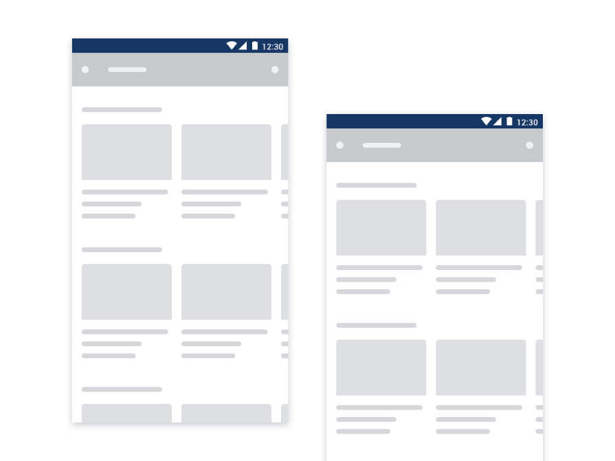
Providing clues for how the page will ultimately look is the critical difference between skeleton screens and loading spinners.
During webpage loading, a skeleton screen will display the layout of a page’s elements before the actual content loads, offering a more gradual and visually appealing transition.
Skeleton placeholders have evolved to become a bit of a standard in SaaS or social media, incorporating features like a shimmering loading effect.
Using a skeleton placeholder reduces cognitive load by providing a visual structure of content before it fully loads.
This temporary preview helps users anticipate the layout, easing the wait and enhancing the overall user experience.
Conclusion
In conclusion, loading spinners play a crucial role in enhancing user experience by providing visual feedback during wait times, managing expectations, and reducing perceived wait times.
They serve as valuable tools, offering a transparent communication channel between users and systems during ongoing processes.
However, as with any design element, the key lies in context-aware choices. In the dynamic landscape of web and app design, the continuous pursuit of user-centric solutions remains paramount.
Designers and developers are encouraged to stay attuned to evolving user expectations, experiment with different approaches, and choose loading indicators that align seamlessly with the unique characteristics of each interaction.
Through this mindful design strategy, we can collectively contribute to a digital environment that not only respects users’ time but also enhances their overall satisfaction and engagement.