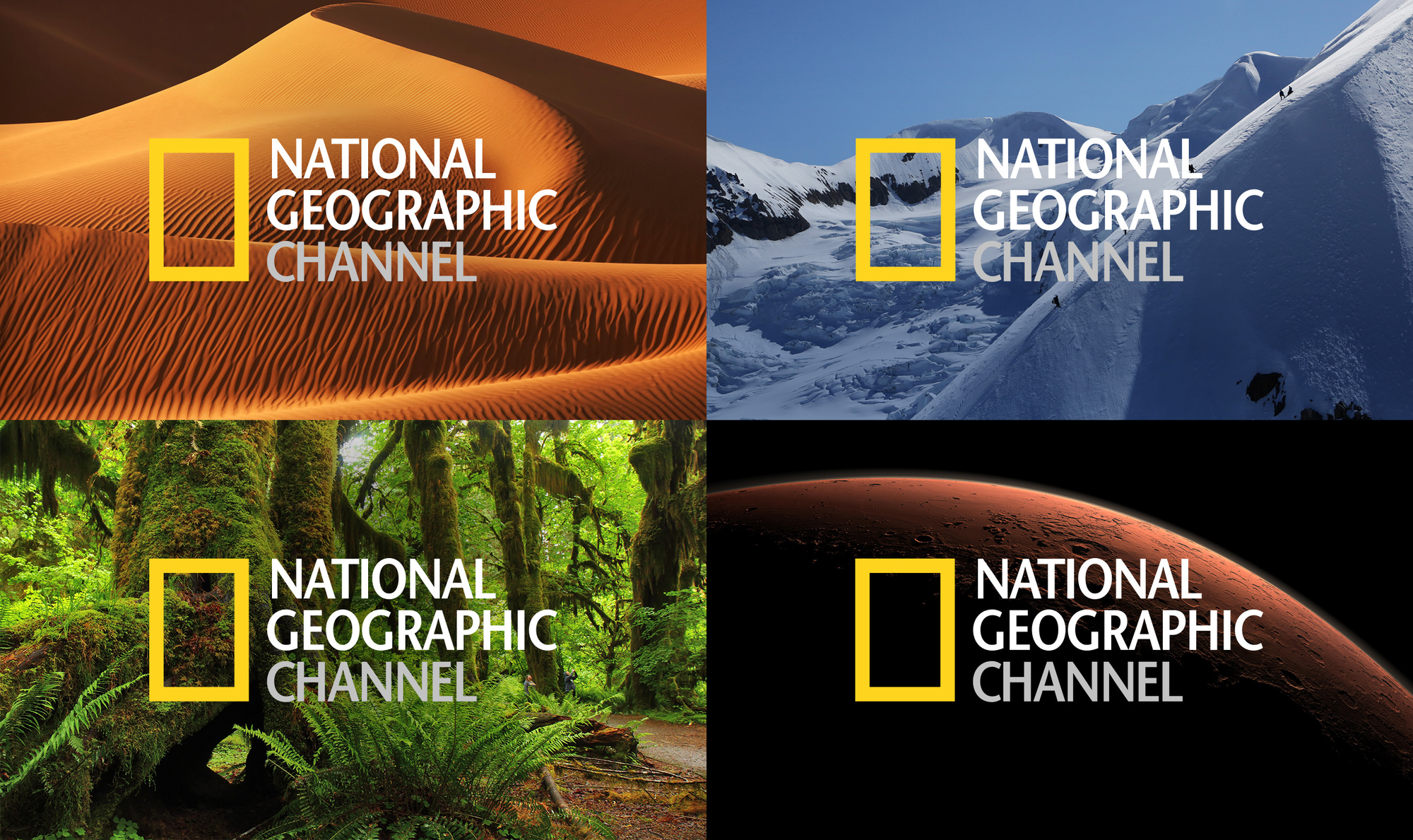
The National Geographic logo is one of those rare icons that doesn’t try to be loud but instead pulls you in with quiet confidence.
Just a yellow rectangle sitting next to the brand name—yet, the moment you see it, you're transported.
You’re taken to far-off places, deep seas, towering mountains, and distant galaxies. This little rectangle has become a portal to the world, a window into everything worth exploring.
But how did such a simple shape manage to become so powerful?
Simplicity That Speaks Volumes
The simplicity of the National Geographic logo is its biggest strength.
It’s just a yellow rectangle—nothing more, nothing less. But with this shape, National Geographic has managed to communicate an entire brand identity.
It's no accident.
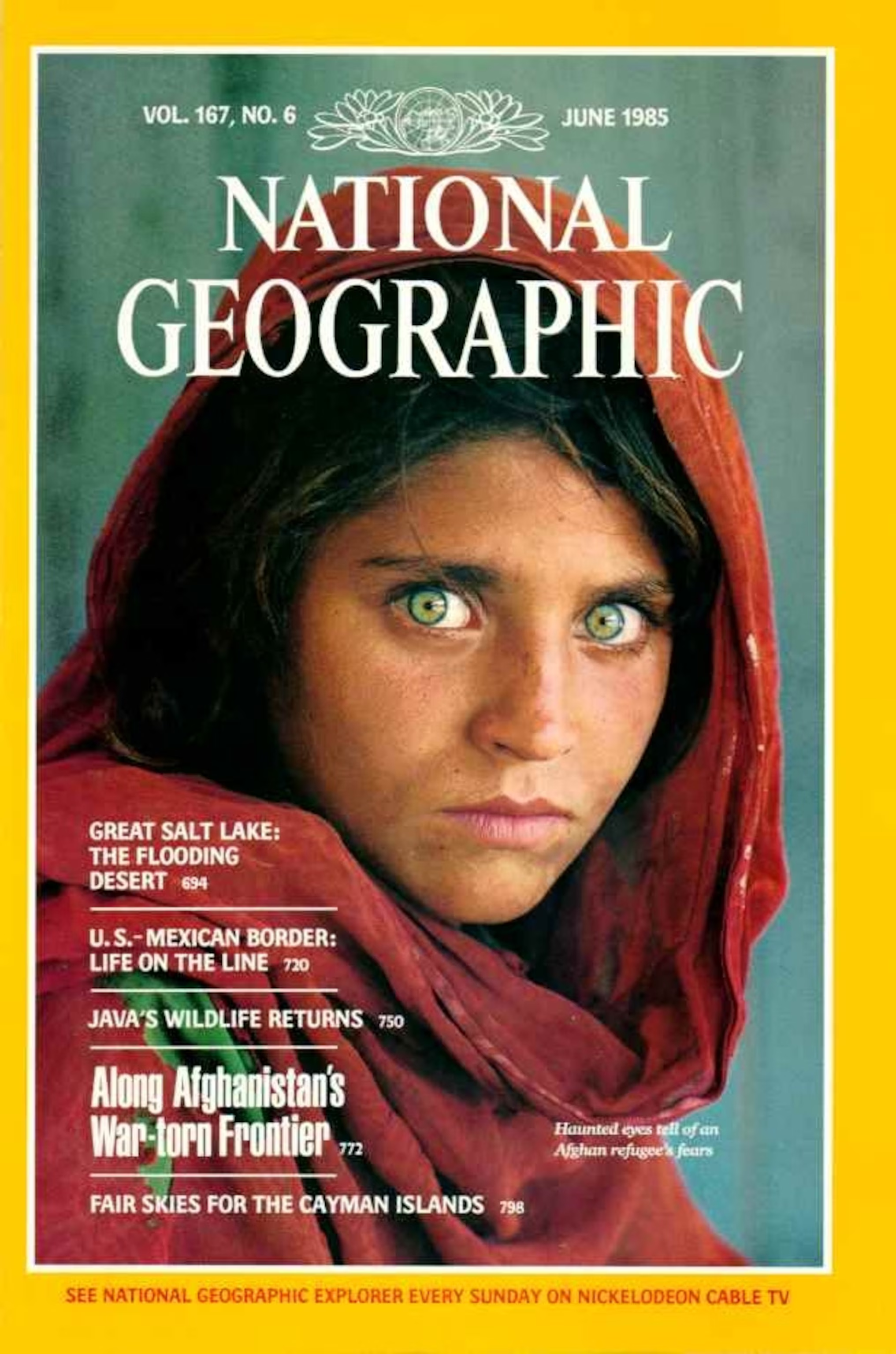
For decades, that yellow rectangle has graced the cover of each magazine issue, framing stories of wildlife, science, and culture. In a way, the logo has come to feel like a doorway, inviting readers to open up the world.
You might say it’s not just the logo design itself that’s remarkable—it’s the decades of effort the company has invested to make this logo so recognisable.
And that’s the genius: it doesn’t need to explain itself. It just lets you in.
Colours can do a lot of heavy lifting, and yellow is perfect for National Geographic.

It’s warm and full of energy, a shade that brings to mind the sun, light, and discovery. When you see that yellow, you can almost feel the buzz of adventure waiting inside.
It's a colour that’s meant to inspire curiosity and bring joy—perfect for a brand that exists to explore and reveal the wonders of our planet.
While other brands might use flashy logos or overly complicated graphics, National Geographic proves that sometimes a single, bold colour can say everything.
A Consistent Icon in a Changing World
One of the things that makes the National Geographic logo so powerful is that it’s universal.
That simple yellow rectangle doesn’t require any translation. You can show it to someone halfway around the world, and if they know National Geographic, they’ll recognise it immediately.
That’s the beauty of minimalism—it breaks down barriers and becomes a shared symbol. In a world with so much noise, this logo whispers, and it speaks to everyone.

Since its inception, the logo has hardly changed.
This consistency has built an enormous amount of trust with the audience. While other brands rebrand, redesign, and try to reinvent themselves, National Geographic has held steady.
That yellow rectangle is like an old friend—it’s familiar and reliable.
In a world where so much changes constantly, this small piece of consistency is grounding. It tells viewers, “We’re still here, still exploring, still uncovering the mysteries of the world.”
The yellow rectangle doesn’t stand alone.
It’s part of a much larger identity—the iconic magazine covers, the mesmerising photography, and the TV network that brings exploration right into people’s homes.
The logo serves as a window into this larger ecosystem. On its own, it’s simple, almost humble.
But within the full context of National Geographic’s brand, it comes alive, representing so much more than just a magazine or a channel. It represents a way of seeing the world.
In the end, the National Geographic logo shows us that a brand doesn’t need a flashy, complex logo to make an impact.
Sometimes, it’s about restraint, about letting a simple shape and a single colour do the talking.
With just a yellow rectangle, National Geographic has built one of the most recognisable logos in the world—a reminder that sometimes, the strongest designs are the ones that leave room for imagination.


