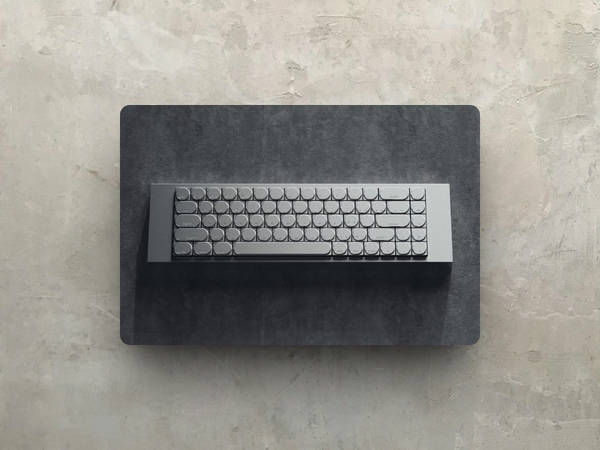
The GameCube might not have hit the sales numbers Nintendo was aiming for, but its legacy still holds up.
The logo, which fans still love today, is one of the most iconic in gaming. At first glance, it looks like a pretty basic geometric shape, but when you take a closer look, you can see how smart and eye-catching it really is.
The clever use of negative space and that bold purple color make it a standout piece of minimalist design.
Even though the console didn’t rule the market, its impact and iconic status are impossible to ignore, and it’s still a favorite among fans and designers.
The Anatomy of the Logo
Note: I never owned a GameCube, so forgive me if this all sounds super obvious to you: but this is genuinely one of the best gaming logos I've seen.
The logo is made up of two main parts: a big cube and a smaller cube tucked inside it. The big cube takes up most of the design, while the smaller one creates negative space that’s just as important as the cubes themselves.
Together, they cleverly form the letters “G” and “C. The “G” comes from the big cube, and the “C” is hidden in the negative space around the smaller cube. It’s a perfect example of how a simple design can pack a big punch.
The logo is usually purple, a color that became super tied to the GameCube. Purple is bold and unique, helping the console stand out from the crowd of other systems that mostly stuck to black, gray, or white.
It’s a fun color but also has a cool, stylish vibe that fits the console’s personality perfectly. One of the most interesting things about the GameCube logo is its use of negative space.
Negative space is the area around and between the main parts of a design. In this logo, the smaller cube creates the curve of the “C.” This turns a simple shape into something more clever and engaging.
This use of negative space is a sign of great design. It’s subtle at first, but once you notice it, it’s hard to miss.
It’s the kind of detail that makes you appreciate the design more, much like the GameCube itself, which had many innovative features that weren’t obvious right away.
A Logo That Reflects the Console
The GameCube logo does a great job of representing the console. That’s not something you see often.
Nintendo’s earlier consoles had a more traditional look, but the GameCube was different—small, cube-shaped, and easy to carry. The logo reflects that simplicity. It’s clean, recognizable, and practical, just like the console itself.
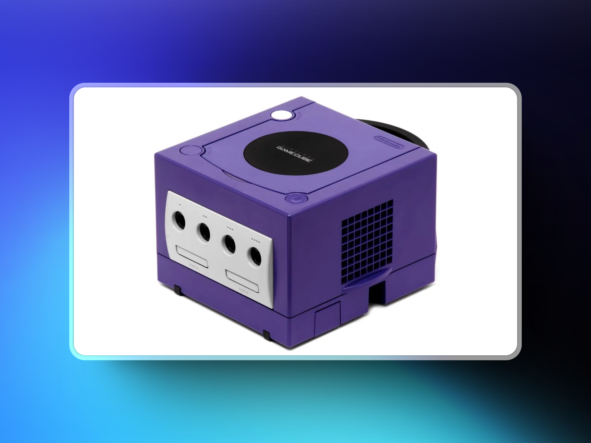
It also captures the playful side of the GameCube, banking on Nintendo's creativity. With games like Mario, Zelda, and Pokémon shaping its legacy, that makes sense.
So while the GameCube wasn’t a massive commercial success, its logo is still talked about to this day.
Designers and branding experts point to it as an example of great logo design. It proves you don’t need anything flashy to make something memorable—just a well-thought-out shape and some clever use of negative space.
Over the years, the logo has taken on a life of its own. It shows up in fan art, memes, and even tattoos, which says a lot about how strong the design is.
The console itself might be a nostalgic piece of the early 2000s, but the logo remains just as recognizable.
The GameCube logo is a masterclass in minimalist design. Simple shapes, smart use of space, and a direct connection to the product it represents—it all comes together perfectly.
Even now, it’s a reminder of how a well-crafted logo can leave a lasting impact. Next time you see that purple cube, take a second to appreciate the thought that went into it. A small design, but a big statement.


