
The Iconic VAIO Logo: A Study in Minimalist Perfection
VAIO's ingenious logo brilliantly fuses minimalism, analogue/digital symbolism, and rich conceptual meaning

When it comes to logo design, few brands have achieved the timeless elegance and instant recognisability of Sony's VAIO mark.
Designed by legendary Japanese designer, Teiyu Goto, the logo adorned the company's line of personal computers and laptops for over two decades, until Sony decided to get out of the PC game.
The deceptively simple VAIO logomark is a masterclass in minimalist expression and brand storytelling, and it's one of my favourite logo designs of all time.
Origins
Introduced in 1996 alongside Sony's first Windows computers, the VAIO name cleverly combines "Video Audio Integrated Operation." This was later updated to "Visual Audio Intelligent Organizer" for the brand's 10th anniversary in 2008.
Goto infused the VAIO's name and mark with rich symbolism.
While the deeper symbolic meanings behind the name and logo may not have been obvious to most consumers, the VAIO mark nevertheless became instantly recognisable and synonymous with personal computing, achieving brand recognition on par with iconic names like Dell, Gateway, and Apple.
Goto, who led VAIO brand concept, naming, logo, and product design as a start-up member from 1996 to 1998, infused multiple meanings into the logomark's simple letterforms.

At first glance, the VAIO emblem appears to be merely the word "VAIO" stylised in a clean, bold sans-serif typeface. Yet a closer look reveals Goto's ingenuity transcending minimalism.
The angled, perfectly chiselled terminals of the "V" and "A" letterforms subtly evoke the iconic "VA" monogram from a distance. This melding of letters into a distinctive icon burns into viewers' minds, ensuring instant brand recognition.
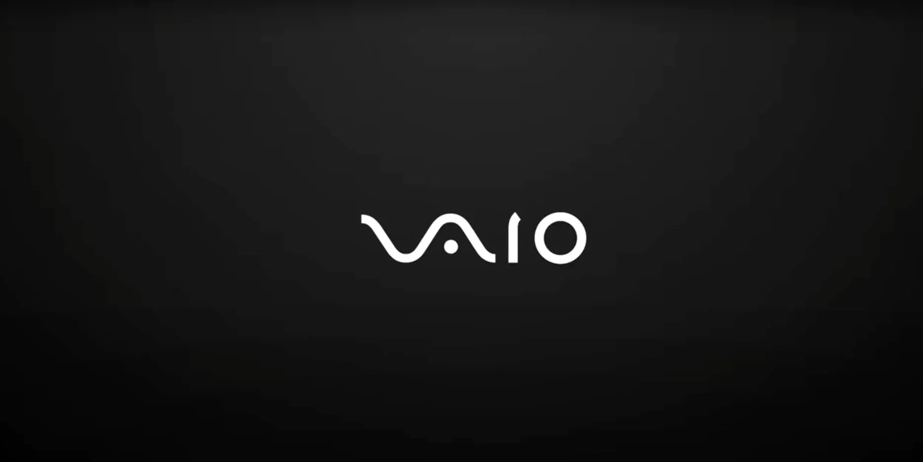
Furthermore, the intersecting angles form the shapes of both an analogue wave and digital binary digits, symbolising the convergence of Sony's analogue and digital expertise that gave life to VAIO.
"The 'V' and the 'A' in the logo are connected together to represent a sine wave, the basic analogue signal. The 'I' and the 'O' can also be interpreted as 1 and 0 which are used to represent digital signals in binary code." - Teiyu Goto
By stylising the "VA" as a waveform and "IO" as 1s and 0s, the logomark celebrates the brand's merger of analogue and digital technologies into an intelligent "computing organizer."
In an interview during the 90s, Goto said, "You wouldn't think of combining nature and PC together, however, VAIO has a strong relationship with nature."
While today's computers are mere machines, he envisioned them progressively becoming more aligned with humanity and the natural world. A somewhat prescient take, as the nature of computing transforms into something more "spatial".
"As this happens, I believe the VAIO name will endure, transcending our current notion of PCs. Even though VAIO may transform into something novel and distinct in the future, that evolution suits me just fine."
The name itself expresses a connection with nature. "VAIO sounds like the prefix 'bio', implying life, as in biotechnology," Goto explained.
While the VAIO logo didn't live on like Goto envisioned, it's legacy certainly has.
A Minimalist Masterpiece
Through subtle letterform angles, Goto united the name, monogram, and technological essence into one deceptively simple icon.
By combining visual economy with layered meaning, Sony's designers created a powerful minimalist identity that has endured for decades.

VAIO's iconic logo reminds today's designers that restraint, precision, and rich conceptual narratives can transform basic letterforms into compelling visual identities built to stand the test of time.
Its global recognition exemplifies the true mastery of thoughtful minimalism in an age of cluttered brand complexity.


Comments ()