The Apple Logo: Why the Bite Still Matters
A simple silhouette that's clean, friendly, and easy to remember. Typical Apple

It’s almost impossible to navigate the modern world without encountering it: perched on laptops, glowing from phone screens, adorning storefronts. The Apple logo, that simple silhouette of an apple with a neat bite removed, is more than just a corporate identifier.

It's a global symbol, a visual shorthand for innovation, design-led thinking, and a specific kind of technological aspiration.
Yet, its origins, dating back to 1977, lie in a moment of focused creativity by graphic designer Rob Janoff. He was tasked with giving a nascent computer company its defining mark.
What Could Have Been?
In 1977, Apple Computer, Inc. was barely a year old, a fledgling enterprise operating in a world where computers were often perceived as intimidating, complex machines.
Steve Jobs, alongside Steve Wozniak, envisioned something different: technology that was accessible, personal, and even friendly. They needed a logo that could communicate this departure from the norm.
Enter Rob Janoff, then working at the Regis McKenna agency. His brief was relatively simple, yet profoundly challenging: create a logo for a company named Apple.
Janoff’s approach was refreshingly direct. He bought a bag of apples, sliced them, and studied their shapes. His initial sketches explored the fruit from various angles, but he quickly gravitated towards the simple, iconic side profile.
The result was clean, instantly recognizable, and inherently approachable. Unlike the often cold, abstract, or overly technical logos prevalent in the industry at the time, Janoff’s apple felt organic and, crucially, human.
It hinted at knowledge and discovery, but without pretension.
It was a shape people inherently understood and felt comfortable with, perfectly aligning with Apple's mission to demystify technology.
The Bite and Its Significance
The masterstroke, however, was the bite. While often shrouded in tech folklore – linking it to Alan Turing, the byte (bite/byte pun), or biblical tales of knowledge – Janoff's primary stated reason was pragmatic.
He worried that the simple apple silhouette, especially at smaller sizes, could be mistaken for another fruit, perhaps a cherry tomato.
The bite immediately broke that ambiguity and, more importantly, provided an unmistakable sense of scale. It grounded the icon, making it clearly identifiable as an apple.
But the bite did more than just clarify; it imbued the logo with personality.
It suggested interaction, consumption, and perhaps a playful non-conformity.
It prevented the simple shape from feeling too generic or cartoonishly perfect. With that small subtraction, the logo gained a layer of intrigue and a quiet confidence.
It wasn't just an apple; it was the Apple.
Design Philosophy and Hidden Logic
Janoff's design sensibilities remarkably mirrored the philosophy Steve Jobs was beginning to cultivate for the company's products: intuitive, user-friendly, aesthetically clean, and purposeful.
Every element should have a reason for being there. The logo wasn't just a whimsical sketch. As Janoff himself has shown in sharing his process, there was a clear geometric underpinning.
The curves of the apple and the detached leaf floating above it were constructed using arcs from circles, adhering to principles of visual harmony and balance.

This underlying mathematical precision, hidden beneath the organic silhouette, speaks volumes about the ethos Apple would champion: complexity elegantly concealed by simplicity.
It demonstrated that minimalist design wasn't about lack of effort, but about rigorous refinement and logical construction.
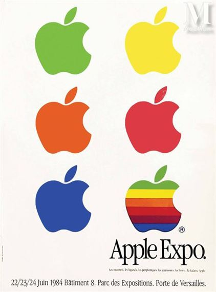
Even the original rainbow stripes – chosen to signify the Apple II's colour capabilities and make the brand feel more human and accessible – were applied with careful consideration to this fundamental shape.
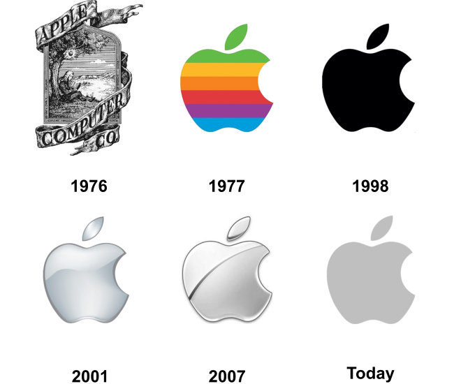
The true testament to the strength of Janoff's original design is its incredible longevity.
While the surface treatment has evolved over the decades – from the vibrant rainbow stripes (1977-1998) reflecting the excitement of color computing, through the sleek monochrome and translucent 'Aqua' phases mirroring shifts in industrial design.
To the current minimalist flat grey or white – the core silhouette has remained untouched for nearly half a century.

This resilience is rare in corporate branding. The shape itself is so potent, so inherently balanced and memorable, that it transcends stylistic trends. It adapts effortlessly, proving that the fundamental design was near-perfect from its inception.
It works small on a watch face and large on a billboard, instantly communicating the brand's identity.
For designers and brand strategists, the Apple logo serves as a perpetual case study and an enduring inspiration. It embodies the principle that simplicity is not the absence of complexity, but the mastery of it.
It's a powerful reminder that achieving a truly simple outcome often requires intense thought, discipline, and a willingness to strip away the superfluous until only the essential elements remain.
Each curve, the stem's angle, and crucially, that distinctive bite, earns its place. They work together to create something far greater than the sum of its parts.
Rob Janoff didn't just design a logo in 1977; he captured the nascent soul of a company that would change the world.
He gave Apple a visual identity that was as forward-thinking and user-centric as its ambitions, proving that a simple, well-considered mark could become one of the most powerful and enduring symbols of the modern age.
It remains a masterclass in balancing clarity, personality, and timeless appeal.