The $35 Design That Launched a Global Empire: Unpacking the Nike Swoosh Story
A student's $35 sketch for motion became Nike's iconic Swoosh


Think about the most iconic brand marks in the world.
Apple's bitten apple, McDonald's golden arches, and, undeniably, the Nike Swoosh. It’s a symbol so ubiquitous, so intrinsically linked with athletic achievement, speed, and determination, that it barely needs the accompanying brand name anymore.
It sits proudly on the shoes of marathon winners, the jerseys of basketball legends, and the gear of everyday athletes striving for their personal best. But this emblem of a multi-billion dollar empire didn't emerge from a high-priced design agency or a lengthy corporate branding exercise.
Its origins are far humbler, rooted in a student project and a payment that barely covered a decent meal.
Carolyn Davidson, Graphic Designer
Before Nike was Nike, the global sportswear behemoth, it was Blue Ribbon Sports, a fledgling company co-founded by Phil Knight and Bill Bowerman.
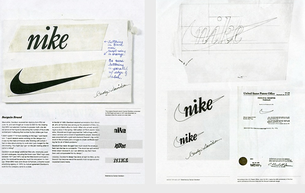
As they prepared to launch their own line of athletic footwear in 1971, they knew they needed a distinct visual identity. Knight, who was teaching accounting classes at Portland State University at the time to supplement his income, turned to one of his graphic design students, Carolyn Davidson.
The brief given to Davidson was famously, almost comically, vague. Knight didn't provide mood boards, target demographics, or extensive brand guidelines. The core requirement was simple yet profound:
- It needed to convey motion. That was the essence. The logo had to look like speed, like movement, like the dynamism the company wanted its shoes to embody.
Working for a modest $2 per hour, Davidson spent roughly 17.5 hours sketching and refining ideas. This wasn't about creating polished, presentation-ready mockups from the outset. Her process involved exploration and iteration:
- Handwritten Notes: Early concepts were often accompanied by handwritten thoughts and annotations, capturing the thinking process.
- Typographic Experiments: She played with different lettering styles, including script-like forms, trying to find a visual language that felt fluid.
- Focus on Form: Several concepts explored balance, proportion, and abstract shapes that could suggest speed without being literal representations of running or wings.
- Simplicity as a Goal: The designs weren't overly complex or ornate. They aimed for directness and function, reflecting the practical nature of athletic footwear.
From these explorations emerged a simple, curved checkmark shape – thicker at one end, tapering to a point, suggesting swift movement across a surface.
It was abstract enough to be intriguing, yet clear enough in its implication of speed and trajectory. This was the birth of the Swoosh. Davidson presented several options, and the choice landed on the mark we know today, though perhaps not with immediate, resounding enthusiasm.
Phil Knight's initial reaction has become legendary in branding circles. Faced with Davidson's final concepts, he wasn't instantly smitten.
His pragmatic assessment was: “Well, I don’t love it, but maybe it’ll grow on me.” It’s a refreshingly honest take, a far cry from the triumphant reveals often imagined in corporate lore.
It highlights that even visionary founders don't always recognize a game-changing element at first glance. Sometimes, effectiveness and familiarity need time to build.
Accepting the Swoosh
And grow on him – and the world – it did. The Swoosh was quickly implemented, appearing on shoes and packaging. Its inherent simplicity proved to be its greatest strength. It was:
- Scalable: It looked good tiny on a shoe tag and massive on a billboard.
- Versatile: It worked across different products, colors, and applications without losing its identity.
- Memorable: Its clean, dynamic form was easy to recognize and recall.
- Abstract: Not being a literal depiction of anything specific allowed it to represent the idea of sport, speed, and victory (fittingly, Nike is the Greek goddess of victory) in a broader sense.
Over the decades, backed by groundbreaking products and powerful marketing campaigns featuring transcendent athletes like Michael Jordan, Serena Williams, and countless others, the Swoosh transcended its status as a mere logo.
It became a symbol of aspiration, excellence, and the "Just Do It" mentality. The initial $35 investment yielded arguably one of the highest returns on investment in design history.
Nike didn't forget the student designer who gave them their mark. In 1983, as the company soared, they held a surprise party for Carolyn Davidson.
She was presented with a gold ring shaped like the Swoosh, embedded with a diamond, and, significantly, an envelope containing Nike stock – a tangible acknowledgement of the immense value her creation had generated.
It was a gesture that recognized her foundational contribution long after that initial $35 invoice was paid.
The story of the Nike Swoosh offers timeless lessons for designers, entrepreneurs, and marketers alike. It proves that groundbreaking ideas don't always require astronomical budgets.
Clarity of purpose – the simple need to "look like motion" – can be a more powerful driver than complex directives.
And perhaps most importantly, it shows that simplicity, when executed effectively and applied consistently, can achieve an iconic status that the most intricate designs might only dream of. Sometimes, you just need a clear vision, a bit of trust, and a mark that moves.