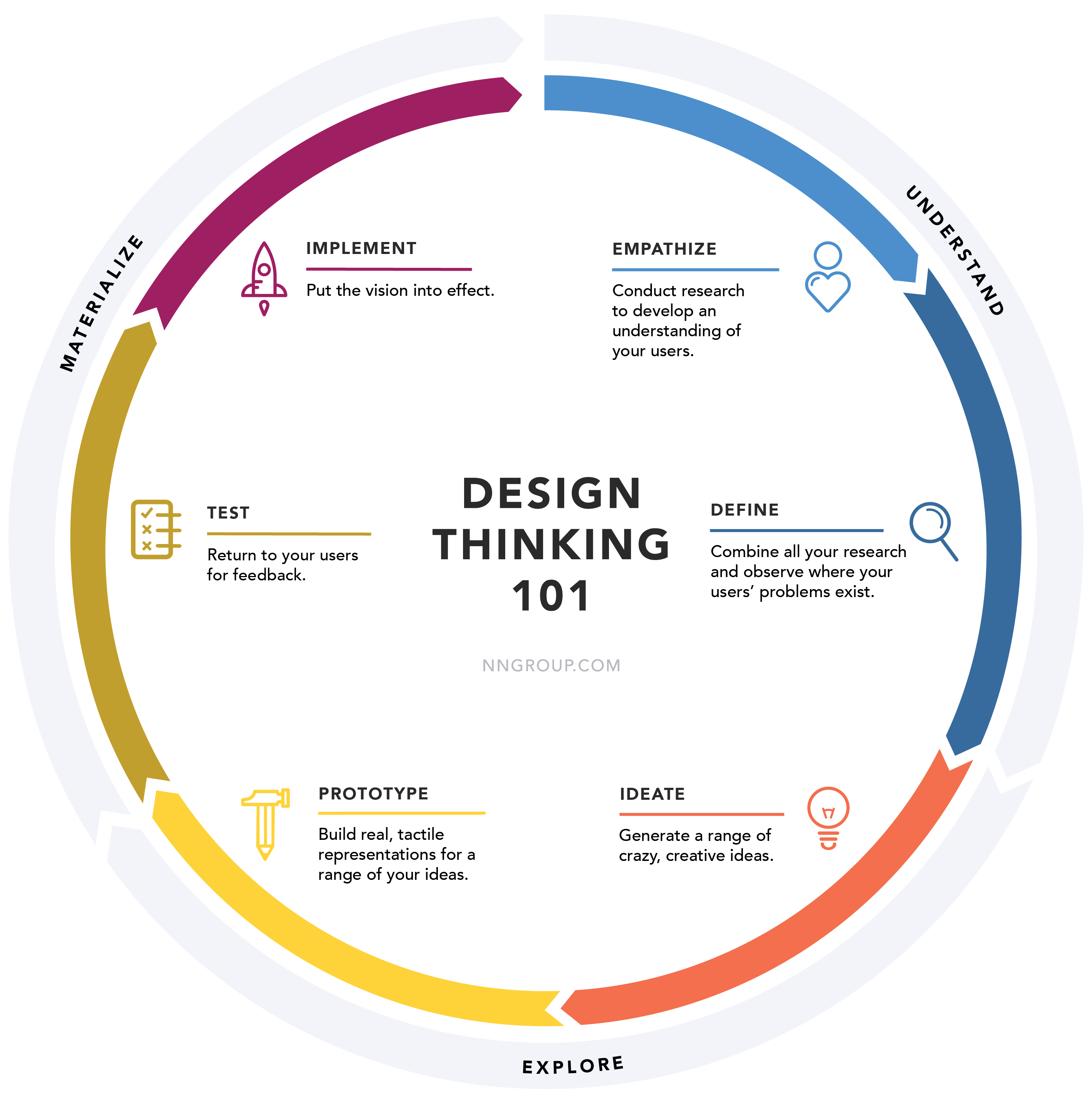
Design thinking: A human-centred approach that emphasises understanding user needs, ideation, prototyping, and continuous iteration.
I'm a fan, users are fans, and companies appreciate it because it typically boosts what matters most to them: profits. It isn't a new invention, having its roots firmly planted in the 1960s, but it has gained a reputation, especially now, in the world of design.
It's difficult to identify an industry that doesn't reap its benefits, with the possible exception of scientific fields, like rocket engineering. It has fallen out of favour with some, however, and while I won't delve into why that might be, I am interested in design thinking in the context of Tesla.
You see, I think that Tesla has a design problem.
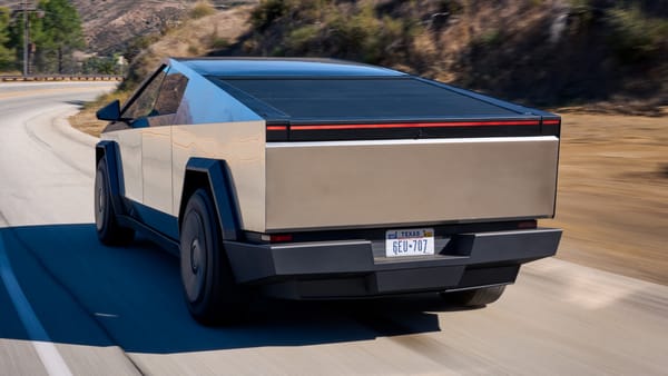
Their output seems to be increasingly devoid of what users need, which has ultimately culminated in the maligned "urinal on wheels", the Cybertruck.
But, at some point in the history of Tesla, design thinking was the differentiator. Other car manufacturers struggled to replicate Tesla's ability to tap into what drivers wanted from an EV.
Some years later, this isn't the case, as major car manufacturers have almost certainly caught up and even overtaken their ability to "design think". The Porsche Taycan, BMW i5 and even the diminutive Smart EQ Fortwo are just three examples of EVs in a now crowded market.
While this approach has catapulted Tesla to the forefront of the automotive industry, there appears to be a diminishing commitment from the company in recent times.
Maybe they're grappling with intense pressure, attempting to plug numerous leaks from other areas of the business. When that happens, design thinking is usually the first to be ejected into the void of poor business decisions.
Or, given Musk's control of Twitter and his multiple examples of pushing features on users they don't want or need, suggests he has a way of muscling into decisions hired professionals should be making instead.
Who knows?
Nowadays, their design compass doesn't point north; it points wherever Musk's vision leads, making the journey as unpredictable as a Tesla's Ludicrous Mode acceleration.
Buckle Up, buckaroos.
Understanding Tesla's Design Thinking Process
At some point, Tesla's design-thinking journey began with empathy.
If you don't start with empathy, well, you're not design thinking as much as you're throwing shit at the wall in the hope you produce something out of it. Sometimes it works, sometimes it doesn't, but ultimately design thinking is about hedging your bets, reducing risk and iterating on ideas.
Difficult to do in the automotive world, but not impossible. Tesla likely found this approach easier to navigate whenever they didn't have larger issues related to scaling the business up.
Alas, Tesla created EVs that the public genuinely wanted.
They still do want them, of course, but in fewer numbers than before. When overpaid YouTubers were asked what their dream car was, they'd say it was a Model S over the usual Lamborghini.
Tesla was making products that tapped into the consciousness of the public, even those with no interest in EVs, making them desirable to previously Lamboghini-loving kids.
They keenly understood their users, delving into their needs, desires, and pain points. This empathetic approach informed the ideation phase, where Tesla's creative minds brainstorm innovative solutions to meet and exceed customer expectations.
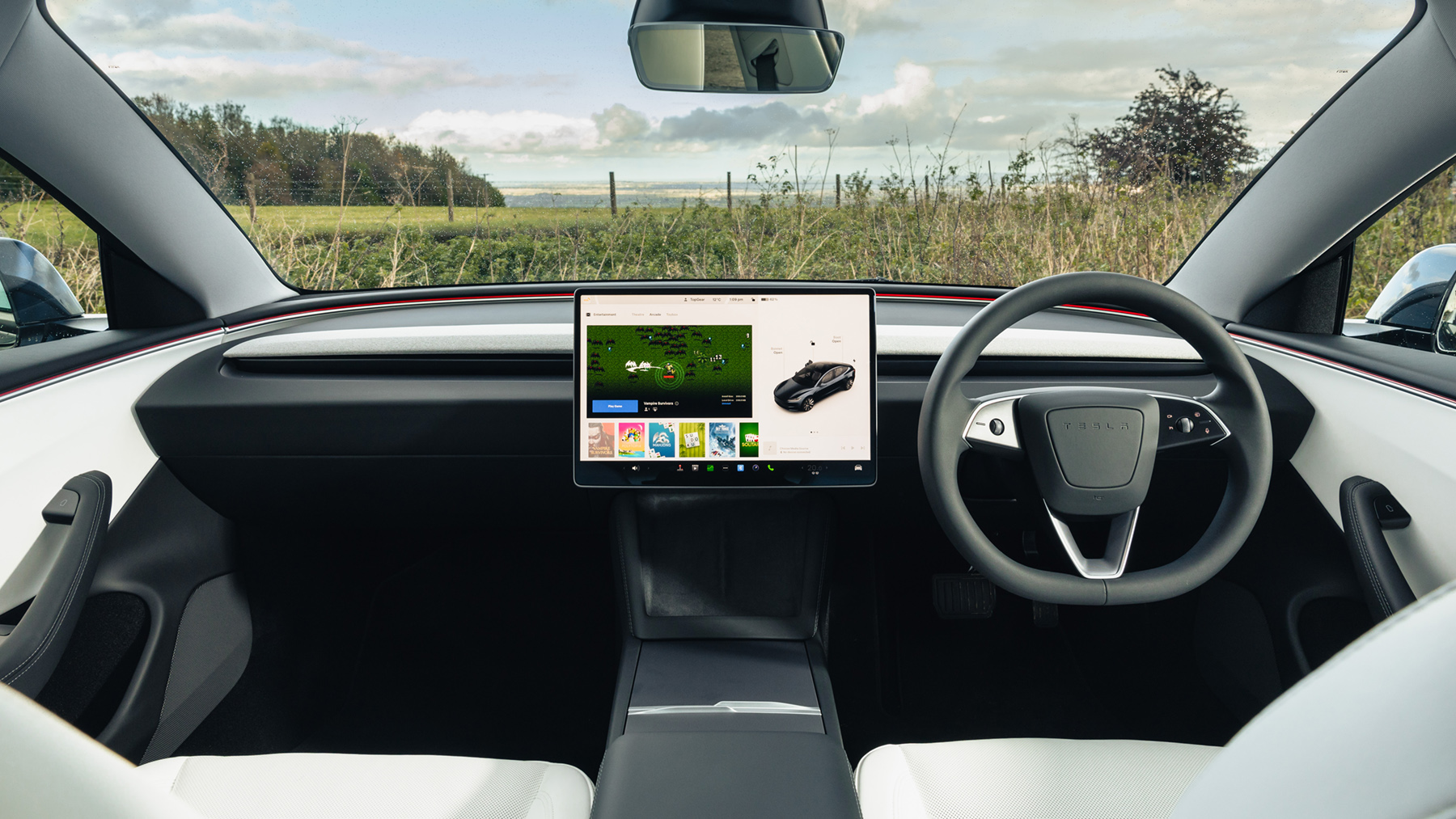
Yet, after all this time, design-related problems are beginning to mount. Quality issues, poor service experiences, buttonless interiors, freezing recessed door handles, and yoke-style steering wheels. I could go on.
While some of these issues are Tesla trying to scale too fast, a lot of design-related choices that Tesla thought drivers would benefit from, have brought up additional problems.
Cybertruck
So what's the rationale behind the Cybertruck's distinctive appearance?
Why does it struggle in specific situations, showcasing unexpected design flaws that seem out of place in Tesla's mature stage?
Ideas don't remain confined to the drawing board; they transition into prototypes. Those prototypes, within the automotive industry, usually make an appearance first in the form of clay.
Surely, Franz von Holzhausen, the head designer, didn't just throw together a clay model with random '70s influences and present that to Musk, right?
“We started unpacking existing pick-up trucks and realised that the market hasn't changed at all. In the early days we had a Lotus Esprit in the studio, the submarine car, and then started looking at what else was in this simplistic, angular theme; stuff like the F-117 Nighthawk and the Countach.
“Like Gandini, we wanted to do something dramatic that changed everything. I had this simple idea right in the beginning, this exoskeleton idea, a low-resolution looking type of truck. And out of that side project we made a full-size clay model to show Elon. And he's like, ‘that's what we're doing.’”
Oh. That explains the look of the Cybertruck then.
But it isn't just the Cybertruck, there's other instances where the design thinking process appears to have taking a backseat to ego, braindead decisions that cause the driving experience to shift into uncomfortable territory.
"There’s a considerable amount of unlearning that needs to be done when you get into a Model 3, because this isn’t like other cars on the market. Most of the investment is up front, messing with the settings like a new mobile phone. It’ll take you at least half an hour just to work out how to adjust the seats, but at least the car will remember everything when you've got it all to your liking.
"The latest company gimmick (presumably done for cost saving reasons rather than an earnest desire to innovate) is the indicators that have moved to the steering wheel. In fact there are no stalks left around the Model 3’s steering wheel, and it’ll be a few thousands miles before your hand is cured of its Phantom Indicator Syndrome." - Top Gear
Fundamentally, Tesla's design problems won't go away soon unless there are some significant changes.
Design Is for the People
The essence of design lies in its ability to solve real problems and cater to the needs of the masses. It's about understanding the challenges faced by everyday folks. When executed thoughtfully, becomes a tool to streamline these daily experiences and make them more efficient, enjoyable, and less stressful.
Why, then, does it appear that Tesla is gradually moving away from this foundational concept of design thinking? Is there a possibility that they are bypassing the crucial understanding stage altogether?
The essence of design thinking lies in comprehending user needs deeply, and any deviation from this principle raises questions about Tesla's evolving approach to user-centric design.
Whether or not Tesla eventually finds their way back to a more user-centred approach, is in the balance as long as Musk remains at the helm. As the EV market matures, it's evident that any good will towards Tesla is running low.
I'm not even sure how much good design can save them now.


