Switzerland has redesigned its passport—and it’s not subtle.
Geneva-based studio RETINAA partnered with Thales and Orell Füssli to overhaul the official travel document, working under commission from the Swiss Federal Office of Police.
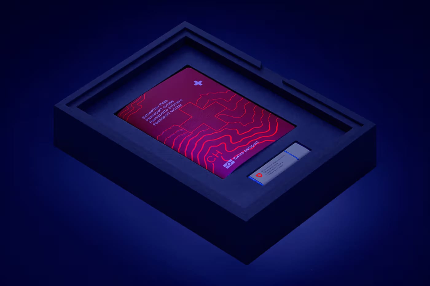
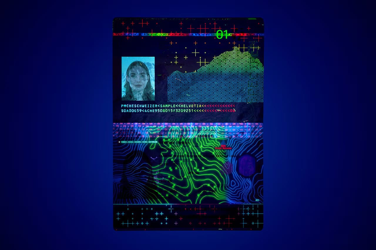
Issued in late 2022, the redesign takes a maximalist turn, packed with layered maps, watermarks, and UV-reactive illustrations.
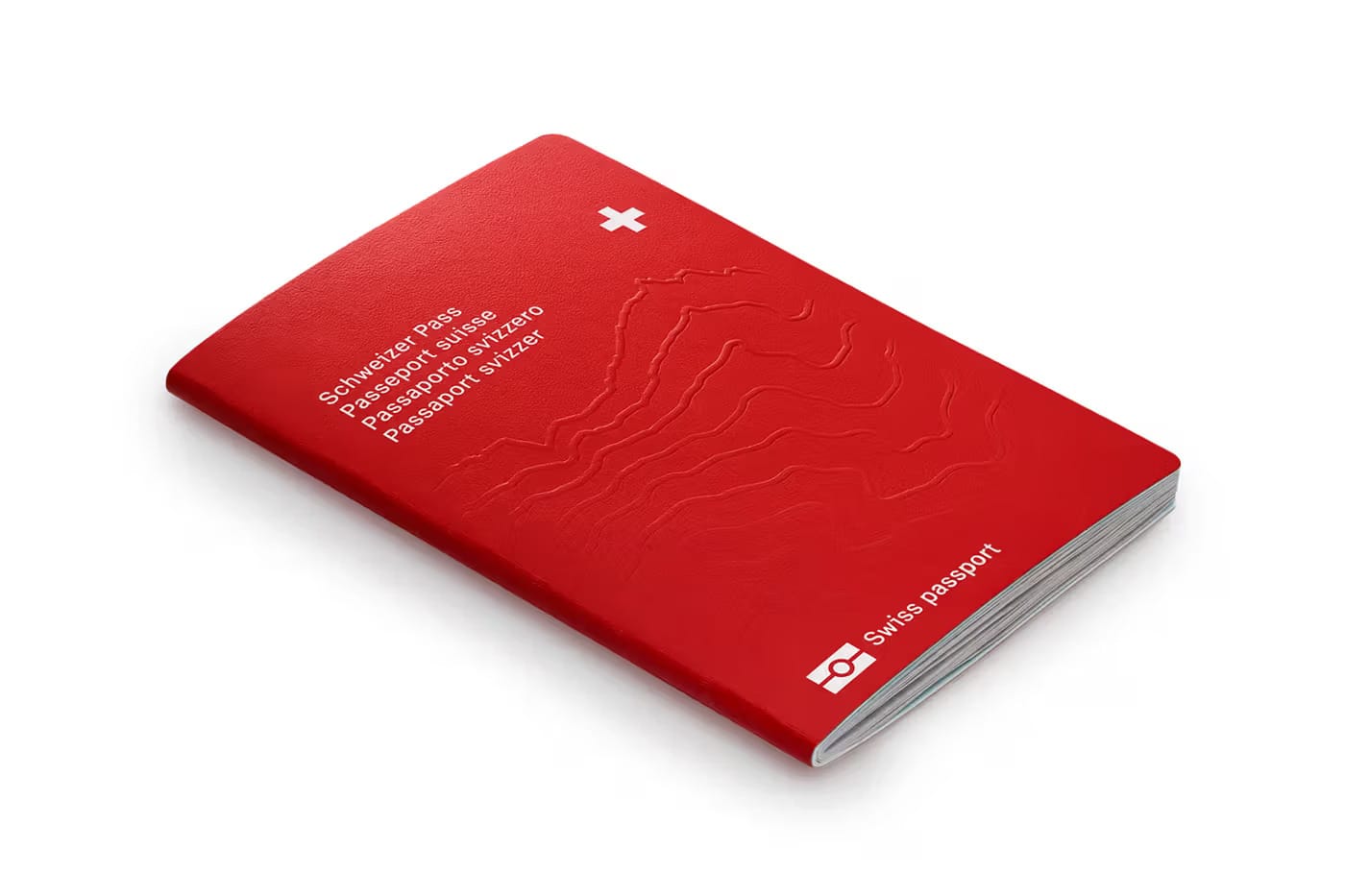
At first glance, the familiar red cover doesn’t give much away. Inside, though, the aesthetic shifts dramatically.
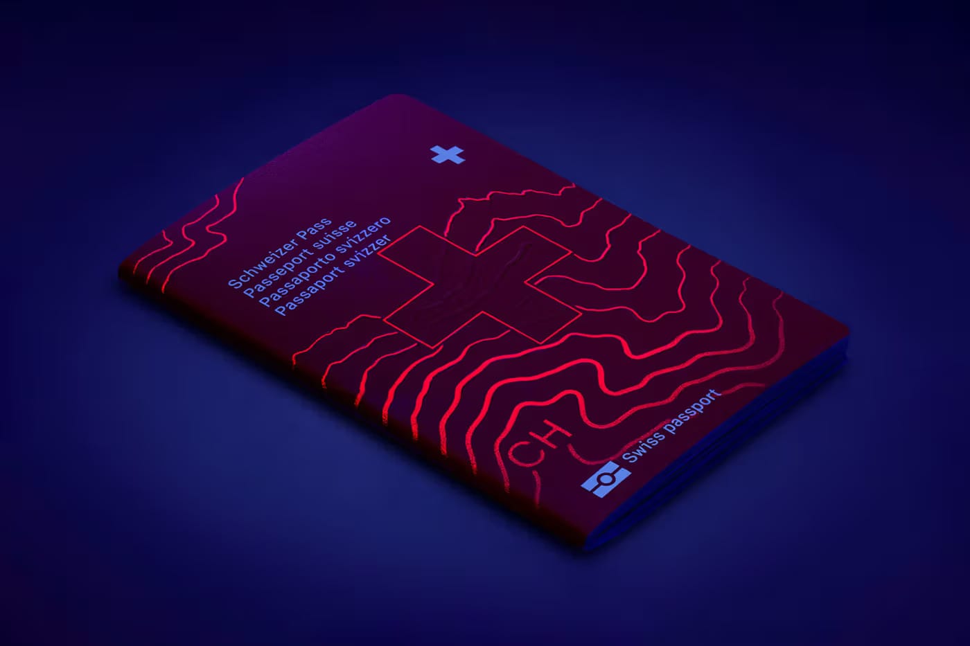
Every page leans into cartographic detail. UV-sensitive inks reveal isolines and security layers. Topographical references show off the country’s landscape in both literal and abstract form.
Layers of Identity
The passport centers design around place. Not just as a motif, but as a system of symbols, patterns, and technical safeguards.
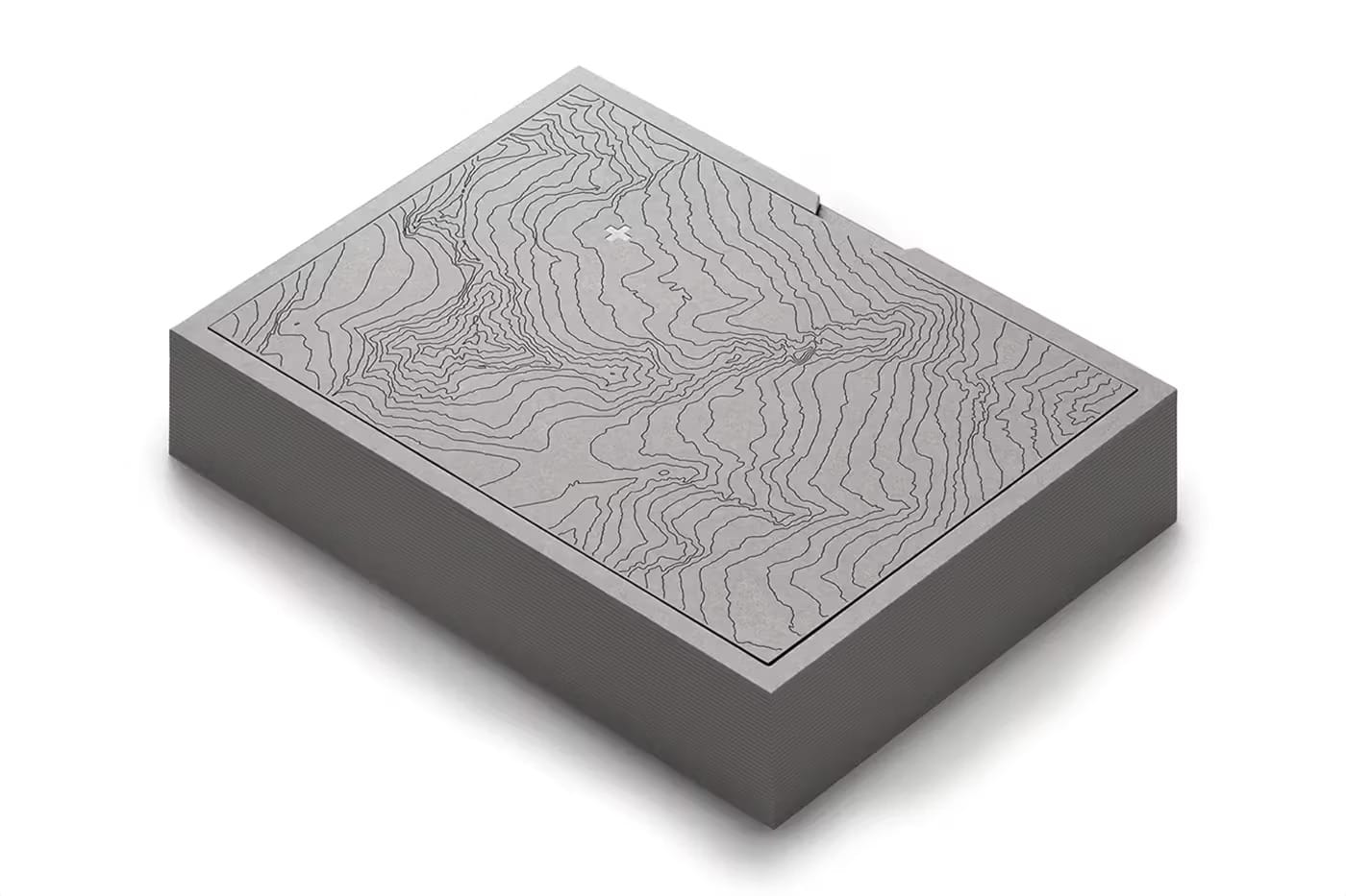
Each page draws from the Swiss landscape—alpine peaks, valleys, river systems—often paired with architectural landmarks or geometric overlays.
The ID page anchors around the summit of Pizzo Rotondo, a mountain in the Saint-Gotthard Massif. Under UV light, topographical lines emerge around the holder’s data.
Elsewhere, a double-page aerial map shows alpine peaks, Swiss crosses, and embedded symbols that light up in UV.
This isn’t just decoration—it’s layered authentication.
Form Follows Security
In an Instagram post, RETINAA noted that the passport “contains the holder’s biometrics and thus requires the highest level of security.” That focus drove many design decisions.
Every page is built to withstand tampering, with design acting as both aesthetic and barrier.
Isolines—thin, contour-like curves—create a network that physically and symbolically “safeguard the holder’s data.” These lines nod to traditional mapping, but also serve as fine-grain security elements that are difficult to replicate.
Even the inside covers contribute to the story.
The front features a hydrological map of Switzerland, while the back expands to a world map showing rivers, ocean currents, and water systems. It’s a clever touch.
For a country defined by its mountains and neutrality, the global water system stands in as a metaphor for movement, access, and interconnection—fitting for one of the world’s highest-ranking passports for international mobility.
Public Design That Doesn't Blend In
What stands out most in RETINAA’s work is its refusal to be passive. Many passports aim for quiet authority—minimalist, conservative, functional. Switzerland’s new passport embraces texture, detail, and experimentation. It’s graphic without being loud. Secure without being sterile.
It’s a reminder that even bureaucratic documents can reflect identity—not just of the holder, but of the place they come from.
Most people won’t look twice at a passport unless they’re renewing it. But Switzerland’s latest design invites attention. Not as a branding exercise, but as a serious bit of public design—layered, secure, and rooted in the landscape.