
Susan Kare: Pioneering Designs at Apple and Beyond
Susan Kare. The mastermind behind unique icons, fonts, and Dogcow
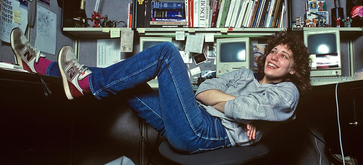
In 1982, Susan Kare found herself immersed in the creation of a life-sized sculpture of a razorback hog for an Arkansas museum when she got a call from her high school buddy, Andy Hertzfeld.
Andy Hertzfeld?
You know, the guy who was part of Apple Computer's original Macintosh development team during the 1980s.
Hertzfeld joined Apple after purchasing an Apple II in January 1978. He stayed until March 1984. His tenure was impactful, playing a crucial role in shaping the user experience and functionality of the Macintosh system.

As a designer, he participated in the creation of new features, refining the user interface, and ensuring the seamless integration between hardware and software components that Apple is renowned for today.
But as for icons and typography? Hertzfeld requested that Kare hand-draw several icons and font elements to serve as inspiration for the upcoming Macintosh computer.
And serve as inspiration it did.

Iconography
They would discuss it over coffee, over desks leafed with earlier renditions, and just about whenever they had the chance. Doodles, doodles and more doodles, as Hertzfeld recommended that Kare purchase a $2.50 grid notebook, with the smallest graph paper available.
"Create multiple 32 × 32-pixel representations of these software commands and applications", he'd suggest. Icons that are all too familiar now but were novel in the '80s, were created anew.
This was after some initial resistance from Kare, however. She'd never worked on typefaces or pixel art before. This was new territory, but Hertzfeld ensured that by sticking to the "pixels" of the notebook, whatever she'd create could be digitally represented on screen.
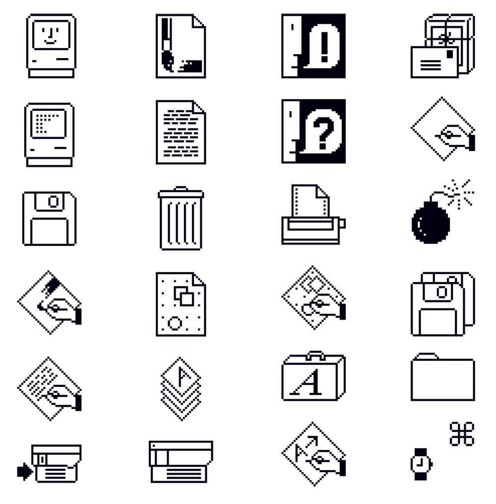
The Macintosh boasted a bit-mapped display, wherein every pixel on the screen was governed by a singular bit of data. Crafting graphics boiled down to the strategic manipulation of these bits, determining which ones to activate or deactivate.
Can you envision a reality where these icons don't exist?
All of this started from a blank piece of grid paper. A piece of paper poised to be scribbled, sketched and designed upon. The iteration of icons that Kare would create would be used for numerous generations.
"It became a Mac team status symbol to be iconified by Susan." - Hertzfeld
That's how impactful the work of Susan Kare is. These icons not only served as navigational aids but also infused personality and warmth into an otherwise sterile digital environment.
Her contributions to crafting icons, fonts, and other graphical components profoundly influenced the user experience, revolutionising how people interacted with technology.
Kare infused the essence of the Macintosh, initiating a journey where the Mac became recognised for its inviting experience compared to other competitors.
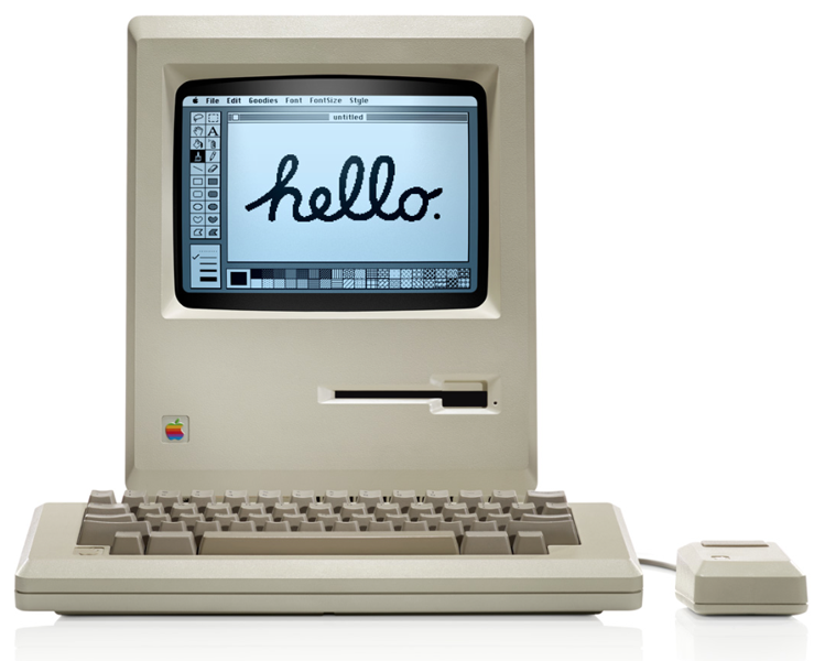
While sketching on paper was always a first choice, according to Hertzfeld, they created a simple tool on the Macintosh itself to further create icons.
He went on to say, "In February 1983, I worked on putting together an icon editor for Susan Kare to use to create icons for the Finder. Inspired by the 'Fat Bits' pixel editing mode that Bill Atkinson had recently added to MacPaint, it had a large window with a 32 by 32 grid."
Typography
At a time when computers were primarily limited to monospaced typefaces, Kare's work introduced a level of typographic diversity previously unseen in the digital realm.
The significance of Kare's fonts cannot be overstated.
The inclusion of multiple fonts pre-installed on the Macintosh marked a watershed moment in the democratisation of graphic design, empowering users to express themselves creatively without the need for specialised knowledge or expensive software.
Among Kare's most iconic typefaces is the Chicago typeface, a design characterised by its clean lines and timeless elegance.
Created for the Macintosh system font, Chicago would go on to become a ubiquitous presence in the digital landscape, its influence extending far beyond the confines of the Apple ecosystem.
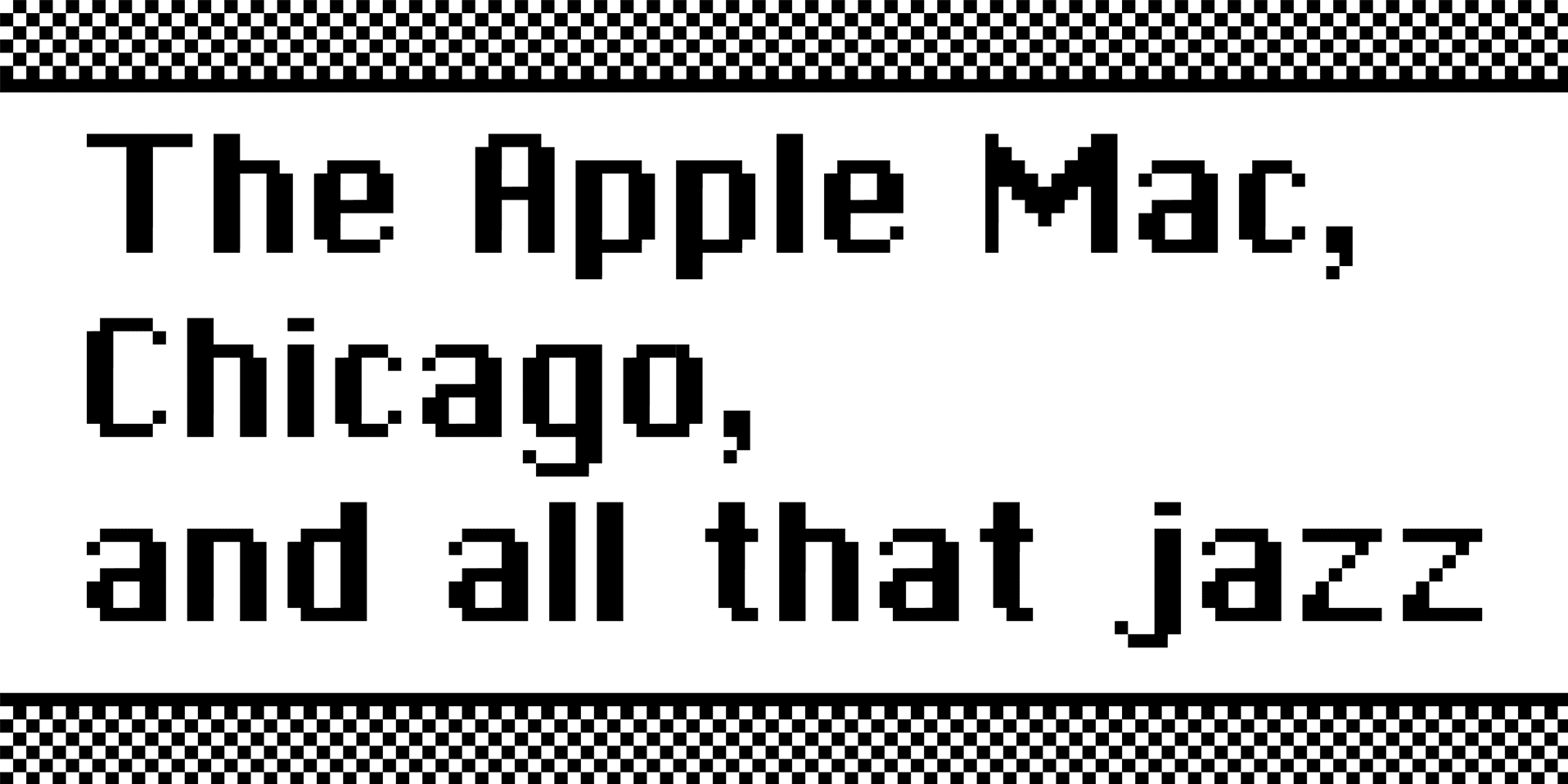
Chicago was also featured in Apple's marketing materials and was often seen in early amateur desktop publishing projects because it came bundled with the system.
Although Apple moved away from using Chicago after switching to the more readable Charcoal font in the platinum theme of Mac OS, it made a comeback in the user interface of the iPod music player.
This was because its legibility on a low-resolution, two-colour screen proved better.
New York is a transitional serif font created in 1983 for the Macintosh computer also by Susan Kare. It was later refined in 1988 by Charles Bigelow and Kris Holmes.
The font was the typical serif style used in the first versions of the Macintosh operating system. Originally named “Ardmore”, it was changed to New York before it was first launched, as part of Apple Computer co-founder Steve Jobs' "World Class Cities" naming plan.
Clarus The Erm... Dogcow?
Kare's contributions to design extend beyond mere typography.
Her whimsical creation of Clarus the Dogcow, a quirky hybrid creature that served as a placeholder graphic in Apple's printing software, captured the imagination of users around the world.

Despite its seemingly frivolous nature, Clarus embodies her playful approach to design and her belief in the power of creativity to inspire and delight.
Clarus was the epitome of surrealistic humour within the corporate culture of the original Macintosh team, a characteristic far more common in the 80s and 90s compared to today's more polished image of Apple.
Even MacWorld noted this, viewing the absence of the Icon Garden and Clarus from Apple's products as a representation of the diminishing culture and character, and an increase in simplicity and austerity, in Apple's products over time.
Kare's influence on the world of graphic design is nothing short of monumental. Her pioneering work at Apple laid the foundation for the democratisation of design, ushering in an era of creativity and innovation that continues to shape our digital landscape to this day.
Her contributions not only influenced the visual style of Apple computers but also played a significant role in shaping technology itself, laying the foundation for democratising graphic design.
Might I propose that she also brought an element of enjoyment to technology? It wasn't always serious and complex; rather, technology could mirror the personalities of those involved in its creation.
I think that's wonderful.
Most important of all, however, is just how she opened up the doors to countless others, solidifying that graphic design could be a viable career choice.
She is, without exaggeration, a trailblazer.


Comments ()