
Sony Design: In 1981, Sony Asked The Public To Redesign Their Logo
Sony dared global designers to revamp their logo, but the bold move didn't stick

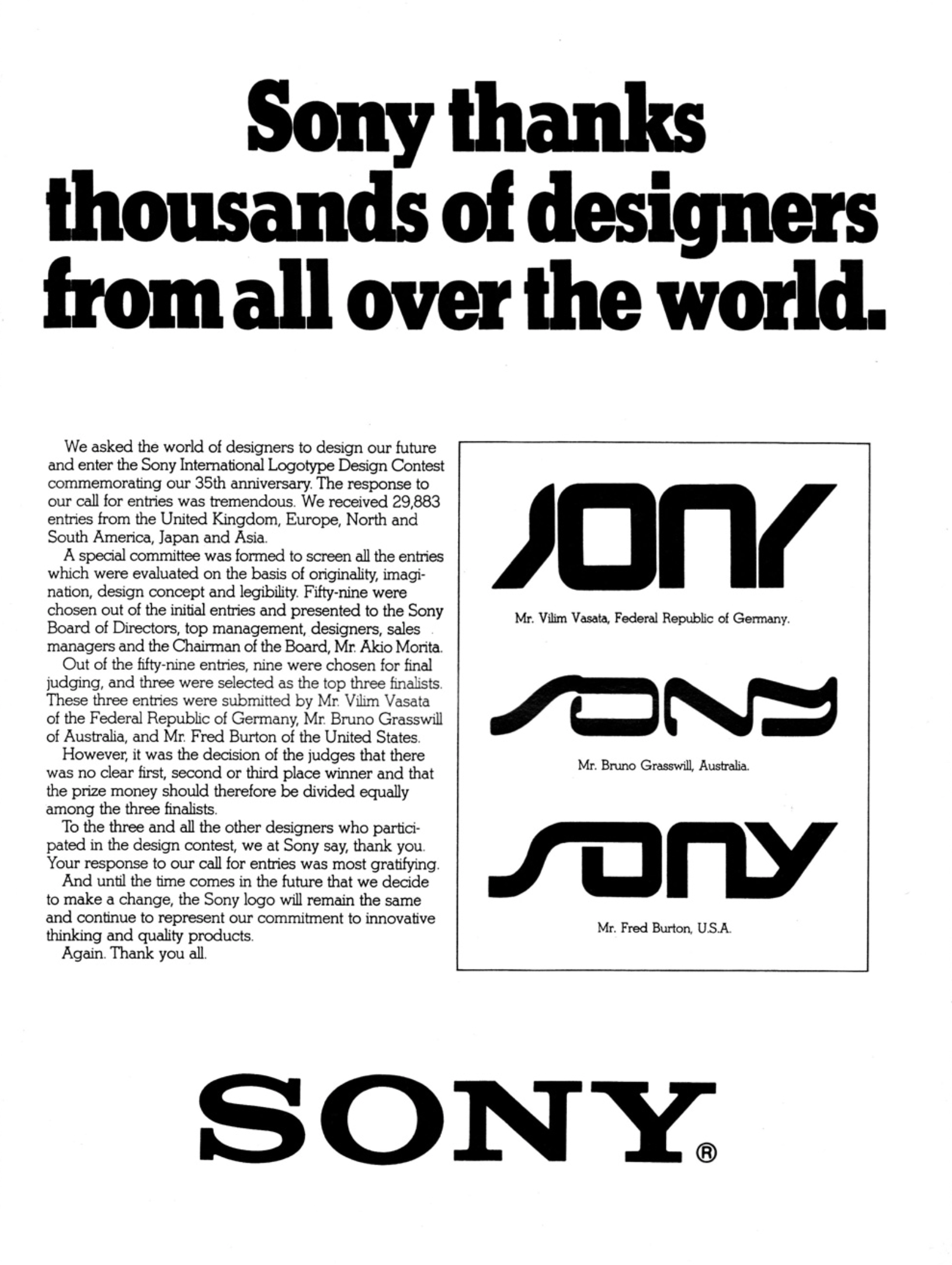
Despite maintaining its iconic logo since 1956, Sony, for its 35th anniversary in 1981, attempted a redesign contest.
Gathering nearly 30,000 global submissions, including the UK, Europe, North and South America, Japan, and Asia, three winners were eventually selected.
This archived vintage ad from Time not only showcases the unrealised Sony logos that won the "competition" but also underscores the pitfalls of attempting to crowdsource design.
Crowdsourcing Design Gone Wrong?

Judges found no clear winner in Sony's logo redesign contest, opting for equal prizes.
The classic logo endures, symbolising "innovation". Sony deemed the '80s-winning logo designs lacked longevity and legibility, leading to the retention of their current logo.
“It was the decision of the judges that there was no clear first, second, or third place winner and that the prize money should therefore be divided equally among the three finalists,” the ad reads.
It continues, “And until the time comes in the future that we decide to make a change, the Sony logo will remain the same and continue to represent our commitment to innovative thinking and quality projects.”
The present logo, characterised by timeless simplicity and slab-serif styling, exemplifies an enduring elegance, demonstrating Sony's strategic commitment to a brand identity that transcends trends and remains visually effective.
Given the age of the logo, it does not look dated. A rare feat in the world of logo design.
A Creative Opportunity, Or An Elaborate Publicity Stunt?
Designers should always approach design competitions with caution due to the risk of providing unpaid work. In this instance, the likelihood of finding success is incredibly slim.
While these contests often promise exposure and recognition, the reality is that countless designers invest time and effort into creating original and thoughtful submissions without any compensation.
The competitive nature of these events can undervalue the expertise and labour that designers bring to the table, perpetuating the expectation that creative work should be freely available.
Moreover, design competitions may not always prioritise fair compensation or ethical treatment of participants.
Some organisations view these contests as a means to acquire professional-level designs at no cost, undermining the value of the designer's skills.
Designers should be wary of such arrangements and consider alternatives that respect their expertise, ensuring that their creativity is appropriately compensated and recognised in a professional context.
So while it's questionable to have so many people design a logo only to reverse the decision, Sony ultimately made the "right" decision.
Even if it does seem like they weren't going to choose a logo anyway.
Principles of Logo Design
Unlock the secrets of impactful logo design with "Principles of Logo Design." Elevate your skills. Buy it on Amazon, and support feedme.design with a small kickback. Thank you!


Comments ()