When you think of SanDisk, you think storage – those trusty USB drives and memory cards that have been knocking around in backpacks, cameras, and desk drawers for years.
They’re reliable, essential even, but let’s be honest: they weren’t exactly design icons. Perhaps, until now.
SanDisk’s recent redesign focuses on "usability and form", bringing tangible improvements to tools people use every day.
With cloud storage and sleek gadgets everywhere, SanDisk’s redesign proves that functional design can still be both purposeful and beautiful.
It can also be fun, so let’s take a closer look.
Less Plastic, More Purpose
If you’ve ever lost a USB drive under a pile of papers or fumbled to insert a memory card the right way up, you’ll appreciate the thought behind this refresh.
While much of SanDisk's brand update focuses on their sleek new logo and its meaning, it’s worth acknowledging the work they’re already doing in the physical space.
SanDisk is (and has been) leaning into ergonomics, with streamlined curves, subtle textures, and functionality that feels intuitive. The designs are deliberate – prioritising usability over clutter.
Take the Extreme Pro SSD, for instance.
Its shape and finish are designed for durability and easy handling. It’s compact, rugged, and ready for modern workflows without excess bulk or unnecessary details.
It appeals to professionals and creatives who require reliable, portable storage—such as photographers, videographers, and designers working on the go - and it's been meticulously designed to meet the needs of these professions.
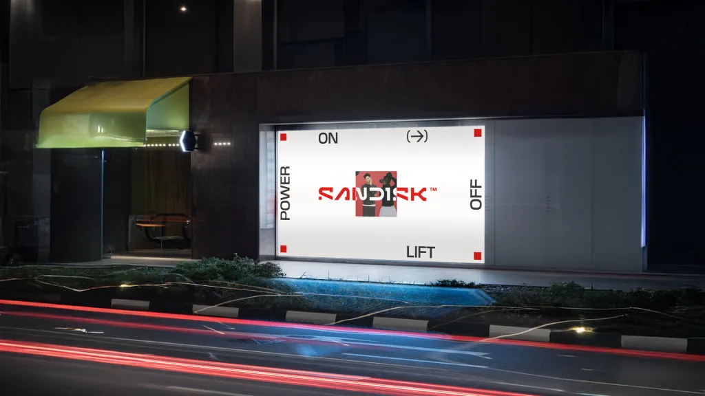
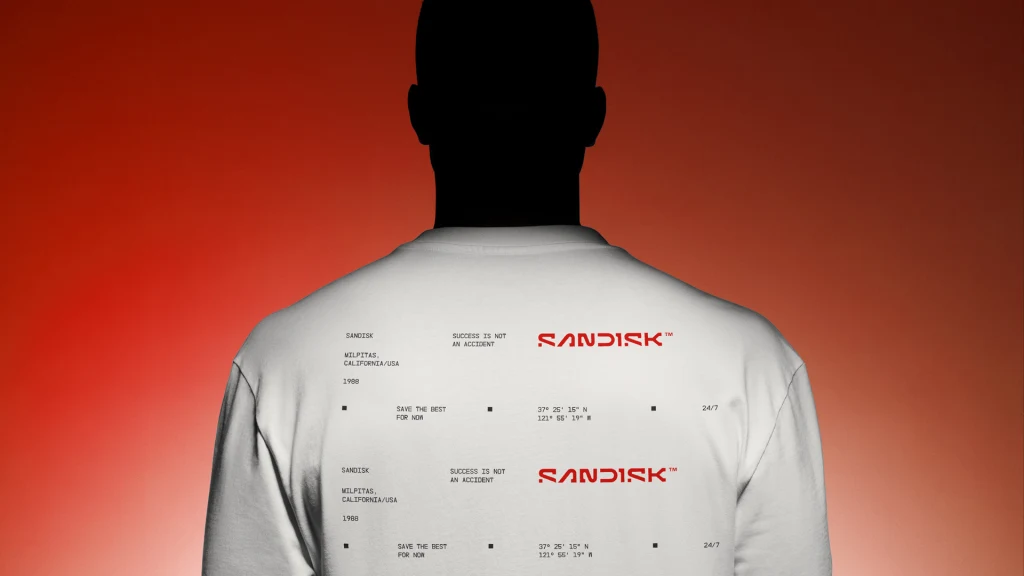
Source: SanDisk
How does this latest redesign connect to SanDisk’s already strong product design?
Colour is now an integral part of SanDisk’s design language. Deep blacks, rich reds, and sleek metallic finishes give the products a modern edge.
The red band wrapped around their drives, for instance, isn’t just a design feature – it’s a subtle nod to SanDisk’s legacy and instantly sets them apart.
Shapes, too, have seen a meaningful change. Rounded edges and textured surfaces make portable SSDs feel better in the hand, while remaining durable and functional.
With waterproofing, shockproofing, and drop protection, SanDisk clearly means business in this space. Their new design language reflects that.
It’s a noticeable departure from past designs and aligns with the expectations of modern users.
Let's Talk About That Logo
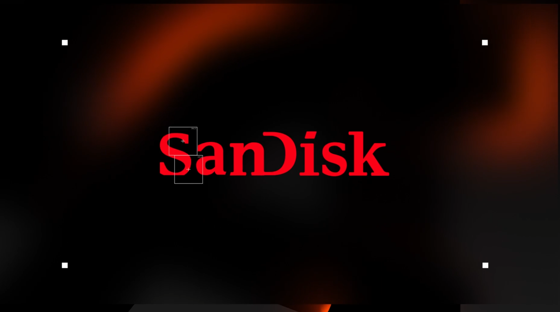
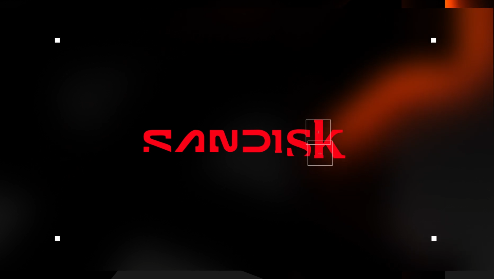
Source: SanDisk
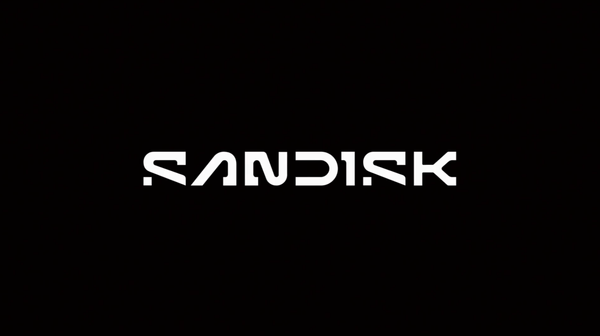
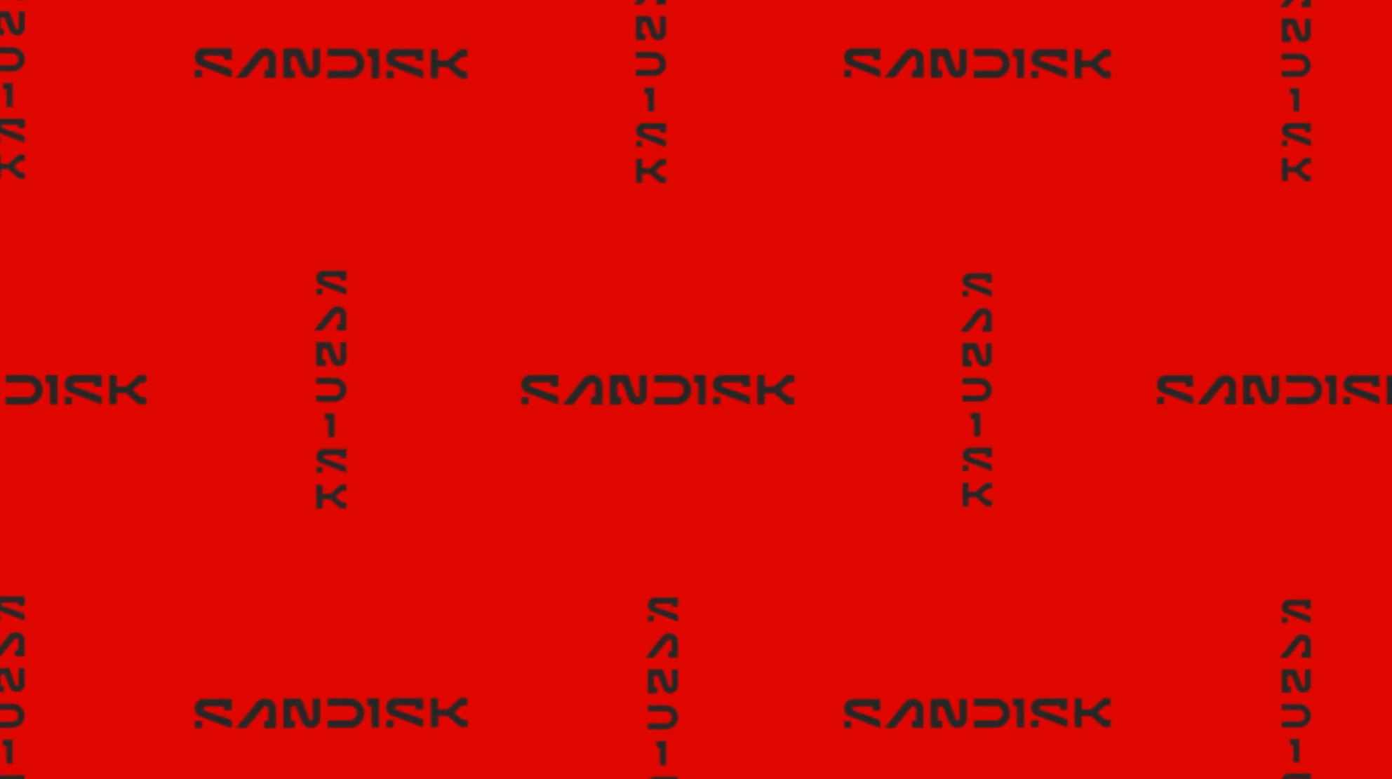
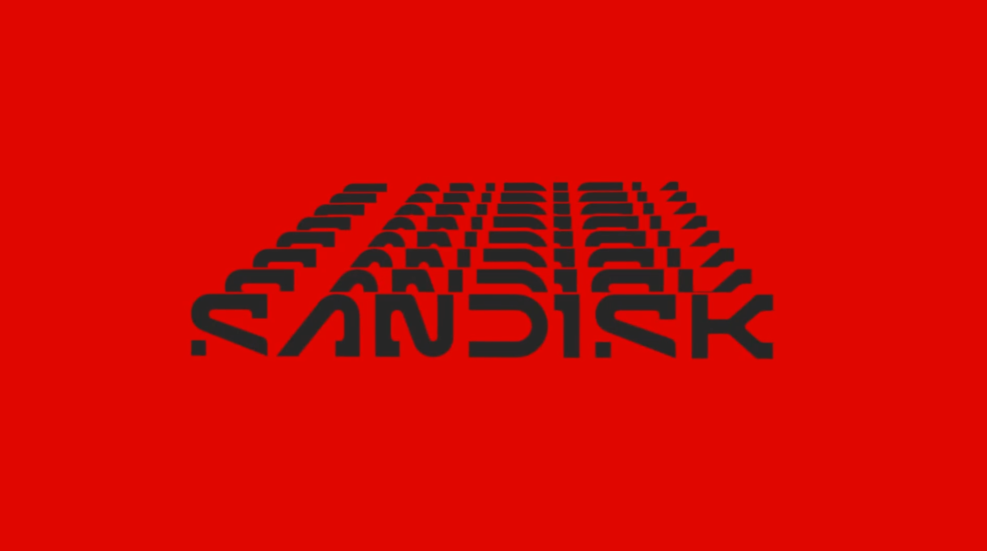
This updated SanDisk logo embraces a minimalist and modern design language, using a sleek, geometric typeface. The most notable feature is the playful yet intentional manipulation of letterforms:
- The "S" and "K": Both letters are abstracted with cut-off segments, creating a sense of movement and modernity. This adds visual intrigue while maintaining legibility.
- The Negative Space: The streamlined gaps within the letters break traditional structure, contributing to a futuristic, tech-oriented aesthetic.
- Balance of Soft and Hard Edges: Rounded corners in "S" and "A" contrast with the sharp, angular cuts in "N" and "K," highlighting SanDisk’s combination of durability and design finesse.
- Monochrome Palette: The stark black and white keeps the focus on the form, aligning with tech minimalism trends and reinforcing a professional, high-end feel.
It feels purpose-built for a brand that wants to project reliability and innovation while appealing to a design-conscious, modern audience. It’s clean, confident, and functional—qualities that reflect SanDisk’s product ethos.
Why It Matters
We know good design isn’t about looks alone – it’s about improving how people interact with a product. SanDisk’s redesign addresses the needs of professionals and everyday users alike.
Photographers, creatives, and tech enthusiasts rely on these tools, and now they’re not just dependable but thoughtfully crafted for real-world use.
By balancing form and function, SanDisk’s new design ensures their tools are as enjoyable to use as they are reliable. It’s a shift that recognises the value of design in even the most practical of products.
We think their redesign also highlights that storage devices don’t have to be forgettable. With these improvements to form, colour, and usability, they’ve turned practical tools into objects worth noticing.
Whether it’s the memory card saving your best shot or the SSD holding your latest project, the focus is clear: thoughtful design makes a difference.
Next time you reach for a SanDisk drive, take a second to notice it. The textures, the shapes, the details – they’re small changes, but they point to a bigger idea: the tools we use every day deserve good design.

