Sometimes a piece of design work stops you in your tracks, and not for the right reasons.
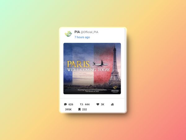
That’s exactly what happened with Pakistan International Airlines’ (PIA) announcement about resuming flights to Paris.
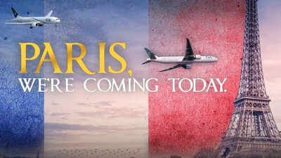
Instead of inspiring confidence, their poster has been widely mocked—and rightly so. Let’s start with the glaring issue: the plane.
Whoever designed this thought it was a good idea to place an aircraft flying alarmingly close to the Eiffel Tower.
The result?
It looks like the plane is either on a collision course or performing a flyby stunt, and neither of those screams "safe, reliable airline."
It’s hard to believe this slipped past multiple sets of eyes. Any designer worth their salt knows that planes and iconic landmarks come with visual baggage.
A plane even remotely positioned near a tower of any kind triggers the wrong kind of thoughts—especially when it’s your airline’s big comeback announcement.
Is that a threat?
Then there’s the typography. “Paris, we’re coming today” is bold, sure, but not in the good way.
It’s overly dramatic, as if PIA’s just discovered the concept of international travel and is in a rush to get there.
The word choice feels casual to the point of being amateurish, not the tone you'd expect from a major airline. And the design itself? A mishmash of elements that don’t gel. The French flag filter feels like it was slapped on at the last second, and the whole thing lacks finesse.
It’s a classic case of “good enough” design—but in aviation, where trust and professionalism are everything, “good enough” doesn’t cut it. This poster is a missed opportunity to do something elegant. Imagine a sweeping shot of the Paris skyline, the PIA plane soaring gracefully in the distance, and a tagline that evokes excitement and trust.
Instead, we get this clunky, meme-worthy graphic that’s already being dragged across social media.
Design isn’t just about making things look nice—it’s about conveying the right message. PIA’s poster fails because it sends all the wrong signals.
For an airline looking to rebuild its reputation, this was their chance to inspire confidence. Instead, they’ve given us a textbook example of how not to do it. If anything, this poster is a reminder that bad design isn’t just embarrassing—it can actively harm your brand.
And if you’re in the business of flying people across the world, you really don’t want to give off the vibe that you’re about to crash into the Eiffel Tower.


