In a world where touchscreens have become the norm for car interfaces, some automakers are bucking the trend and returning to tactile controls. Hyundai is one such company that has decided to embrace physical buttons.
This potential resurgence of knobs and buttons is not just a nostalgic throwback, but a practical response to the limitations of touchscreens within the context of driving.
A recent study by vibilagare.se , which I wrote about in an article titled To the surprise of no one, physical buttons outperform touchscreens, indicates that relying solely on touchscreen controls for basic functions generally leads to a subpar user experience — and at worst, dangerous.
Buttons: simple, effective, timeless.

According to a recent article on The Drive, Hyundai’s decision to embrace physical buttons over touchscreens is rooted in creating a safer and more intuitive driving experience.
The company’s Chief Designer, Luc Donckerwolke, stated that the decision was based on feedback from customers who found touchscreens distracting and difficult to use while driving.
Hyundai has implemented a new design philosophy that prioritises physical buttons for frequently used functions such as climate control and audio.
This approach has several advantages over touchscreens. First, physical buttons provide tactile feedback, which allows drivers to operate them without taking their eyes off the road.
This is especially important for functions that require frequent adjustments, such as temperature control. Additionally, physical buttons are easier to locate by touch alone, reducing the time drivers spend looking for the proper control.
By embracing physical buttons in their car interfaces, Hyundai is demonstrating a commitment to user-centred design that prioritises safety and ease of use.
What does the science say?
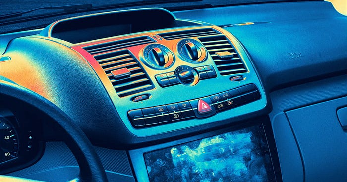
Several studies have shown that physical buttons outperform touchscreens in most driving situations.
One study by the AAA Foundation for Traffic Safety found that touchscreens can be more distracting and time-consuming to use than physical controls.
The study found that drivers took an average of 4.6 seconds to complete a touchscreen task, compared to 1.4 seconds for a physical button task.
This delay can have serious safety implications, as even a brief moment of distraction can lead to an accident.
Another study by researchers at the University of Utah found that drivers who use touchscreens are more likely to make errors than those who use physical controls.
The study found that drivers who use touchscreens take their eyes off the road for longer periods and are more likely to miss important visual cues while driving.
These findings are consistent with Hyundai’s decision to embrace physical buttons over touchscreens in their latest designs.
By prioritising physical controls, Hyundai is taking a user-centred approach that puts safety first.
Fitt’s Law
Fitts’s Law is a UX principle that supports the idea that physical buttons outperform touchscreens in most driving situations.
Fitts’s Law states that the time required to move to a target depends on the distance to the target and the size of the target.
In the context of car interfaces, physical buttons provide larger targets that are easier to locate by touch alone, reducing the time drivers spend looking for the right control.
This principle has been applied in the design of physical controls in cars for many years, and it is a key reason why physical buttons are often preferred over touchscreens.
Laws of UX: Using Psychology to Design Better Products & Services
Want to learn more about Fitt's Law? Head over to Amazon and grab a copy of Laws of UX: Using Psychology to Design Better Products & Services. We'll get a small portion of the sale. Thanks!
In contrast, touchscreens require users to locate and press smaller targets, which can be more difficult and time-consuming, especially in a driving context where attention and focus are key.
While touchscreens can provide a sleek and modern look, they can also be less intuitive and more distracting to use than physical buttons.
This is why many automakers are returning to tactile controls, providing a safer and more user-friendly driving experience.
The resurgence of physical buttons in car interface design represents a shift towards a more user-centred approach that prioritises safety and ease of use.
Automakers like Hyundai recognise the limitations of touchscreens in the context of driving and are responding by implementing physical controls that provide tactile feedback and larger targets that are easier to locate by touch alone.
This is supported by studies that have shown that physical buttons outperform touchscreens in most driving situations, and by UX principles like Fitts’s Law, which highlight the importance of target size and distance in user interface design.
While touchscreens may have their place in certain contexts, it is clear that they are not always the best solution for car interfaces.
As technology continues to evolve and become more integrated into our lives, designers need to prioritise user needs and preferences over trends or novelty.
By embracing physical buttons in their car interfaces, automakers like Hyundai are setting a new standard for a user-centred design that prioritises safety, ease of use, and the overall driving experience.


