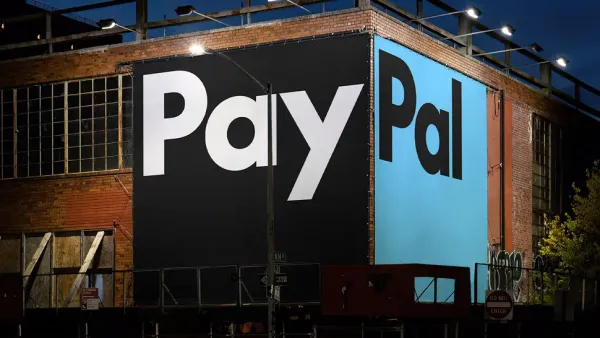
PayPal’s decision to revamp its logo after 25 years was bound to raise eyebrows.
On the surface, the redesign looks clean, minimalist, and, dare I say, polished.
But is that enough?
Sure, it replaces the familiar italics with a bold, contemporary aesthetic, a custom typeface rooted in Futura’s legacy.
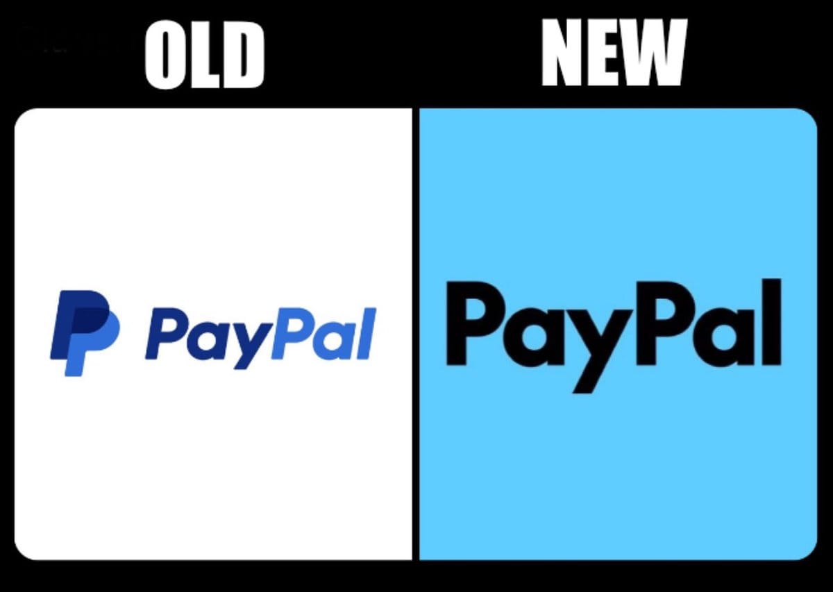
It’s slick, professional, and, unfortunately, indistinct.
Designed by Pentagram, this rebranding screams corporate—perhaps too loudly.
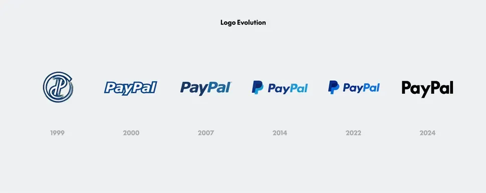
Yes, the sharpened “P” adds some modernity, and the simplified color palette feels less cluttered.
Yet, what once was a logo that exuded individuality now appears to be veering dangerously close to a safe, generic identity.
When fintech brands are constantly competing for attention, does PayPal’s new logo stand out?
Or does it simply blend into the sea of corporate blue?
The visual overhaul seems more concerned with playing it safe than truly pushing creative boundaries.
It feels like a missed opportunity to inject character into an established brand, which, ironically, may have just erased some of its own.
One unhappy graphics design user on Reddit said, "Ugh, why? That'll be $30,000 please."
Is this what PayPal’s brand should look like in 2024—a faceless giant in the fintech world?
Perhaps only time will tell. But in a world where standing out matters more than ever, this sleek redesign might just lack the punch needed to stay memorable.