When Steve Jobs left Apple in the 1980s, he had no intention of starting his next venture quietly.
Everything about NeXT, from its products to its branding, had to make a statement.
For the logo, Jobs turned to Paul Rand, a designer whose work already defined some of the world’s most recognisable companies, including IBM, UPS, and ABC.
By this point in his career, Paul Rand’s reputation gave him near-total creative control.
Jobs, famously hands-on, requested multiple options for the logo.
Rand, however, refused, saying, “I will solve your problem, and you will pay me. You don’t have to use the solution. If you want options, go talk to other people.”
His approach was direct, even blunt, but it worked.

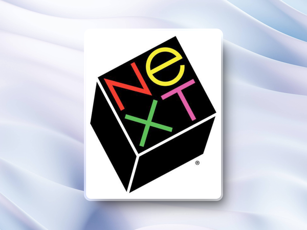
Rand’s confidence stemmed from decades of experience, and his results spoke for themselves. For NeXT, Rand designed a cube tilted slightly upward with the company name written in bold, clean typography.
The design wasn’t purely aesthetic.
The cube symbolised stability and structure, while the upward tilt reflected forward-thinking ambition.
The black background and bright colours added contrast, suggesting a balance of creativity and professionalism.
It was a perfect fit for Jobs’ vision of NeXT as a cutting-edge company redefining computing. Rand charged $100,000 for the project—a figure that raised eyebrows at the time. But he wasn’t just selling a logo; he was delivering a solution backed by a lifetime of expertise.
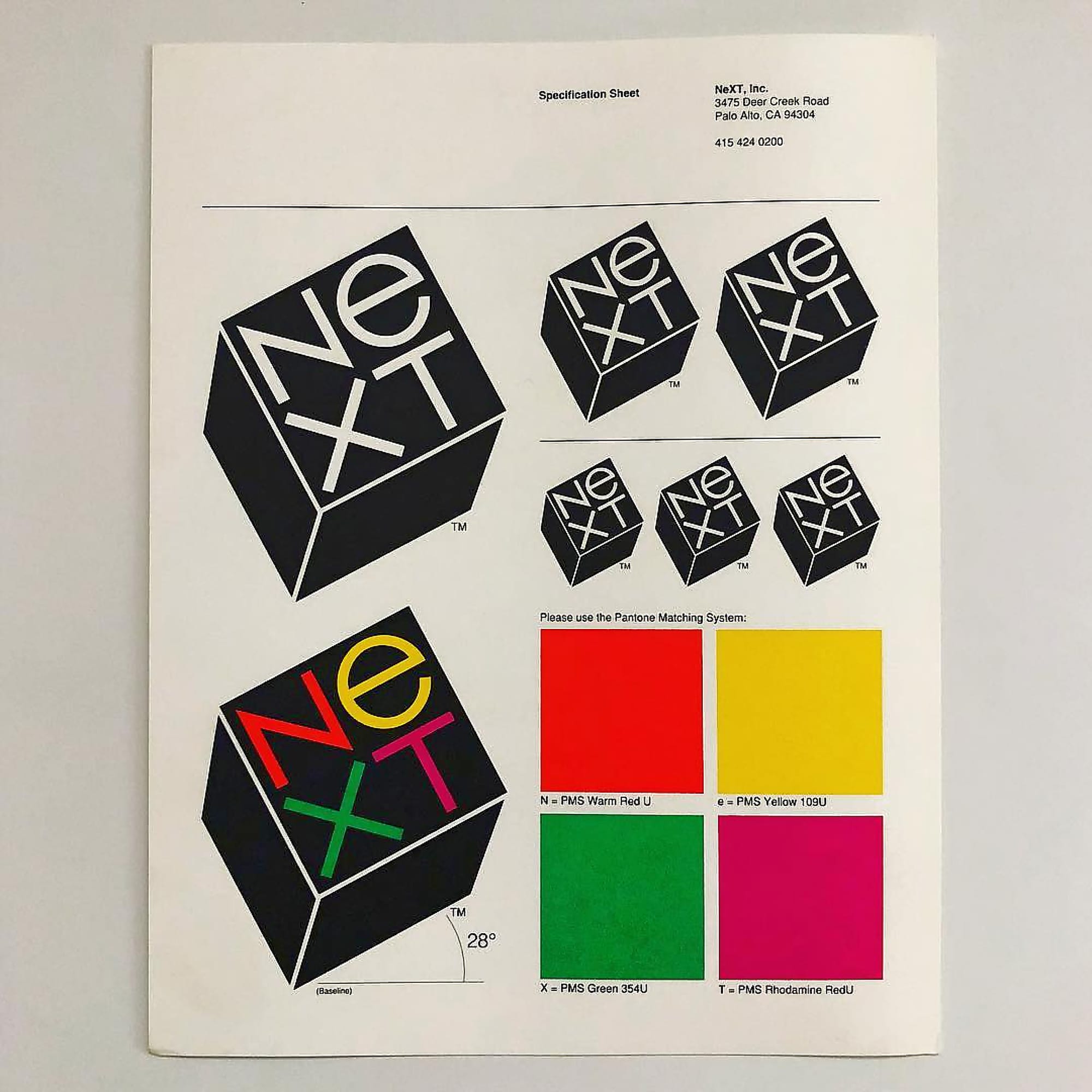
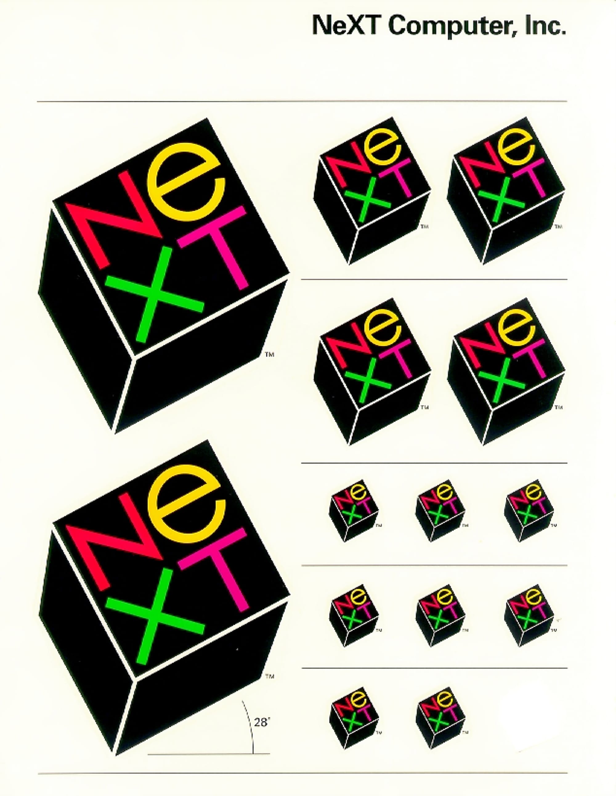
NeXT logos, different treatments. Source: paulrand.design and Milton Glaser archives.
Jobs, known for his exacting standards, was reportedly so impressed by Rand’s presentation—a detailed booklet explaining the concept—that he paid without hesitation.
"I asked him if he would come up with a few options, and he said, 'No, I will solve your problem for you and you will pay me. You don't have to use the solution. If you want options go talk to other people.'" —Steve Jobs on Paul Rand The logo arguably became more iconic than the company itself.
NeXT’s hardware never achieved mainstream success, though its software later formed the foundation of macOS.
Still, the logo remains a standout example of effective design—simple, timeless, and perfectly aligned with the brand it represented. Paul Rand’s work reminds us that great design isn’t just about appearances.
It’s about creating something meaningful and memorable. And when you’re as respected as Rand, you can set your price and stick to it.
Rand's principles are all the more important today.
With cheap design tools and endless revisions offered today, the NeXT logo stands as a reminder of the value of expertise.
Paul Rand didn’t just deliver a logo—he delivered clarity, purpose, and a sense of identity.
That’s why, decades later, it’s still regarded as a masterclass in design.


