In 1976, NASA didn’t launch a rocket—but they did launch a new identity. And it was just as bold as a moonshot.
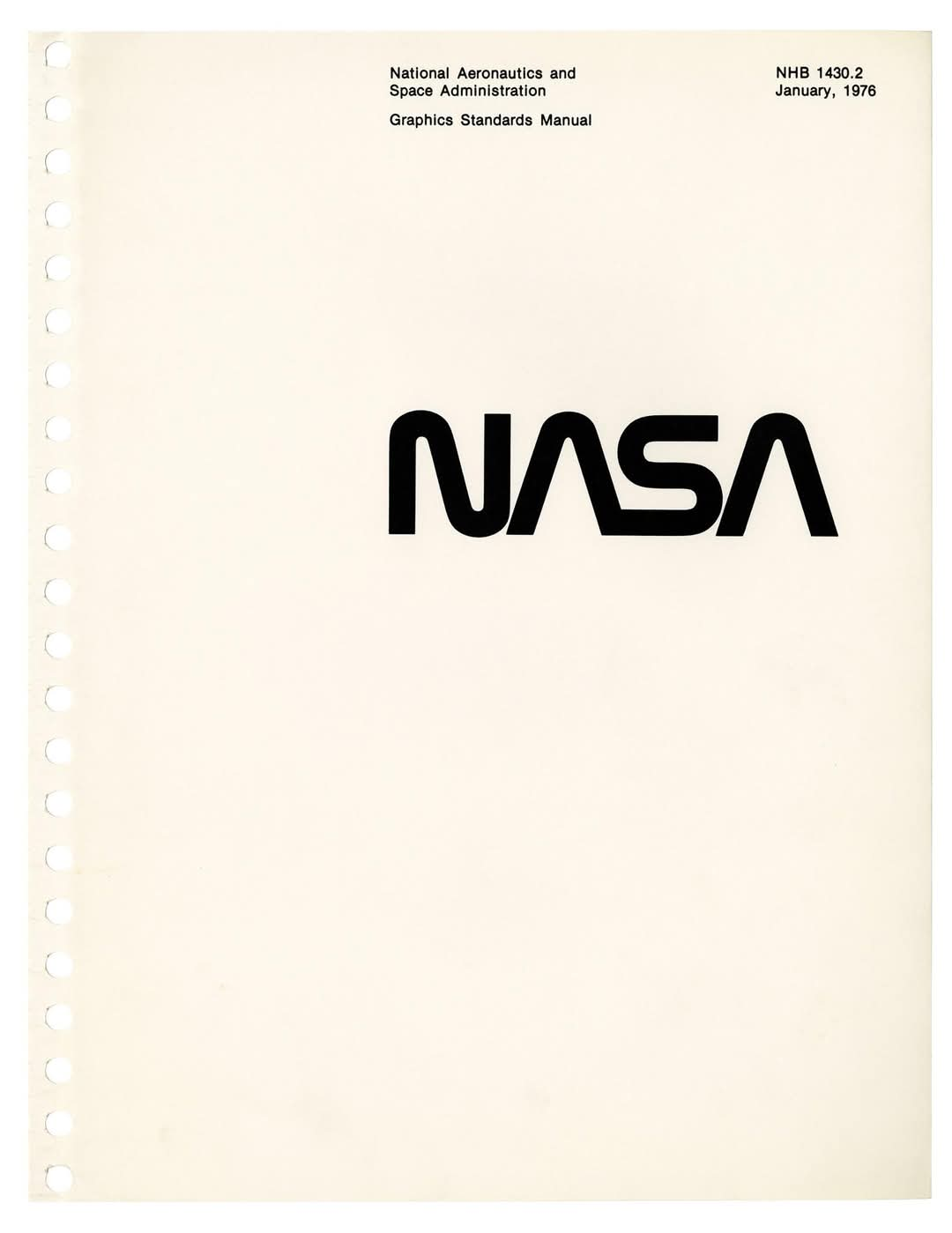
Enter the NASA Graphics Standards Manual, a clean, spiral-bound book that introduced the world to a sleek, no-nonsense version of the NASA wordmark.
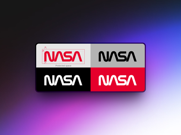
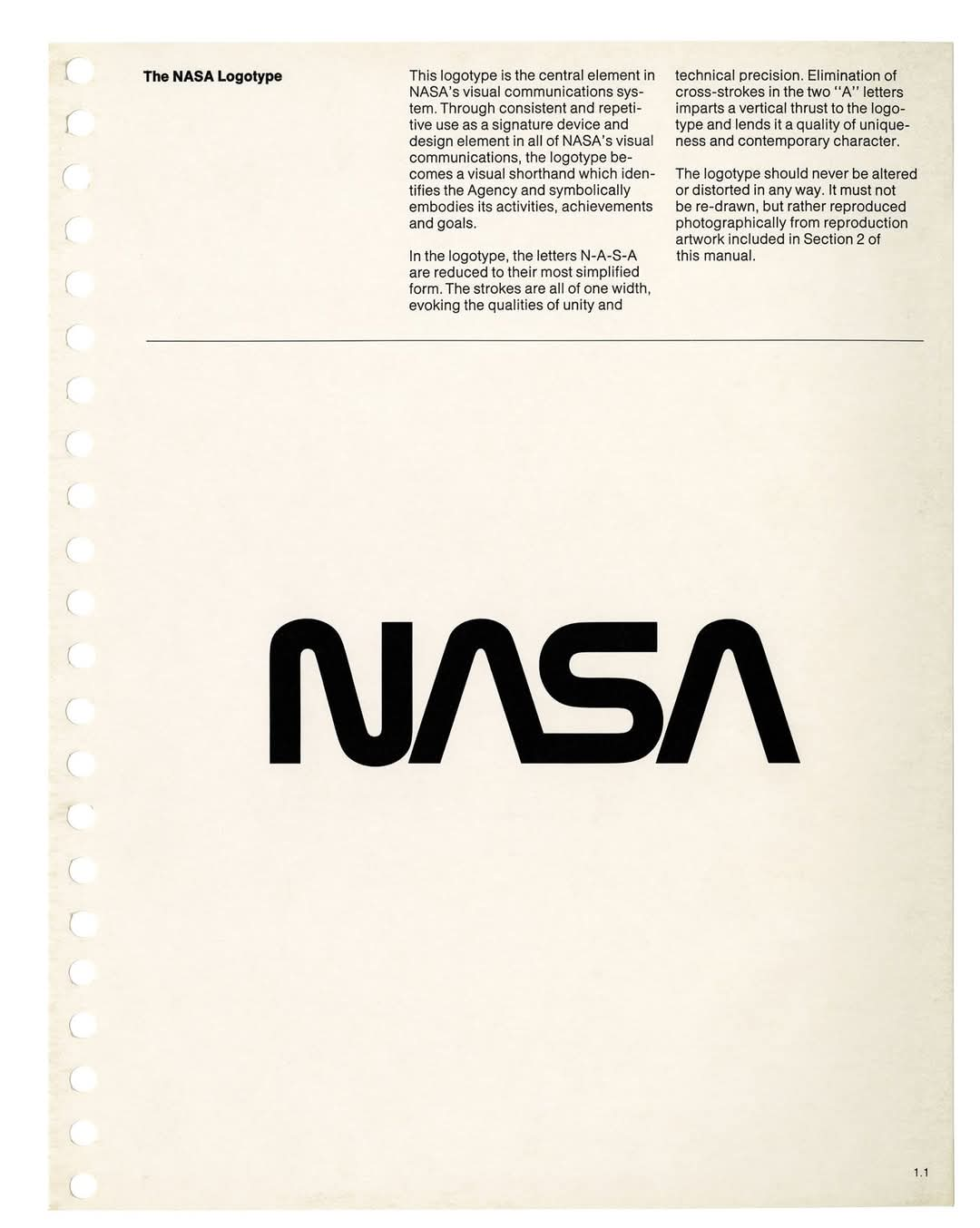
Gone were the stars, the swooshes, and the patriotic flash of the original "meatball" logo. In came the "worm.
The worm logo is what you see on the cover of that manual. Four custom letters, all smooth and connected, with a modernist flair that screamed future.
The designers behind it were Richard Danne and Bruce Blackburn—two guys who knew their way around a typeface. They didn’t just want a new logo. They wanted to change how NASA looked to the public.
Let’s pause here.
NASA, at the time, was riding the high of the Apollo program but struggling with its image. The old logo—the "meatball"—was cluttered. It had stars, red vector lines, and multiple typefaces.
It looked like it belonged to a sci-fi cereal box, not the cutting edge of space exploration. The redesign wasn’t just about taste. It was strategic.
Danne and Blackburn’s logo ditched curves for control. It used horizontal strokes and geometric forms.
The letterforms were streamlined. The crossbar of the "A"? Gone. It’s a gap, not a line—symbolizing a spacecraft’s trajectory or a launch window.
This new look had a job: make NASA look like the future again.
The result? Instant classic. Clean. Confident. Functional. But not everyone loved it.
Internally, some NASA folks thought it was too radical. It didn’t scream patriotism. It didn’t feel like the NASA they knew. But for many designers and fans of modernism, it was perfect.
The logo reflected the clarity and ambition of space travel itself. No distractions. No fluff.
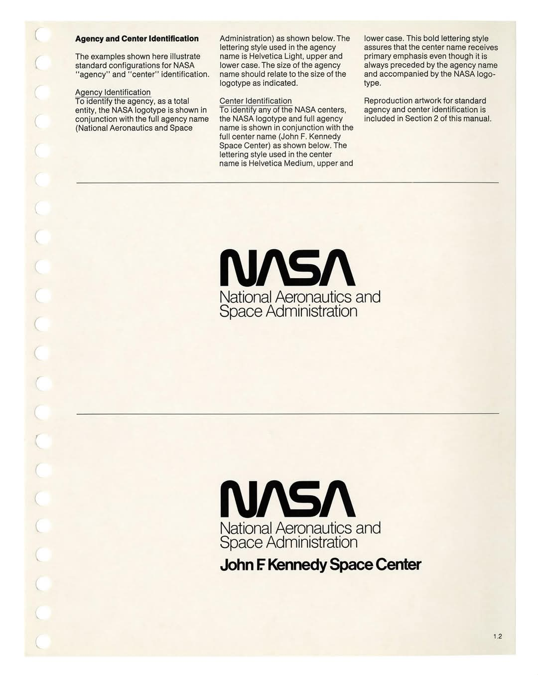
The manual itself was strict. You didn’t just slap the logo on things and hope for the best. There were rules. Exact measurements, alignments, font sizes. Every document, badge, brochure, and spacecraft had to follow them.
Design-wise, that level of control wasn’t about ego. It was about unity. NASA wanted everything—from internal memos to space shuttle markings—to feel like it came from one place.

And it worked. For years, the worm was everywhere. It appeared on launch pads, technical documents, patches, even space suits.
But then, in 1992, it was quietly shelved
NASA brought the meatball back, saying it better represented the agency’s heritage. A lot of designers groaned.
The worm wasn’t just a logo—it was design history. It showed that even the most serious agencies could embrace minimalism. And here’s the twist: the worm never really died.
In 2020, NASA brought it back. Not full-time, but for select missions and merchandise. It made an appearance on SpaceX’s Falcon 9 rocket for the Demo-2 mission.
That simple mark, long retired, suddenly looked fresher than ever.
Why?
Because the best design doesn’t age—it just waits for its moment to come back around.
The worm logo proves that even a government agency can go modern. That a logo without stars or stripes can still inspire. That clarity beats clutter.
And that good design might not always win the vote, but it’ll stand the test of time.
So next time you spot that smooth, red NASA wordmark, know this: it wasn’t just a rebrand. It was a design revolution.
Quiet, sharp, and still orbiting.