
TL;DR: Mozilla's rebranding is a nostalgic nod to its roots, with a fresh twist. Ditching the quirky "Moz://a" logo for a more traditional typeface and an M-shaped flag, the new look channels its activist spirit while distinguishing itself from Firefox. A retro-inspired color palette and ASCII-style mascot are key elements in the refresh, aiming to bring Mozilla back into the spotlight as a champion of internet openness and innovation.
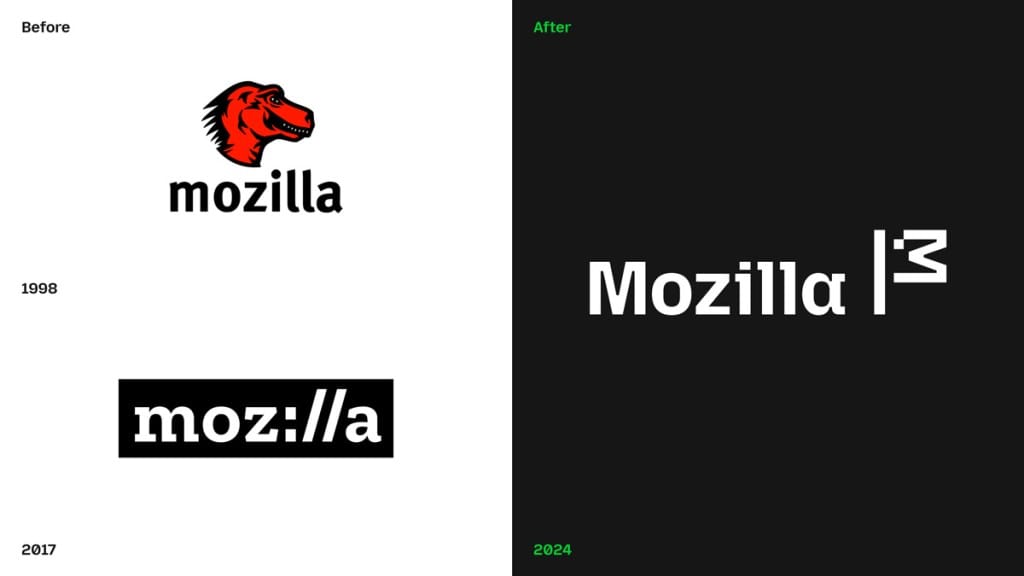
Mozilla, a name that echoes through internet history, has just revealed a brand overhaul that’s both a tribute to its past and a statement of intent for the future.
The non-profit, which has been a steadfast advocate for an open and secure internet, has refreshed its visual identity with a design that’s both modern and distinctly retro, tapping into its Netscape roots while aiming to reassert its identity beyond just the Firefox browser.
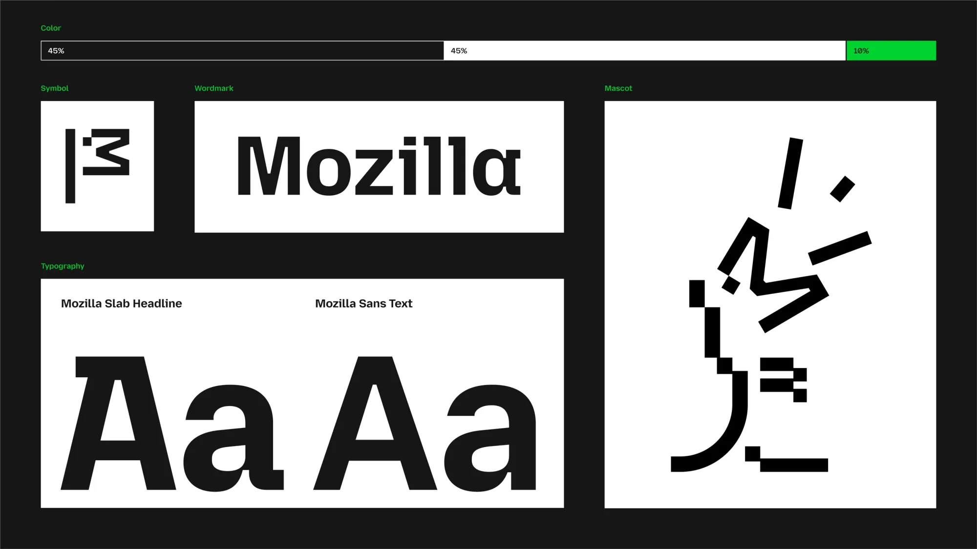
The New Logo: Goodbye “Moz://a,” Hello M-Flag
The most eye-catching change is the new logo.
Mozilla has retired the quirky “Moz://a” wordmark—a clever nod to its internet-first ethos—in favor of a more straightforward, yet no less meaningful, design.
The new logo spells out the Mozilla name in full, anchored by an M-shaped flag. This isn’t just a design choice; it’s a statement of Mozilla’s “activist spirit.”
The flag, a potent symbol of rallying and revolution, is meant to embody the company’s mission to champion a free and open internet, something that has been core to its identity since its inception.
Colors and Typography: A Retro Vibe with a Modern Edge
Gone is the firetruck red of the old T-Rex logo, replaced by a palette that blends saturated green, pink, and orange.
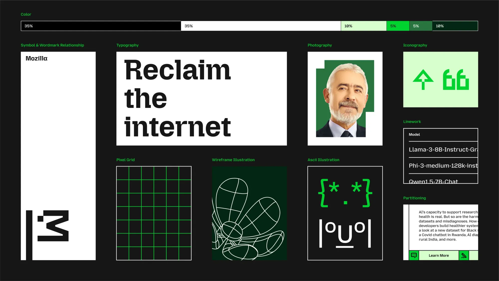
This shift is more than just cosmetic. The orange subtly tips its hat to Firefox, Mozilla’s most recognized product, while the green and pink inject a fresh, vibrant energy into the brand’s visual identity.
The new typefaces—Mozilla Semi-Slab, Mozilla Sans, and Mozilla Sans Text—are custom-designed to reflect the brand’s blend of authority and approachability.
The decision to lean into a retro aesthetic isn’t purely nostalgic.
It’s a deliberate effort to remind users of Mozilla’s storied past while reinforcing its ongoing relevance in today’s digital landscape.
The inclusion of 2D bitmaps and 3D wireframes in its design elements serves as a nod to the early days of web development, evoking a sense of authenticity and grassroots creativity.
A Mascot with Character
Mozilla’s rebranding also introduces a playful new mascot, a throwback to its 1998 “Hack” poster featuring a Tyrannosaurus Rex.
This mascot, rendered in ASCII art style, can morph from the flag symbol into a recognizable dino. It’s not just a fun addition; it’s a rallying cry for the community, a symbol of Mozilla’s enduring commitment to empowering users in an increasingly corporate internet.
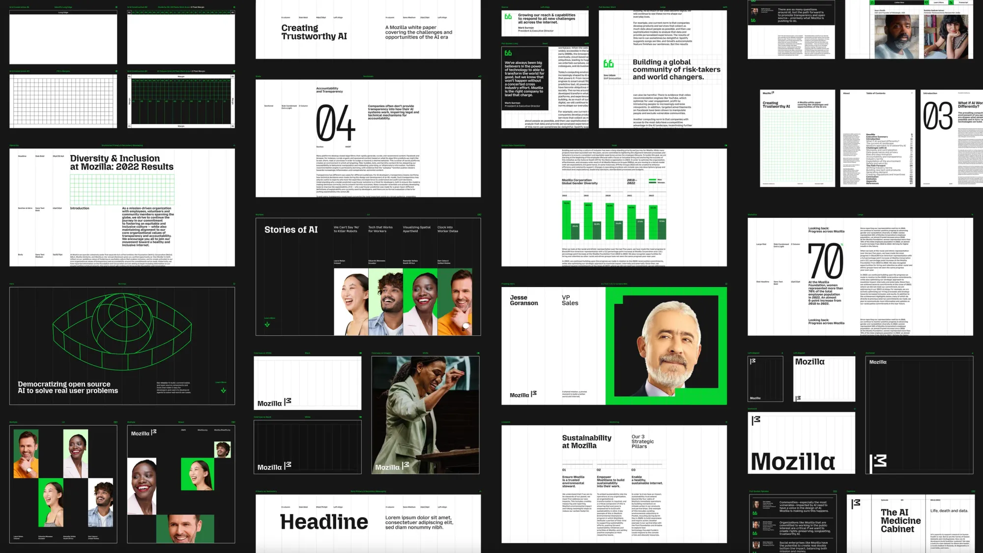
The rebrand is still in its early stages, with much of Mozilla’s website and digital presence set to transition gradually over time.
But the message is clear: Mozilla is looking to reassert itself as a leader in the fight for a better internet.
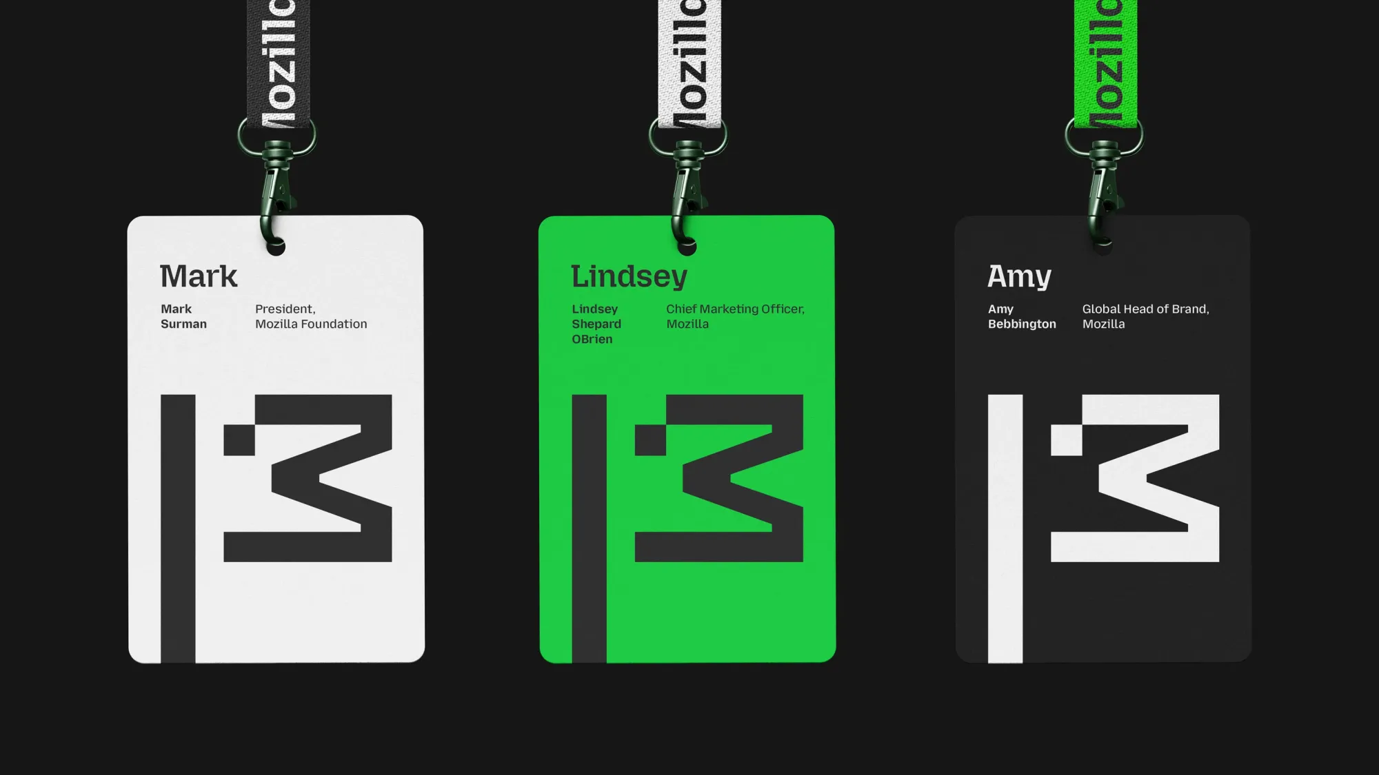
“We are planning to roll out the brand in different settings and surfaces with the intent to bring Mozilla back to the top of mind,” said Amy Bebbington, Mozilla’s brand head.
With an internet increasingly dominated by a few tech giants, Mozilla’s refreshed identity serves as a reminder of the power of grassroots activism and community-driven change. It’s not just a new look—it’s a renewed mission.