Mountain Dew’s getting a makeover. For the first time since 2009, the brand is unveiling a new logo designed to connect with the younger crowd—specifically Gen Z and millennials.
The marketing spin?
They're reclaiming their roots, drawing on a nostalgic connection to the outdoors while pushing a fresh, adventurous vibe.
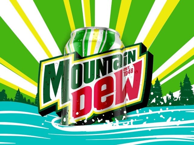
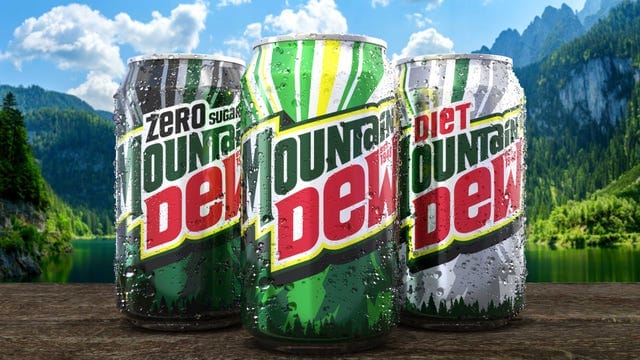
The updated look isn’t just about the logo; it’s about capturing the spirit of "DO THE DEW" with outdoor landscapes and a vibrant color palette.
The brand wants to align with the culture of exploration and adventure.
But, here’s the real question: does a new logo really make Mountain Dew more approachable to younger generations?
Logos and packaging are important, sure. But how much weight does a design hold when you're trying to resonate with a generation that cares more about substance than flash?
Gen Z isn’t just buying a product for the label—they're more likely to care about the brand’s ethos, sustainability practices, and overall authenticity.
It’ll be interesting to see how this redesign plays out in the real world next summer.
While the outdoorsy imagery might appeal to long-time fans, I’m curious to see if the younger crowd will actually be moved by a “nostalgic” look for a soda they didn’t grow up drinking.
Maybe it’s the flavors, the nostalgia, or the cultural phenomenon they’re banking on—but a logo alone might not carry the weight Mountain Dew hopes for.
Let’s just hope the taste still delivers.