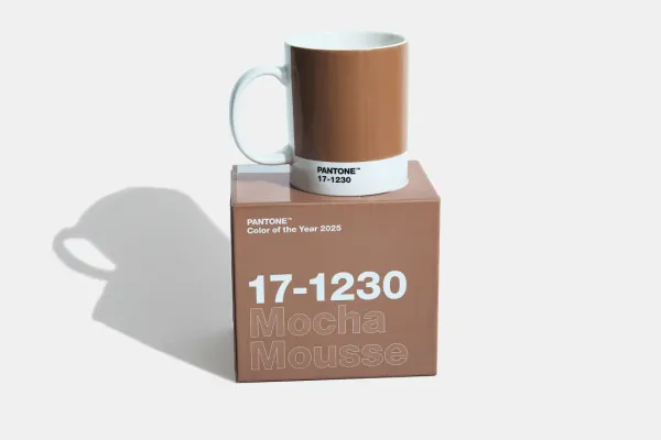
Pantone has unveiled its Colour of the Year for 2025: Mocha Mousse, a "sensual" brown inspired by cacao, chocolate, and coffee.
A comforting hue, it’s said to offer “thoughtful indulgence” and a sense of luxury.
But let’s pause for a moment—are we really embracing brown or just Pantone’s genius branding machine?
Every December, Pantone crowns a colour, claiming it reflects our collective psyche.
Experts scour runways and pop culture, wrapping their choice in language as lush as the hues themselves.
But at its core, isn’t this more about shifting products and marketing trends than global harmony?
Mocha Mousse is pleasant, sure—a rich neutral that works in both a cappuccino and your living room. But does anyone wake up thinking, I hope brown defines my year ahead?
The annual pick feels more aspirational than practical, creating a designer buzz that ensures Pantone stays relevant (and profitable).

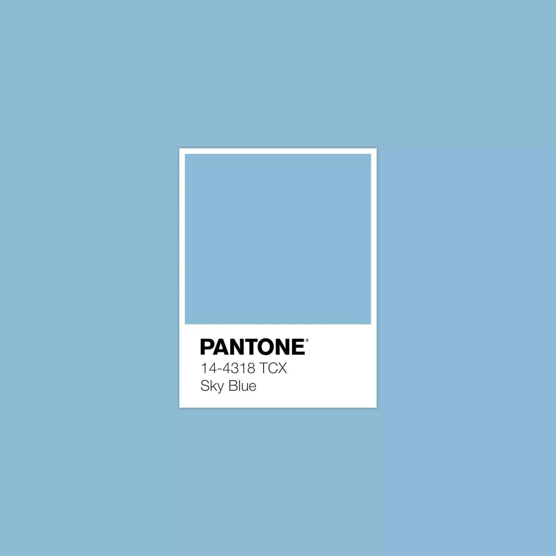
Since its start in 1999 with Sky Blue, this tradition has morphed into a cultural phenomenon.
Fashion houses, paint brands, and tech gadgets often align with Pantone’s proclamation, turning colour into commerce.
Yet, for all the hype, how many of these shades actually resonate in our daily lives? Did last year’s Peach Fuzz or Viva Magenta change your outlook, or just your Instagram feed?
Mocha Mousse is cosy, versatile, and undoubtedly easy to sell. But let’s not overstate its significance.
Colour of the Year might not define humanity, but it certainly defines Pantone’s marketing prowess—and, frankly, who can blame them?
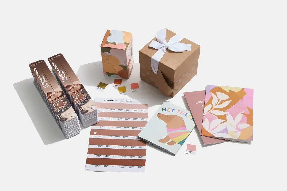
If you’re a fan of warm, chocolaty tones, embrace the trend.
But remember: your personal taste matters more than what’s trending. Whether Mocha Mousse inspires your decor or just a trip to the coffee shop, don’t let the hype dictate your palette.
Now, where’s my latte?

