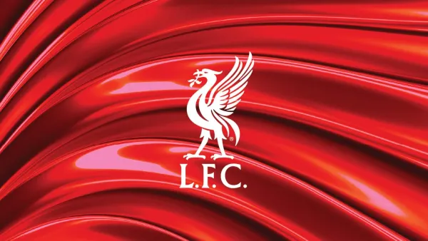
Liverpool FC has given its identity a refresh, and it's a lesson in how to modernize a brand without losing its soul.
The club has introduced new typefaces, a refined color palette, and subtle tweaks to its visual identity—all inspired by the Liver bird, the city’s most famous symbol.
At first glance, this might seem like just another sports rebrand. But there’s a lot to unpack here.
The Balancing Act of Heritage and Progress
Football clubs are more than just teams. They’re institutions, cultural landmarks, and in some cases, global brands.
That means updating their identity isn’t just a matter of picking a new font or tweaking a color—it’s about walking a tightrope between tradition and evolution.
Liverpool’s approach?
Rather than chasing trends, they’ve built on their existing identity. The new custom typefaces, LFC Sans and LFC Serif, take inspiration from the Liver bird’s wings and talons.
It’s a small detail, but one that roots the typography in something deeply meaningful to both the club and the city.
And then there’s the color palette.
Instead of overhauling anything, they’ve refined it, making sure Liverpool’s signature red remains the hero.
No flashy gradients, no unnecessary extras—just a sharper, more focused use of color that works better across digital and print.
Liverpool’s redesign is a textbook example of how to modernize a brand without alienating a loyal fanbase.
Too often, companies overhaul their identity to chase a new audience, only to lose what made them recognizable in the first place. (Remember when Gap tried to change its logo and had to backtrack in six days?)
This update shows that sometimes, the best approach isn’t about reinventing—it’s about refining. Strip away the noise, make the essentials stronger, and respect what already works.
A brand refresh doesn’t mean starting over – Evolution often trumps revolution.
Liverpool FC’s update isn’t flashy, but it’s smart. It respects the past while sharpening the future.
And in branding, that’s a winning strategy.