
Let’s talk about Jaguar’s new logo. It’s minimal.
It’s clean. And it’s… kind of boring?
For a brand built on sleek design and roaring engines, this feels like a bit of a flat tyre. The leaping cat—gone.
Instead, we’ve got a wordmark that’s so stripped back it could be from any high-end furniture brand.
Sure, it’s modern, but does it really scream Jaguar? Or even whisper it? I get it.
Jaguar’s all about pushing into the electric future. They want to feel fresh and fancy. But the logo has always been a huge part of their identity.
That cat wasn’t just a logo; it was a vibe—fast, powerful, exciting. This new design? It’s the graphic equivalent of “just OK.” Logos are meant to connect.
They’re meant to give us a feel for what the brand’s all about. This one feels safe. And Jaguar isn’t supposed to be safe.
Minimalism might work for some brands, but Jaguar isn’t just a brand—it’s an icon.
Jaguar has a new logo redesign and it's... something 😳
— AR12GAMING (@AR12Gaming) November 19, 2024
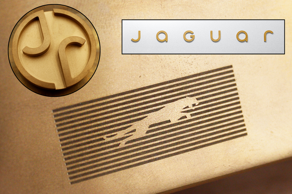
New logos feature an angular "leaper" design, a modern typeface, and a circular badge with "J" and "r."
First luxury EV debuts in 2026, with prices expected to double, prioritizing exclusivity over volume. pic.twitter.com/e19LK4MAaE
This change feels more like a sidestep than a leap forward.
Fingers crossed the cars bring the wow factor that this logo doesn’t.