It’s no exaggeration to say the PlayStation logo is iconic—bold colours, sharp design, and enough retro vibes to give you a warm dose of nostalgia every time you see it.
But what’s truly fascinating is that Sony didn’t just stumble upon that polished “P” and “S” design. Oh no. The journey to the final PlayStation logo was a wild ride filled with experimentation, risks, and some truly odd attempts.
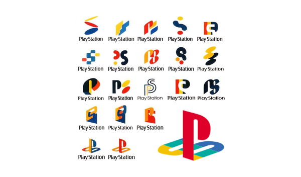
The featured image (above) gives us a glimpse of what might have been, and honestly, it’s a design buffet.
Some of these feel like they belong in a ‘90s tech startup that went bust after three months, while others hint at pure genius. Sony had a real challenge on their hands—they weren’t just building a logo but an entire identity.
And as we now know, they nailed it.
The vibrant mix of red, yellow, green, and blue wasn’t just aesthetic. According to Sakamoto, it symbolised the console’s versatility and creativity.
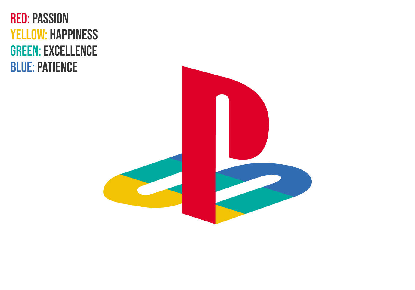
It’s fascinating how the PlayStation logo manages to be unmistakably a product of the 1990s—its bold colours, geometric design, and playful yet professional vibe are all hallmarks of that era.
And yet, despite being rooted in such a distinct period, the logo feels anything but outdated. It has aged remarkably well, standing the test of time while continuing to look fresh and relevant even in today’s design-conscious world.
The fact that it hasn't been redesigned since its inception is a testament to that. But how did Sony arrive at "the one"?
The Search for the Perfect Logo
The design process behind the PlayStation logo started with an open brief: make it modern, memorable, and globally appealing.
Easier said than done, right?
Early iterations included chunky letters, abstract squiggles, and shapes that wouldn’t have looked out of place on a fridge magnet. They were playing around with geometry, colour blocking, and trying to balance playful with professional.
But here’s the thing: PlayStation wasn’t just another electronic gadget—it was an experience. Or at least, Sony aspired for it to be. It did indeed end up becoming a groundbreaking gaming revolution.
The logo had to scream “future of fun,” not “cheap toy brand.” And this is where legendary designer Manabu Sakamoto enters the chat.
Sakamoto created several options, but it’s the now-iconic overlapping “P” and “S” that ultimately stood out.
The clever interplay between the two letters creates depth, almost like it’s popping off the screen—a subtle nod to 3D gaming, which the original PlayStation helped pioneer.
What About the Rest?
Looking at the other logo concepts, it’s obvious Sony dodged some potential disasters. For example, a few of these logos are too abstract, bordering on confusing.
Others lack the timelessness of the final design—imagine trying to stick some of these on a console in 2024. Some even resemble the work of a particularly energetic MS Paint user.
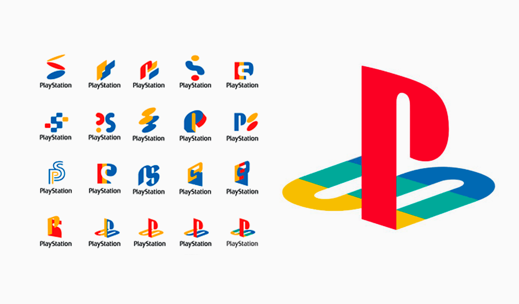
But that’s the beauty of design iteration. You need those duds to find the diamond. And let’s be fair—some of these are still pretty cool in their own right.
If nothing else, they capture the experimental spirit of the ‘90s, a time when everyone was figuring out what the future even looked like.
Why the Final Logo Works
Here’s why the final design still hits hard:
- Simplicity: It’s clean, easy to remember, and stands out whether you see it on a game case, console, or controller.
- Meaning: The “P” and “S” combo has depth—literally—and feels tied to PlayStation’s innovation.
- Timelessness: It looked cool in 1994 and still looks cool today. You can’t say that about every logo here.
A Legacy in Design
The PlayStation logo isn’t just a triumph of branding—it’s a reminder of what good design can achieve.
It tells a story, defines an era, and connects millions of fans around the globe. Looking back at these early concepts, it’s clear how much thought, trial, and error went into getting it just right.
Proof that the grind pays off—and that sometimes, you’ve got to sift through a few “meh” ideas before you find a masterpiece.

