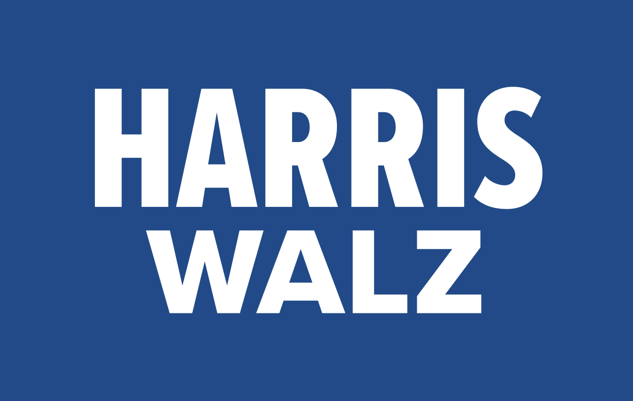
Harris/Walz 2024: Stripping Political Typography to Its Core
Sometimes simplicity is best - especially for a high stakes political campaign

The Harris/Walz 2024 campaign has embraced minimalism in its typography, ditching the stars, stripes, and arrows that typically dominate American political branding.
Their logotype, available in black-on-white and white-on-blue, cuts through the visual noise with stark simplicity. This approach isn't just an aesthetic choice—it's practical. Most voters will see this branding on screens, often as small, waving images during rallies.
The clean, bold typography ensures legibility even on a smartphone or in the background of a crowded event.
Some draw parallels between this design and Harris's 2020 primary campaign, which claimed inspiration from Shirley Chisholm's 1972 run. But let's be critical of this "historic" connection.
Yes, both used all-caps typography, but that's hardly revolutionary in political messaging.
All-caps text has been grabbing attention on posters and headlines for generations. The claim that Harris's 2020 campaign paid typographic homage to Chisholm feels tenuous.
Chisholm's posters used Franklin Gothic, a ubiquitous typeface of the time. If a true visual link was the goal, why not use Franklin Gothic?
The choice of a different sans-serif font weakens this supposed connection.
A Departure
In political branding, sometimes less truly is more.
The Harris/Walz typography proves this point, stripping away excess to focus on what matters: the message.
While some may find the Harris/Walz logotype "boring," its simplicity is its strength.
It cuts through the visual clutter of modern campaigns, offering a clear, legible message across various media.
Rather than leaning on questionable historical connections or tired patriotic imagery, it presents a fresh look that stands out by not trying too hard to stand out.
This shift is particularly interesting given Harris's initial use of Biden's traditional branding when she joined his ticket in 2020.
The move to minimalism for her presidential run indicates a desire to forge a distinct identity—modern, straightforward, and message-focused.
What's noteworthy about the Harris/Walz 2024 design is its departure from contemporary political design clichés.
By avoiding the standard red, white, and blue palette and patriotic imagery, the campaign makes a statement. It suggests prioritizing substance over spectacle, policy over patriotic pandering.


