TLDR: Figma's updated visual identity is a collaborative, flexible system designed to evolve with the brand. It’s not just a refresh, but a new "foundation for future growth", emphasising teamwork and adaptability.
Figma has always championed collaborative design, and their latest update to their visual language perfectly encapsulates this ethos.
The reimagined brand identity wasn't crafted in silos but through an all-hands-on-deck effort.
As Jefferson Cheng, a Brand Designer at Figma, notes, "It doesn’t matter where something originates; we’re coming together to make something great."
The Mindset
This collaborative mindset not only sped up the design process but empowered the entire team.
Instead of relying on a single designer specialising in specific elements, everyone contributed to the development and reuse of design primitives.
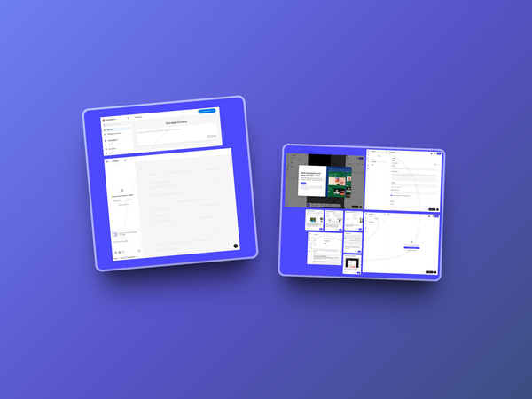
By leveraging Figma’s own design system features, the team built comprehensive brand libraries and toolkits, making assets universally accessible across the company.
It’s a testament to how their own tools can drive efficiency and inclusivity.
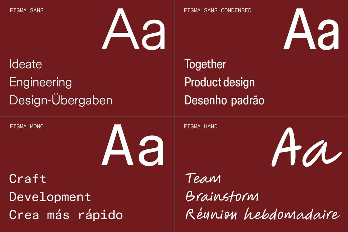
But this isn’t just a visual refresh—it's a foundation for the future.
As Taryn Cowart, Design Manager of the Brand Studio, explains, "This isn’t the final destination. It’s a new starting point."
Figma’s new system is designed to evolve, adapting as the brand grows and changes.
With this flexible system in place, Figma continues to prove why they remain a key player in the design industry—putting collaboration and adaptability at the forefront.
The new visual identity doesn’t just mark a milestone, it sets the stage for what’s next.
