Figma's UI3 update reflects a delicate balance between pushing forward with innovation and responding to user needs.
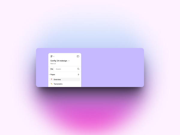
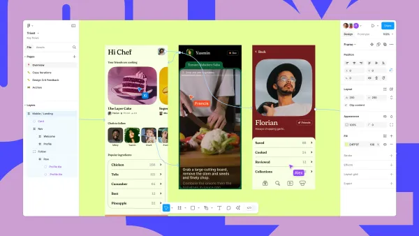
Initially, Figma introduced floating panels as part of the redesign, seeking to create a streamlined interface that put the "canvas first".
But the design community? Well, they weren't happy.
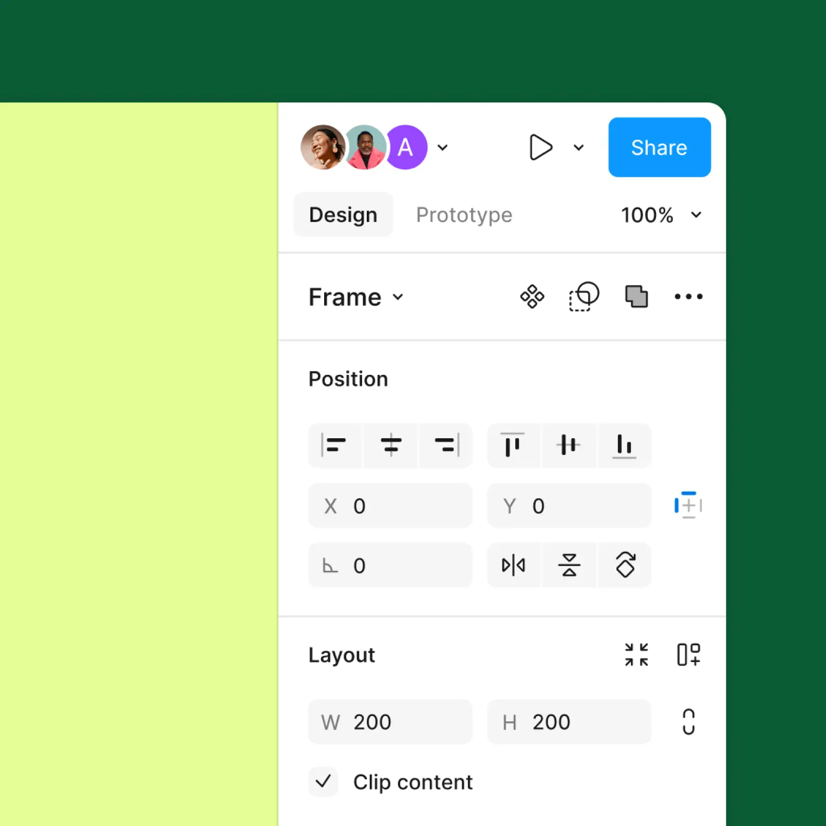
Some folks found panels intrusive, especially on smaller screens. As a result, Figma has now reversed course, opting for fixed, resizable panels.
Designers spend countless hours with these tools, so even small UI changes can dramatically affect their workflow. The floating panels, while an interesting experiment, slowed down tasks rather than streamlining them.
So brilliant news, right? Floating panels are no more. Rejoice!
Most important of all - this decision highlights a core principle: listening to feedback is as important as a bold vision.
Figma’s willingness to pivot shows that maybe they do read the complaints on Twitter and Reddit.
The reversal has mostly been met with praise.
Redditor Willy_1967 was relieved saying, "The right thing to do. The floating panels were pointless form over function and objectively worse. The UI3 design team must feel like shit for having to backtrack on all their ‘improvements’ but I’m glad these mistakes are getting fixed."
It's an important factor in the design process: no matter what you think is best for the user, sometimes, the user won't care.
What about the small minority that honest to God liked the floating panels? Well, in an ironic twist, even those who didn't like them suggested that they should have at least been an option.
Donkeyrocket, another Redditor, said, "It may not be a popular opinion here, and I'm personally against the floating panels, but really Figma should be allowing for more user-controlled flexibility over their workspace. Complicates things from a product standpoint no doubt."
Spoken like a true designer, Donkeyrocket. When it doubt, just let the user choose their UI preference.
Minimise UI
Figma also introduced a "Minimise UI" feature, a welcome change allowing distraction-free work without completely hiding tools.
It’s a more thoughtful evolution than the abrupt floating panels, offering flexibility while respecting different work habits.
The same careful thinking applies to updates in blend modes, component controls, and labeling systems, showing Figma’s effort to address pain points from the past while staying adaptable for future needs.
Ultimately, the story of UI3 isn't just about new features—it's about Figma's commitment to building with its users.
While experimenting and pushing boundaries is crucial, recognising when to listen and adjust course is equally important.
Figma's move to reverse some of its decisions shows humility and a genuine commitment to its community, something that not all companies are willing to do.
This update is not perfect, but it's a promising example of how user-centered design should work.