Figma’s UI2 is Dead. Long Live UI3
Figma retires UI2 April. You ready?

TL;DR: Figma’s old UI is out on April 30. Switch to UI3 now or get switched automatically.
Let us know what you think of the new layout—any glaring issues, or is it actually better?
If you’ve been clinging to Figma’s old interface like your favorite hoodie from 2018, it’s time to let go.
Figma just dropped the final date: UI2 will disappear on April 30. After that, it’s UI3 or nothing.
A little dramatic? Maybe. But here’s what’s actually happening.
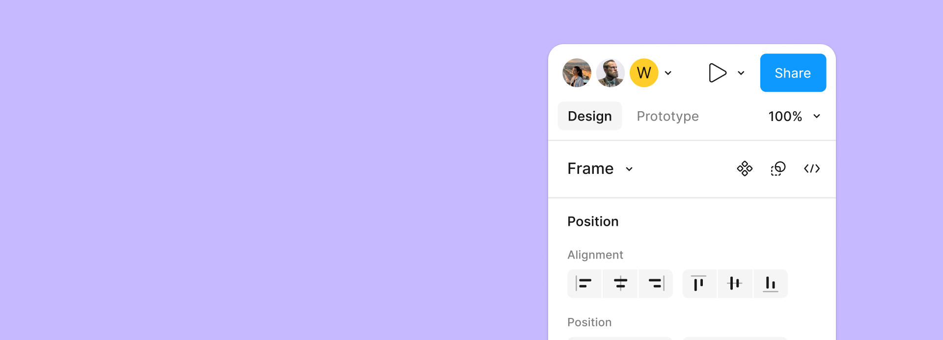
What’s Changing?
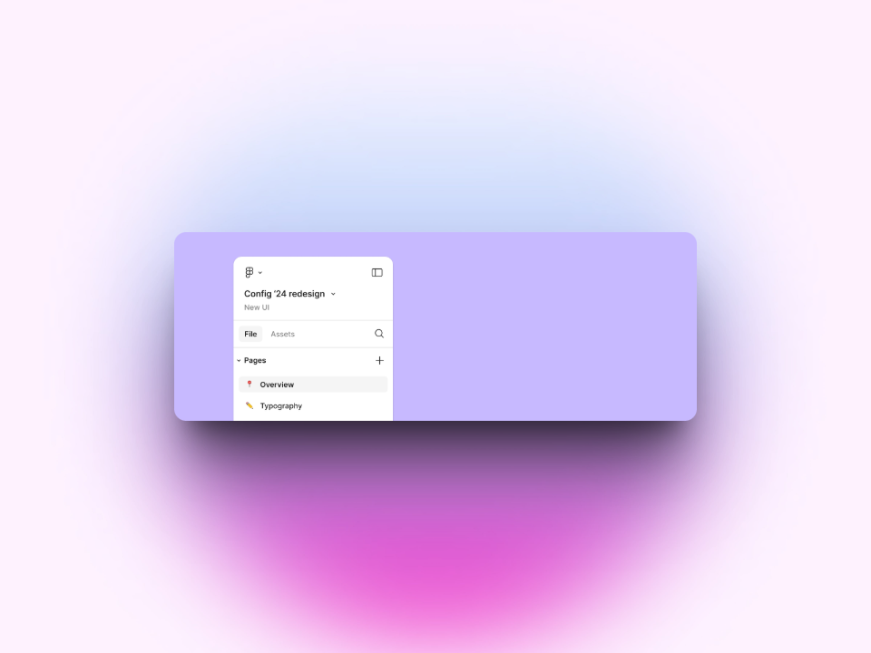
Figma is moving everyone over to UI3—their newer, shinier interface. You’ve probably already seen it or even tried it. Cleaner layout, more modern styling, and a handful of tweaks that have been slowly rolling out.
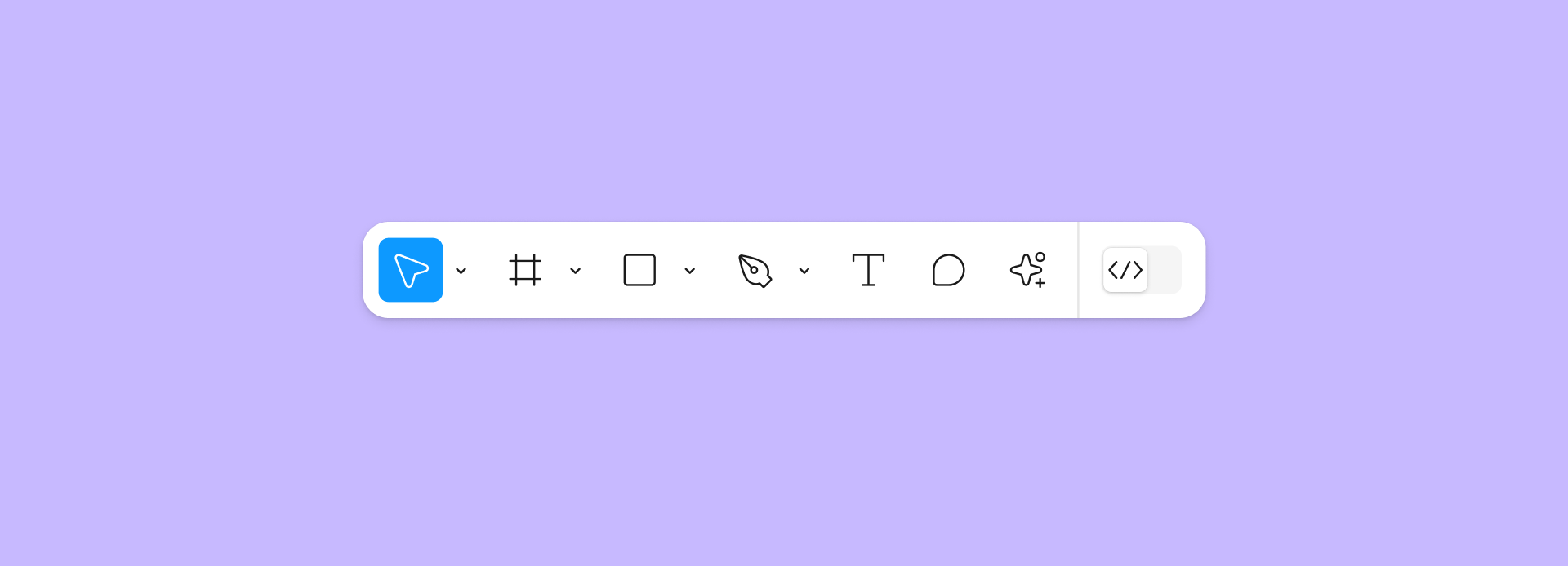
This isn’t just a design refresh. UI3 brings:
- A more consistent toolbar across design and prototyping
- Updated icons and grouping
- Easier access to common actions
- Improved accessibility and spacing
Basically, it’s meant to reduce clutter and bring some order to the chaos.
Why Should You Care?
Well, if you’re still using UI2, you won’t be able to after April 30. That’s it. No in-app toggle. No secret settings menu. Just a full switch.
If you work in a team, best to make the switch now so you’re not scrambling later.
Plus, Figma says they’ve made adjustments based on user feedback—so if you hated UI3 before, it might not be as bad now.
Not Sure Yet?
There’s a “Switch to UI3” button already in-app, right where they show the notice. You can jump in now and get used to it on your own terms.
Or you can wait till May 1st and be thrown in like a toddler into cold water.
Your choice.