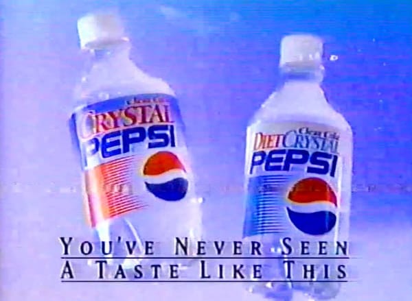
Crystal Pepsi hit shelves in the early 90s looking like a sci-fi reboot of a cola.
Transparent liquid. Minimalist label. Stark white cap. It felt more like bottled tech than a soft drink. Pepsi leaned hard into the idea of “clarity.”
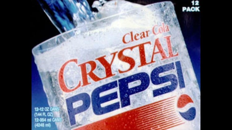
Not just in the product, but in the branding. The label flipped expectations—white space took over, soft gradients slid across the background, and the old Pepsi blue orb was nearly the only familiar anchor. Typography was loud.
"CRYSTAL" was printed in a red serif, sharp and declarative. "PEPSI" held onto its sans-serif roots.
The combination looked awkward in places, but it worked if you squinted at the intention: this was still Pepsi, just one that glitched into a health-conscious future.

The problem?
It looked healthier than it tasted. People expected something clean and citrusy. Instead, it was just cola without the caramel color.
That disconnect—between what the design suggested and what the product delivered—killed it. But from a visual standpoint?
It’s pure time-capsule gold. The kind of thing you’d expect to see on a Tumblr page about defunct branding, or printed on a thrifted hoodie with too much kerning.
Crystal Pepsi didn’t survive the 90s, but its design holds up because it tried something. It zigged while everyone else stayed dark, fizzy, and safe. It’s the kind of design risk we rarely see now—especially from legacy brands. And whether you loved it or not, you remembered it.
That’s a win in design terms.