TLDR: Canva's recent "glow up" update has left users frustrated, particularly those who rely on it for critical work. From functionality issues to interface changes, the update is seen as a rushed, shareholder-pleasing disaster. The lack of communication and failure to consider diverse user needs is eroding trust and usability.
The bad news keeps coming for Canva users.
After the announcement that teams users would be paying more for the privilege, users aren't happy with a sizable update that no one apparently asked for.
Canva's latest update, ironically dubbed a "glow up," has ignited a wave of frustration among its users, particularly those whose livelihoods depend on the platform.
What was meant to be an enhancement has instead stripped away essential functionality, forcing long-time users to reconsider their loyalty.
This isn't just a minor inconvenience—it's a full-blown crisis for many. One user, who relies on Canva to create fundraising graphics for global causes, has been vocal about the detrimental impact of the update.
Their grievances range from core usability issues, like the platform's broken interface and lag, to more significant concerns about how this change has disrupted their workflow and business.
With Canva now apparently more focused on monetisation—perhaps evident in the removal of the free template search function—the platform's once-solid user experience is crumbling. The biggest pain points?
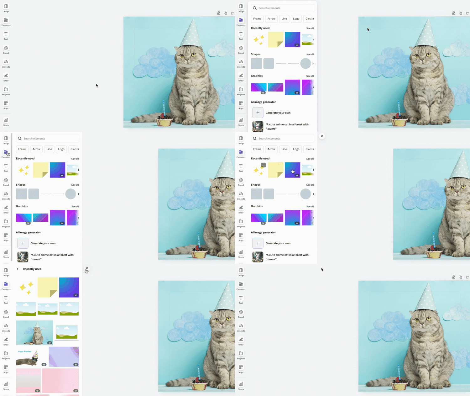
The interface now resets progress when switching between tabs, wasting hours of work.
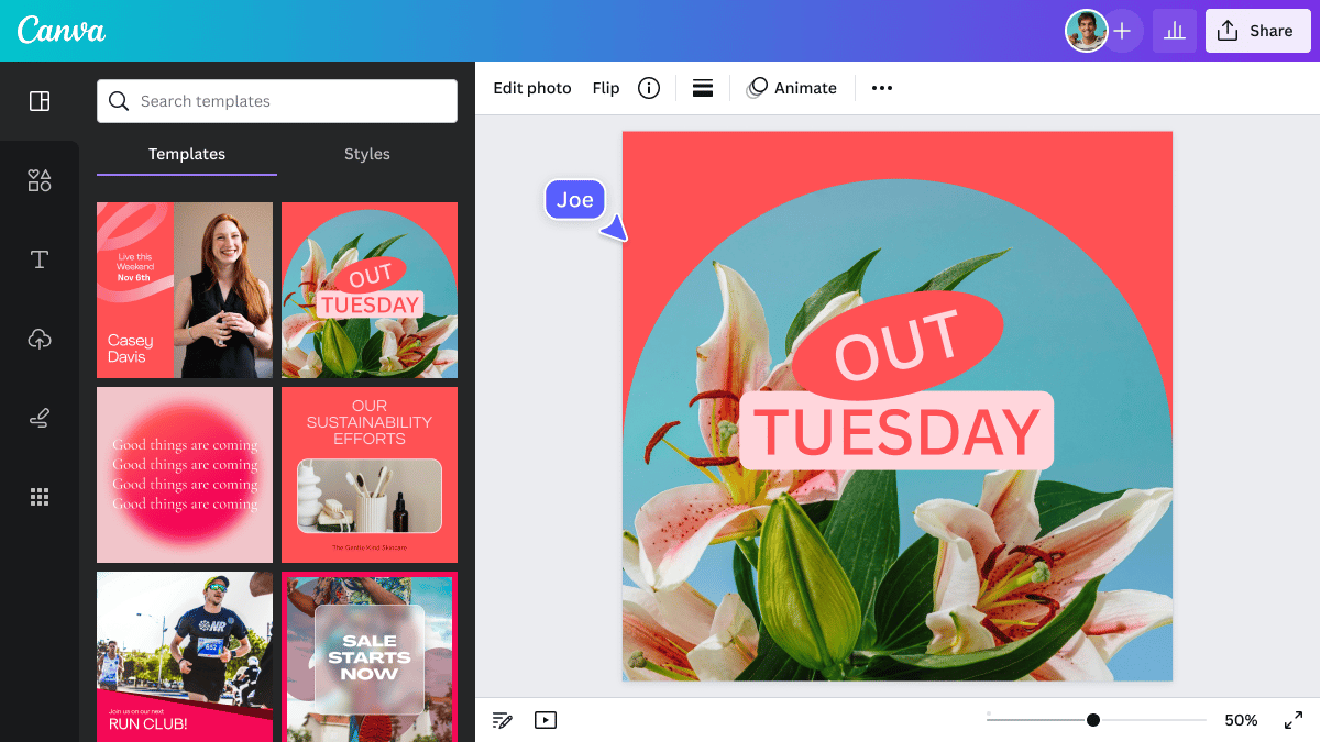
Basic functionalities, like dragging and dropping templates, have been inexplicably removed, adding to the frustration.
And the lag—particularly on Mac desktops—is so severe that editing even simple videos becomes a rage-inducing task.
For a service that charges $15+ per month, vocal users on the Canva subreddit think these issues are unacceptable. It’s not just the technical glitches that are enraging users; it’s the perceived greed behind the changes.
Canva has made the app less accessible, with higher costs and a push towards paid features. This move, which many see as a transparent attempt to boost shareholder profits, comes at the expense of user trust and functionality. Canva's apparent disregard for diverse user needs, including those of neurodivergent individuals, is glaring.
The platform's refusal to provide an option to revert to the previous version has left users feeling trapped and unheard. For many, Canva is not just a design tool but the backbone of their business operations.
The decision to roll out such a disruptive update without adequate beta testing or user feedback is baffling. The backlash has been swift and severe, with calls to boycott Canva growing louder.
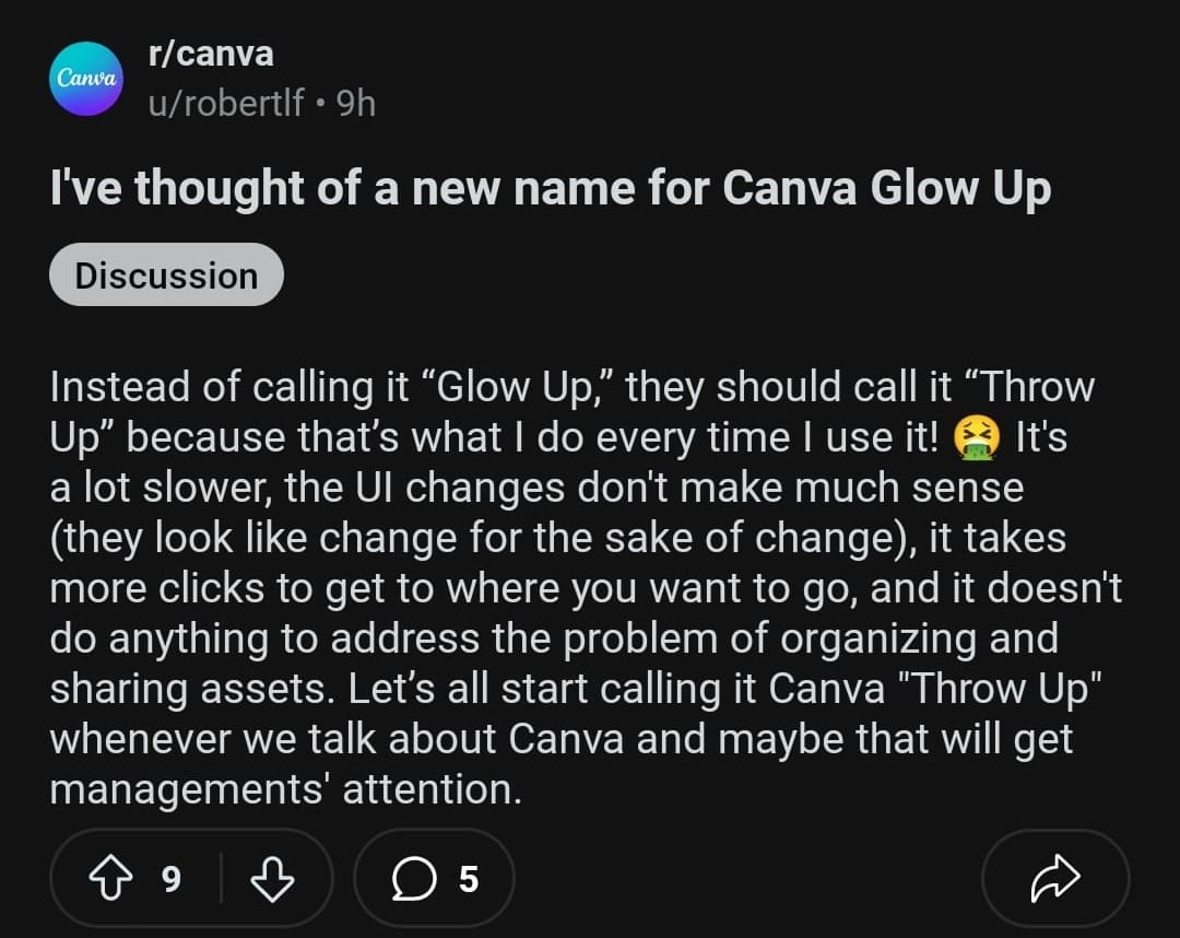
Users are demanding not just a rollback of the update but also more transparency and better communication from the company.
This "glow up" has done anything but make the platform shine—it's dimmed its reputation and alienated the very people who helped build its success. Canva needs to take these concerns seriously and act fast. Or is this just a case of users hating a redesign they'll eventually accept in time?
Who knows?
One thing is for sure. The platform’s future depends on its ability to listen to its users, restore lost functionalities, and rebuild the trust that’s been so rapidly eroded.
Otherwise, this glow-up might just be the beginning of a serious burn-out.
Looking for an alternative service? We'd recommend Kittl.
