Built from Circles, Burned into Memory: The Enduring Power of the Aphex Twin Logo
Aphex Twin's iconic logo: hand-drawn geometry defined 90s electronic identity

In the sprawling visual landscape of music, few symbols achieve true iconic status – instantly recognizable, deeply resonant, and intrinsically linked to the artist's sound and ethos. Among the most potent in electronic music is the strange, compelling mark of Aphex Twin.
It’s a logo that feels less designed and more discovered, like an alien glyph or a schematic for some unknown technology. And its origin story is refreshingly analogue, rooted in basic tools and geometric principles.
Picture this: 1991. The electronic music scene is bubbling with innovation, pushing sonic boundaries. Richard D. James, the enigmatic producer known as Aphex Twin, is solidifying his place as a pioneering force. He needs a visual identity as unique and challenging as his music.
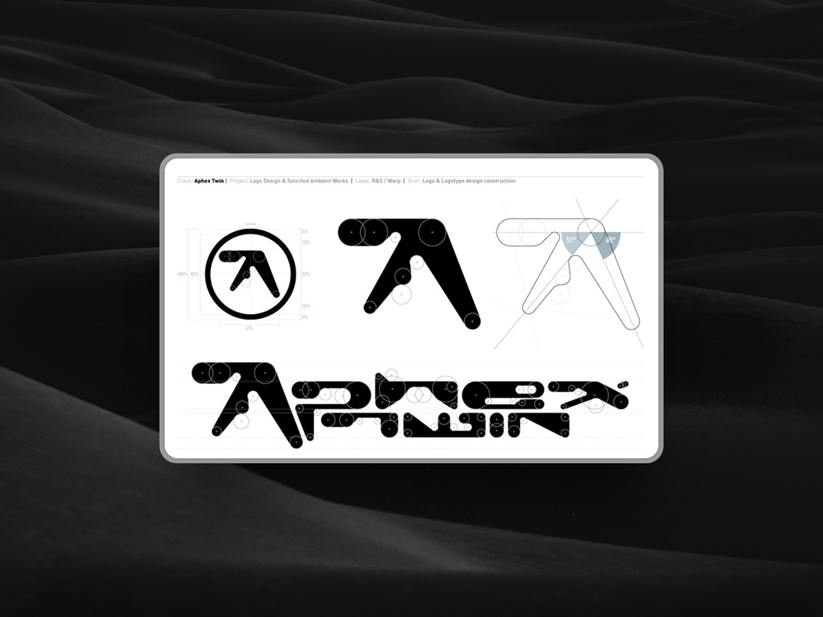
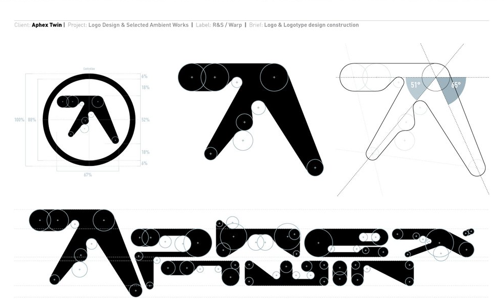
Enter Paul Nicholson, a designer tasked with creating this mark. Forget sophisticated software suites or collaborative digital mood boards. Nicholson sat down with the fundamental tools of graphic design: a ruler, circle templates, and paper.
What emerged from this hands-on process wasn't just a letter 'A', but a symbol loaded with intrigue:
- Geometric Foundation: The logo is famously constructed using principles of geometry, primarily circles and arcs. This gives it an underlying sense of order and precision, even amidst its unconventional form.
- Hand-Drawn Intent: Despite its geometric basis, the fact that it was manually drafted imbues it with a certain character, a slight tension between mathematical rigidity and human execution. It wasn't pixel-perfect from a machine; it was drawn with purpose.
- Ambiguous Form: Is it an 'A'? A mutated symbol? Something else entirely? Its abstract nature avoids literal interpretation, allowing it to absorb the complex, often unsettling beauty of Aphex Twin's music. It feels simultaneously futuristic and ancient.
- Bold and Uncompromising: The logo is assertive. Its thick lines and sharp angles (even within curves) give it weight and presence. It doesn't blend in; it demands attention, much like the music it represents.
This blend of the precise and the uncanny is central to the logo's enduring appeal. It achieves a difficult balance: it’s weird, undeniably experimental, yet incredibly tight and memorable.
There’s no extraneous flourish; every curve and line feels deliberate, necessary. It possesses an almost ambigrammatic quality, looking strangely coherent from multiple angles, further adding to its mystique.
It doesn't feel "designed" in the slick, corporate sense; it feels engineered.
Paul Nicholson's contribution to the visual identity of 90s electronic music extends beyond this single, iconic mark. His work graced projects associated with other seminal artists and labels, helping to craft the aesthetic of an era:
- Orbital: He contributed visual elements, capturing their blend of euphoric melody and intricate rhythm.
- Warp Records: As Aphex Twin's primary label, Warp itself became synonymous with cutting-edge electronic music, and Nicholson's work contributed to its distinct visual identity.
- Defining an Era's Look: Alongside other designers, Nicholson helped shape how this burgeoning electronic subculture looked. In the pre-internet saturation era, logos and artwork weren't just branding; they were tribal markers, visual shorthand for complex sonic worlds, shared on flyers, record sleeves, and t-shirts. They signified belonging.
The Aphex Twin logo wasn’t merely a tag to slap on merchandise (though it certainly works brilliantly for that).
It was conceived as an integral part of the identity, a visual manifestation of the sound – intelligent, complex, sometimes abrasive, always distinctive. It didn't need to spell out "electronic music" or "innovative soundscapes." Its very form communicated these ideas implicitly.
For designers working today in an environment saturated with digital tools and minimalist trends, the story of the Aphex Twin logo offers valuable reminders:
- Craft Matters: Foundational skills and manual processes can yield unique and powerful results that stand apart from purely digital creations.
- Precision in Experimentation: Being experimental doesn't require abandoning structure. The logo's strength comes from its controlled, geometric weirdness.
- Impact Over Explanation: The most enduring logos often resist easy explanation. They create a feeling, an association, rather than making a literal statement. Their ambiguity allows them to remain relevant as contexts shift.
Decades later, the Aphex Twin logo hasn't aged. It still feels futuristic, enigmatic, and instantly recognizable. It’s burned into the memory of anyone who has delved into the depths of experimental electronic music.
It shows what a solid idea and a bit of weirdness can do—just some circles, a ruler, and a clear sense of what you’re going for. That’s all it took.