Touchscreens are everywhere these days—on our phones, in our cars, at ATMs, you name it.
Some contexts are better than others. But cars? Well, cars are the last place touchscreens should be.
They’re convenient, sure, but as Spectrum’s recent article points out, they come with a lot of issues that we often overlook, especially when it comes to making tech easy and accessible for everyone.
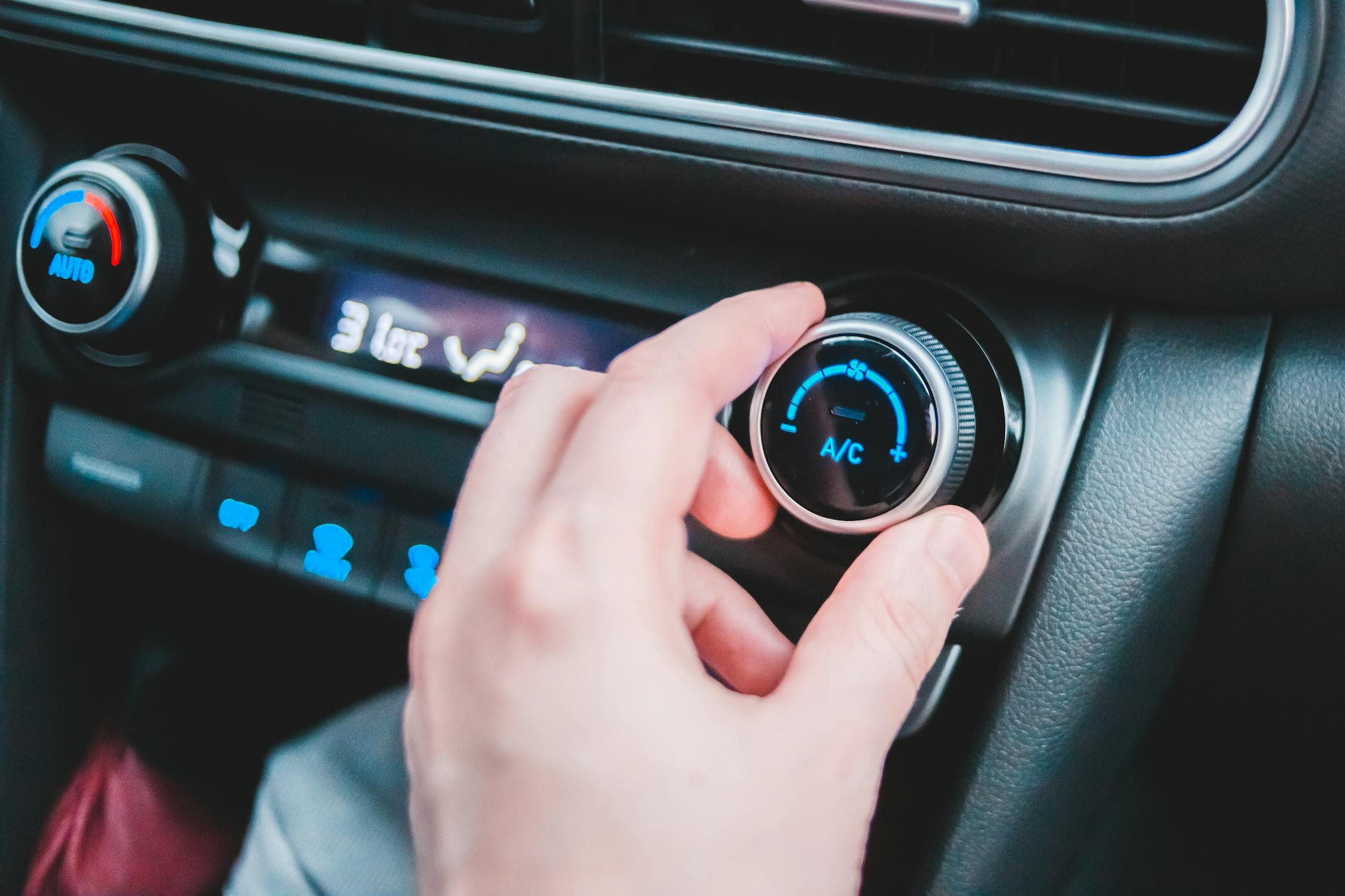
That's changing, with car manufacturers, like Hyundai, saying enough is enough. Critical controls should stay outside of touchscreens to ensure quick access and safer, distraction-free operation.
The safety benefits aren't up for dispute.
Europe is even mandating physical buttons in the cabin to achieve top safety ratings, signaling a shift at the regulatory level. Will the US follow suit?
So, let’s get into what’s actually going on with touchscreens and why it might be time to rethink their dominance.
The Ups and Downs of Touchscreens
Touchscreens make things feel super modern and straightforward, but they’re not always as user-friendly as they seem.
The biggest issue?
They’re designed in a way that assumes every user and every environment is the same. Most of these screens just aren’t built for situations like being outside in bright sunlight, or for people who wear gloves, or those who have limited dexterity.
For anyone with a disability, touchscreens can sometimes make using tech harder, not easier. If you can’t press a button accurately or get any feedback from it, using the device can quickly become frustrating.
This is a problem if you don't have a disability too. One of the biggest downsides of touchscreens is the lack of tactile feedback.

Physical buttons give you something to feel—a click or press that lets you know, “yep, that’s done.”
This might not seem like a big deal, but it’s surprisingly handy, especially in situations where you can’t—or shouldn’t—take your eyes off the road, like when you’re driving.
Touchscreens may look sleek, but they fall short when you need to make quick, precise moves.
Research even shows that having tactile controls can improve safety and satisfaction, especially in high-stakes situations like driving.
The Swedish magazine Vi Bilägare discovered that a 2005 Volvo significantly outperformed modern cars with infotainment screens, allowing a driver to complete all four tasks in just ten seconds and covering only 1,000 feet.
Accessibility Woes
The truth is, that touchscreens aren’t always accessible. While that's a problem in most walks of life, it's especially the case in a moving car.
There are features like voice commands and assistive modes, but they’re usually clunky or buried in menus. They still cause more cognitive load than simple dials.
For people who find tech intimidating already, this lack of intuitive accessibility is a big problem.
Plus, tactile buttons have proven benefits, as they offer simplicity and reliability that touchscreens still can’t match. So maybe it’s time to rethink our touchscreen obsession.
As Spectrum’s article suggests, touchscreens shouldn't be the default for every device. In cars, they can work well, provided they’re limited to controlling secondary functions only.
Bringing back physical buttons in some cases and mixing them with touch features might actually improve usability for a lot of people.
In an era where we have smart tech all around us, maybe we could develop screens that adjust to different conditions or give us some physical feedback, so they’re just as easy to use as the old-school buttons.
Who knows what the future holds - maybe we won't need controls at all. Touchscreens have definitely changed the way we interact with tech, but there’s no harm in admitting they’re not perfect.
By combining them with tactile controls, we might end up with something more practical, accessible, and user-friendly. After all, good design isn’t just about what looks cool—it’s about what actually works for everyone.


