NASA’s Worm Logo: A Clean Break From the Stars
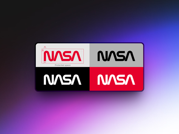
In 1976, NASA didn’t launch a rocket—but they did launch a new identity. And it was just as bold as a moonshot. Enter the NASA Graphics Standards Manual, a clean, spiral-bound book that introduced the world to a sleek, no-nonsense version of the NASA wordmark. Gone were the stars, the swooshes, and the patriotic flash of the original "meatball" logo. In came the "worm. The worm logo is what you see on the cover of that manual. Four custom letters, all smooth and connected, with a modernist fl

Chris Kernaghan