
Aptos: The New and Improved Font for Microsoft Office
Aptos is now the default font of choice for Microsoft Office users.
If you use Microsoft Office, you may have noticed something different about your documents lately.
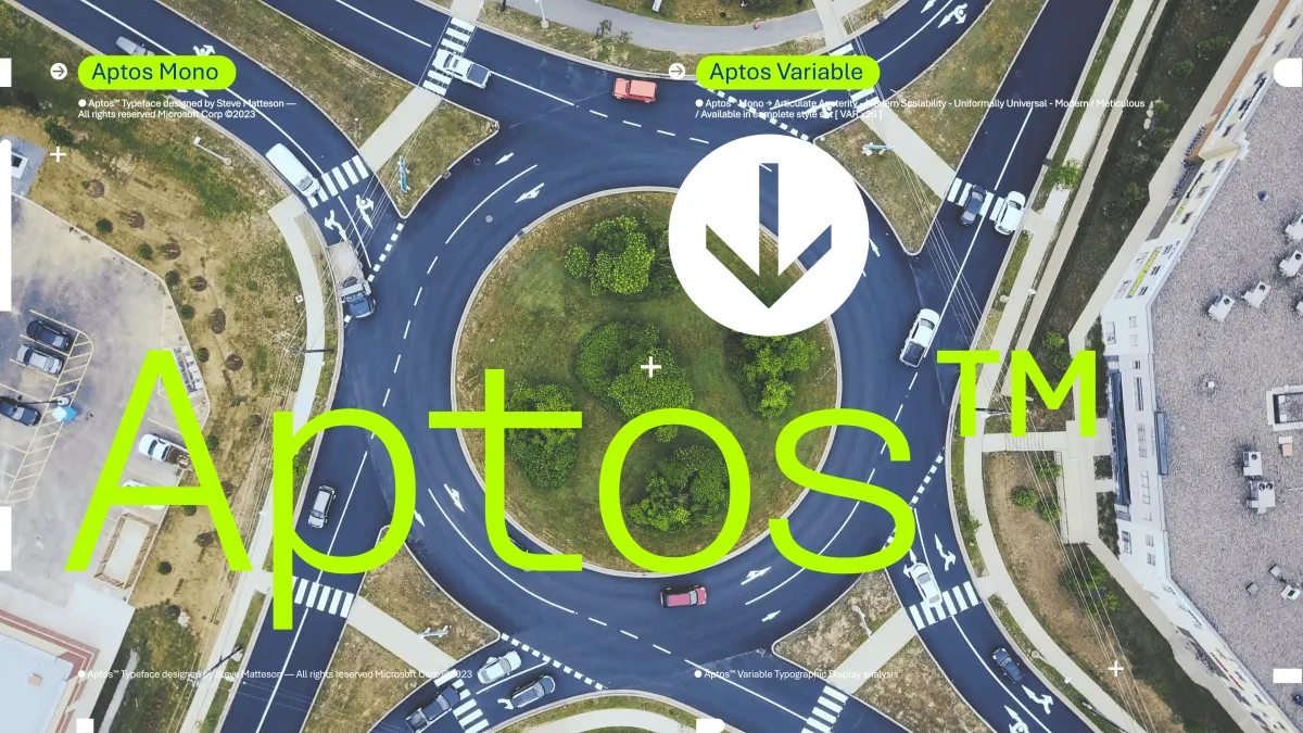
That’s because Microsoft has introduced a new default font for its popular suite of apps, called Aptos. What is it? Aptos is a sans-serif typeface that combines simplicity, elegance, and functionality.
It's a contemporary typeface that Microsoft eagerly incorporates, emitting a modern vibe within a software package that might otherwise appear mundane.
"Like Calibri, the new default font [is] our customer's voice, brand, and personality, unless of course, they chose one of the hundreds of other options we provide," says Si Daniels from Microsoft.
It's designed to be clear, legible, versatile, and suitable for any document you need to create. Excited? Let's take a closer look at Aptos, and how it can help you communicate better and express yourself more creatively.
The Story Behind Aptos
Aptos is the result of a collaboration between Microsoft and Monotype, a leading global provider of fonts and typefaces.
That's not all they do though.
Monotype specialises in font design, technology, and expertise related to typography. Founded in 1887, they're one of the oldest and most influential companies in the field of type design and printing technology.
They've played a significant role in shaping the world of typography, providing fonts and technologies used in various industries, including publishing, advertising, and digital media.
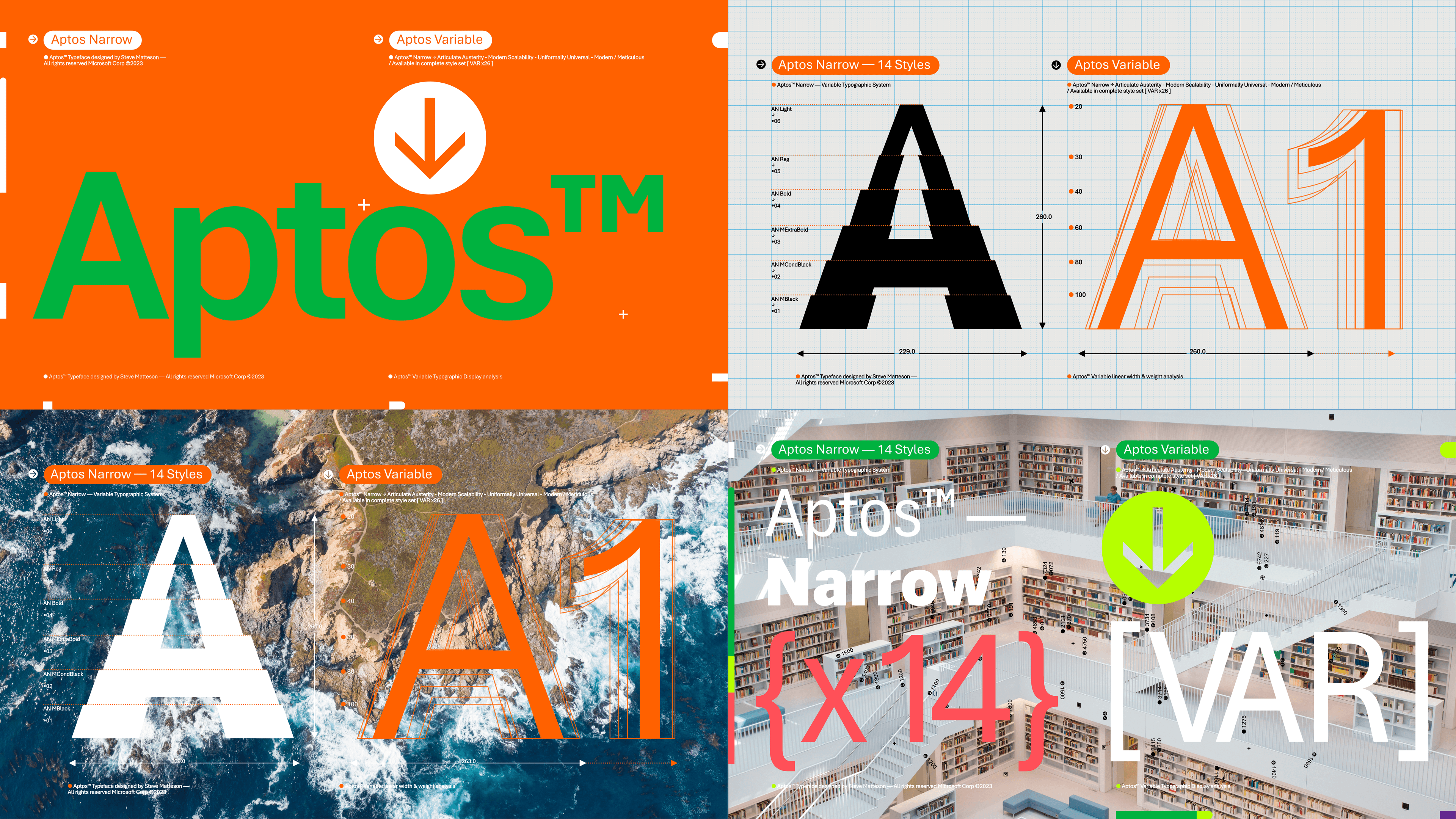
The Aptos project was led by Steve Matteson, a renowned type designer who has created fonts such as Segoe, Droid, and Open Sans.
Just like everyone else, Matteson finds inspiration in others. Adrian Frutiger, a Swiss type designer renowned for crafting influential fonts like Univers, Avenir, and Frutiger, serves as a source of inspiration.
Matteson wanted to create a font that would honor Frutiger’s legacy, but also reflect the needs and preferences of the 21st century. He named the font Aptos, after a town in California where he spent his childhood.
Aptos is also a Spanish word that means “fitting” or “suitable”, which reflects the font’s adaptability and suitability for various contexts and purposes.
The Beauty of Aptos
Aptos is a font that has a geometric structure but also incorporates humanistic elements that give it warmth and personality.
It has a large x-height, which means that the lowercase letters are relatively tall compared to the uppercase letters. This makes the font more legible and readable, especially on small screens and low-resolution devices.
Aptos also has a generous spacing between letters, which enhances the clarity and readability of the font. It has a moderate contrast between thick and thin strokes, which gives it a balanced and harmonious appearance.
“I wanted Aptos to be used in many languages and tones, without confusing or distracting the reader.” - Steve Matteson
It has a slightly curved terminal, which means that the end of the letter strokes are slightly rounded. This gives the font a friendly and approachable feel and also helps to avoid sharp corners that could cause visual fatigue.
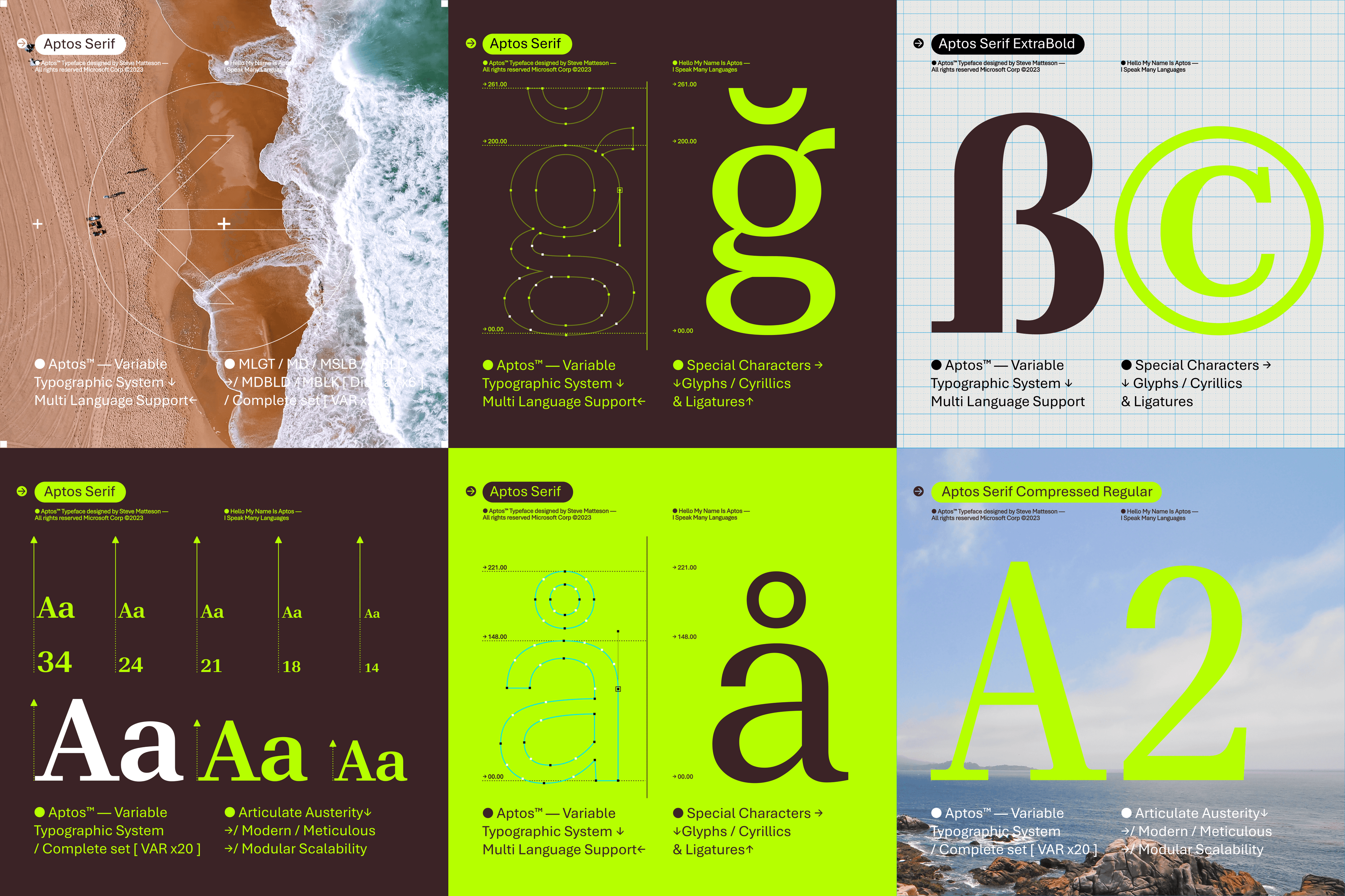
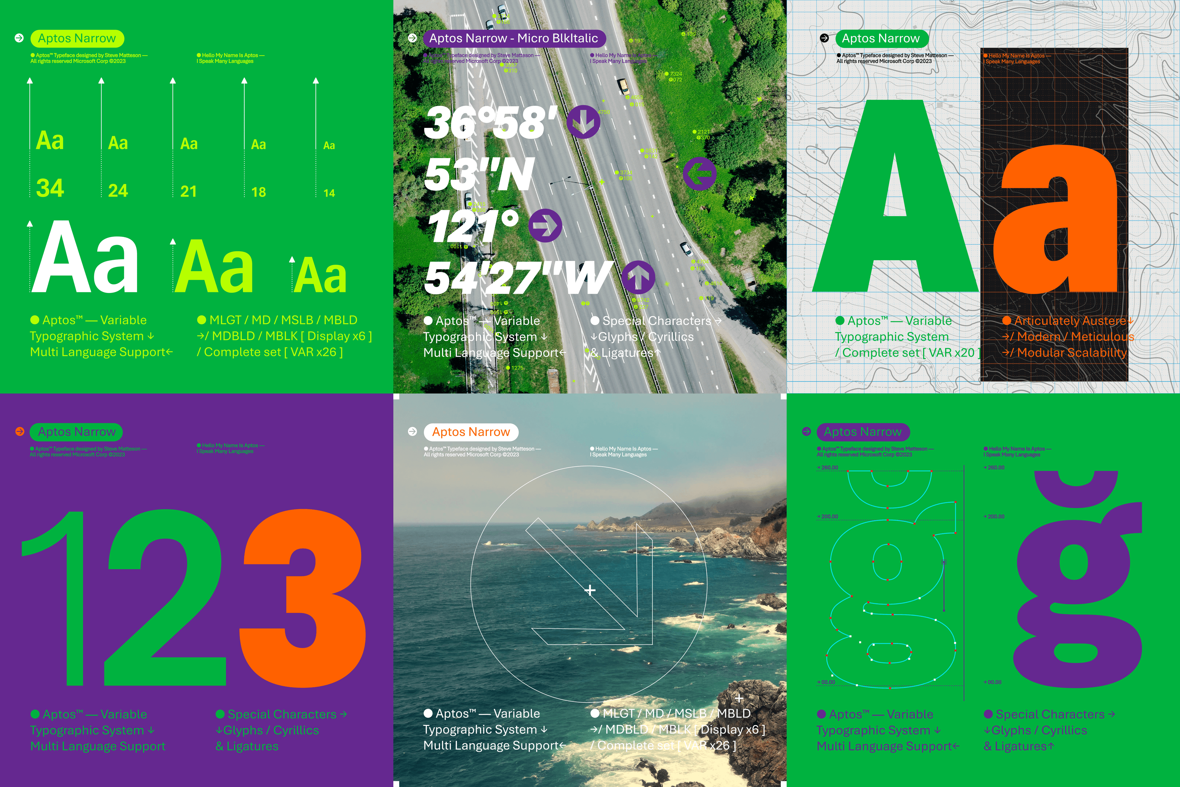
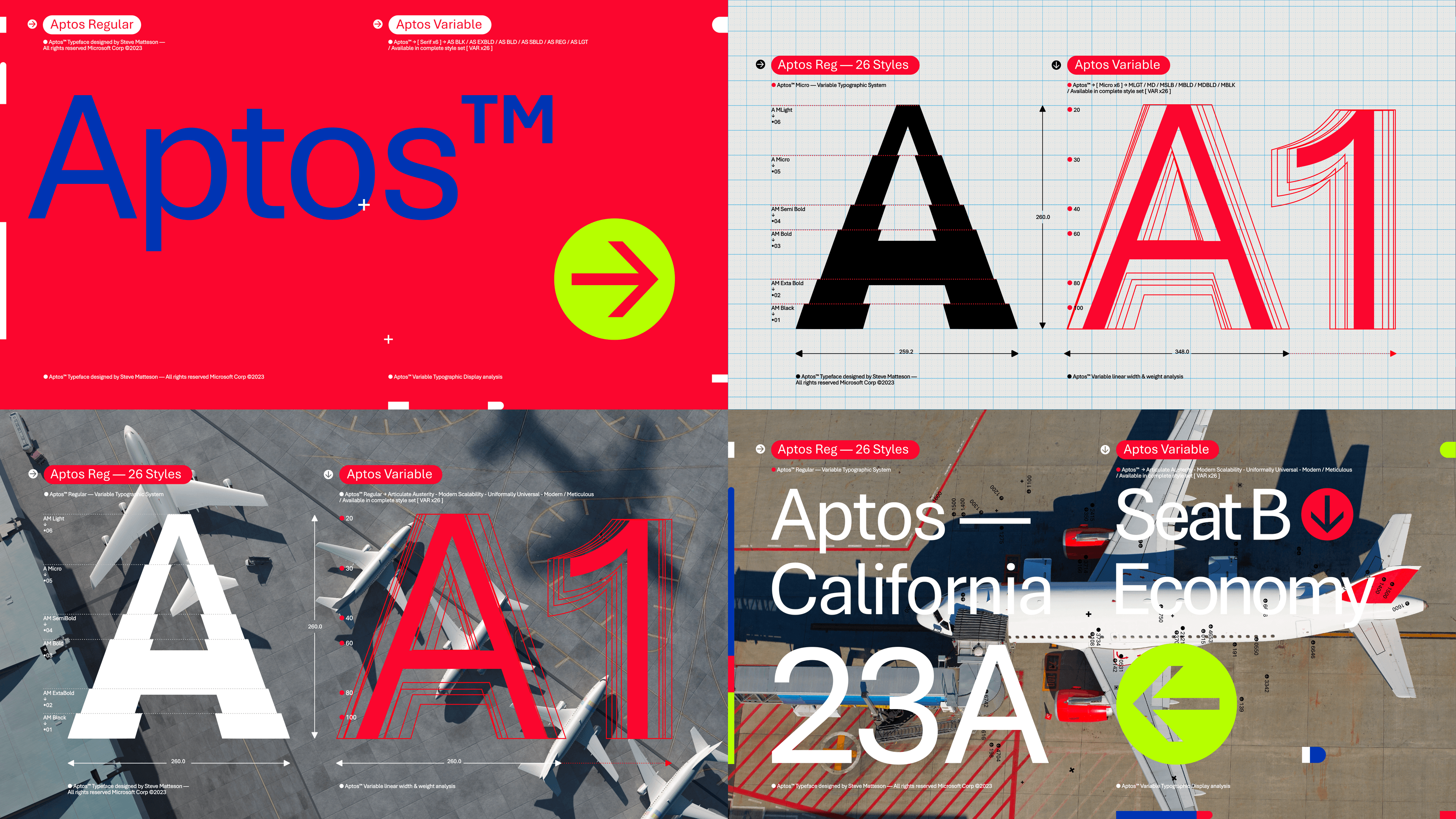
Aptos has a wide range of weights and styles, from light to black, and from regular to italic. It also supports a variety of languages and scripts, including Latin, Greek, Cyrillic, Arabic, Hebrew, Thai, and more.
It also has a rich set of symbols, icons, and emojis, which can add visual interest and expression to your documents.
The Benefits of Aptos
Aptos is a font that can transform your documents in many ways. Here are some of the benefits of using Aptos:
- It can improve the readability and comprehension of your documents, as it is designed to be clear, legible, and easy to scan.
- It can enhance the aesthetics and appeal of your documents, as it is designed to be elegant, modern, and versatile.
- It can convey the tone and mood of your documents, as it is designed to be warm, friendly, and expressive.
- It can adapt to different contexts and purposes, as it is designed to be flexible, suitable, and fitting.
Whether you are writing a report, a presentation, a newsletter, or a blog post, Aptos can help you create more engaging and effective documents.
You can also customise Aptos to suit your preferences and needs, by changing the font size, color, alignment, and spacing.
How to Use Aptos
If you are using the latest version of Microsoft Office, Aptos will be automatically applied as the default font for your documents.
You can also manually select Aptos from the font menu in the Home tab of the ribbon. If you are using an older version of Office, or you want to use Aptos with other applications, you can download the font from the Microsoft Typography website.
Aptos is a font that can bring a new level of quality and creativity to your documents. It is a font that honours the past but also embraces the future. It is a font that is fitting for the modern world.
Try it out and see for yourself how Aptos can transform your documents.


Comments ()