Ajax has just dropped their new badge for the 2025/26 season, and instead of jumping on the minimalism train, they've gone full retro.
While loads of clubs are stripping down their logos to the bare essentials, Ajax has decided to flex its history with a more detailed, traditional design. And honestly, it's a breath of fresh air.
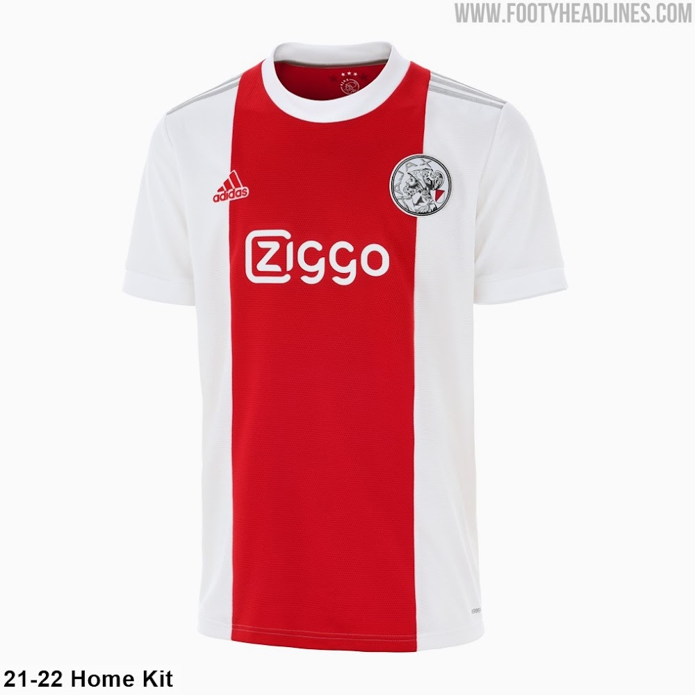
The new crest brings back some of the flair from the pre-1990 era, ditching the simplified vibe they've been rocking for decades.
It’s got more depth, more character, and more personality.
This isn't just a design refresh—it’s a statement. In a world where logos are getting so minimal they look like app icons or tech start-ups, Ajax is taking a stand for heritage.
Take Juventus, for example.
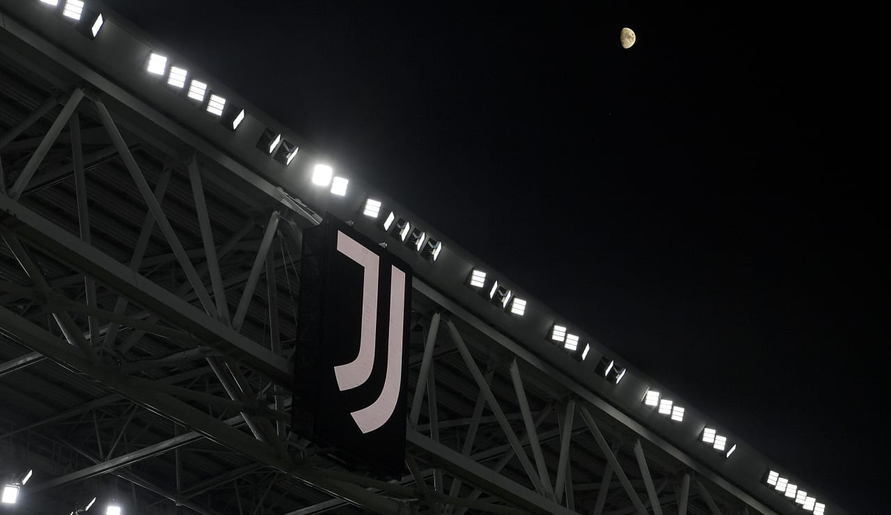
Their 2017 rebrand reduced their badge to a sleek “J” design that might look sharp on a billboard but left a lot of fans feeling detached.
Even Manchester City has leaned into simplicity over the years, removing iconic features in favour of clean lines and a modern aesthetic.
It’s not just football either—this trend is everywhere, from fast food brands to car companies.
The push for minimalist logos has been so aggressive, it feels like the individuality of some designs is getting left behind.
But Ajax?
They've gone the opposite direction, leaning into the storytelling potential of a badge.
Their new crest isn’t just a logo—it’s a nod to their legacy. It speaks to decades of footballing glory, their Dutch roots, and the pride of their supporters. It’s a decision that says, "We’re not here to forget who we are."
The fans are absolutely buzzing.
Social media is full of praise for the bold move, with supporters appreciating how the new badge captures the soul of the club while still feeling modern enough to fit in today’s game.
It’s a rare thing—bringing in more detail and making it work. But Ajax has pulled it off.
In an era where logos are shrinking to soulless simplicity, Ajax’s decision to add depth, character, and history to their badge feels refreshing.
It’s proof that sometimes, looking back can be the best way to move forward. Football isn’t just about the game; it’s about identity, history, and pride.
Ajax’s new badge? It nails all three.

